Columns Component
Overview
Use the Columns component to customize the layout of your module. The Columns component includes pre-made column designs and the ability to build custom column design layouts. Once you've added a Columns component to your module, blue Drag and Drop boxes display in your chosen column design layout. Drag and drop components into these boxes and organize them into each column.
You'll find the Columns component in the Display & Layout group to the left of the Module Builder.
About the Configuration Window
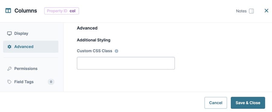
To learn more about general component settings and those that display when a component is associated with Data Models, view our General Component Settings article.
Display Settings
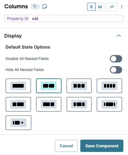
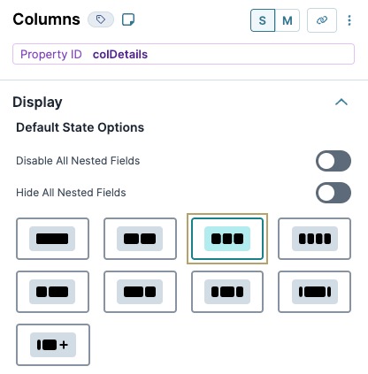
Default State Options
|
Setting |
Description |
|---|---|
|
Disable All Nested Fields |
When set to (ON), all components placed inside the columns are disabled. Use this setting instead of disabling each component. By default, this toggle is set to (OFF). |
|
Hide All Nested Fields |
When set to (ON), all components inside the columns are hidden from the end-user. Use this setting instead of hiding each component. By default, this toggle is set to (OFF). |
|
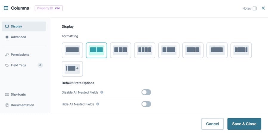
Formatting |
Displays a list of preset column options based on a 12 column grid system. Column presets include:
If the preset options do not meet your needs, create your own using the By default, the Columns component is set to the Double column setting. |


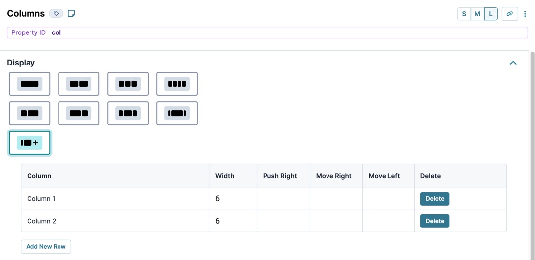
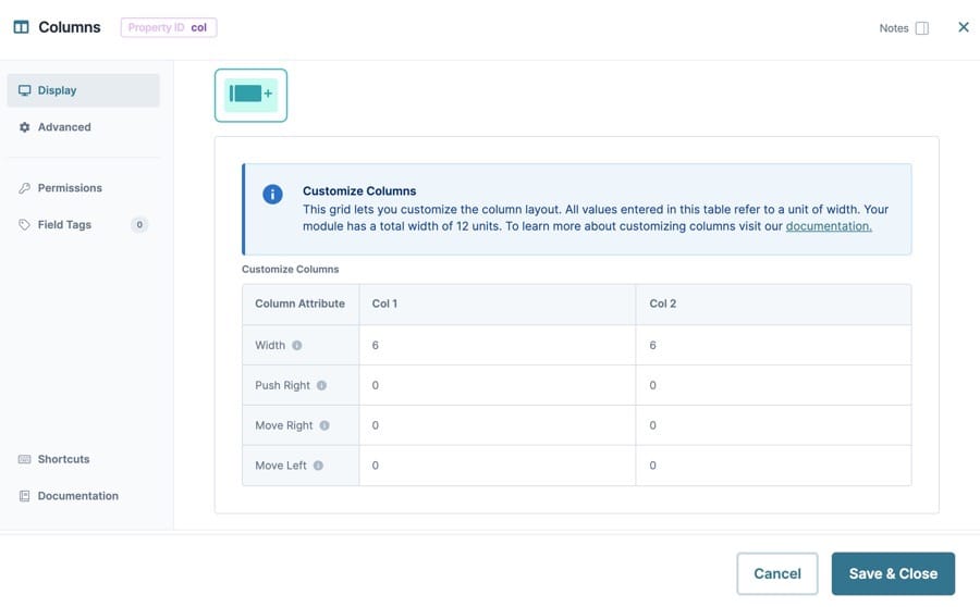
Customize Columns
Click the  Customize Columns button to create your own column layout. The Column component uses the 12 column grid system to organize and position columns on the page. Customizing the column layout lets use set column widths, and push or move columns within the 12 grid system.
|
Setting |
Description |
|---|---|
|
Column |
Each row represents the individual columns. Each column can be adjusted using the column attribute fields. |
|
Width |
The total width of the column. Your module has a total width of 12 units. For example, you could create 12 columns at a width of one unit each, or you could create two columns at a width of six units each. |
|
Push Right |
Moves all columns to the right by a specified number of units. If you push a column beyond the available width, a new row of columns starts |
|
Move Right |
Moves the individual column to the right by a specified number of units without moving the other columns. If you move one column into another column, the columns overlap. |
|
Move Left |
Moves the individual column to the left by a specified number of units without moving the other columns. If you move one column into another column, the columns overlap. |
|
Delete |
Permanently deletes the Column row. |
|
Add New Row |
Adds a new Column row to the bottom of the table. |
Adding a Columns Component
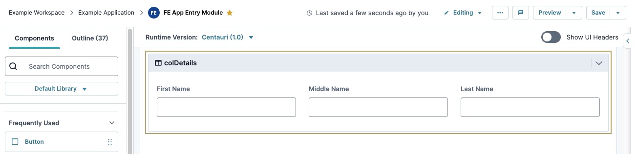
In this example, you'll set up three evenly-spaced columns with three Text Field components for your end-user to submit their first, middle, and last names.
Configure the Columns Component
This component divides your module into three evenly-spaced columns.
| 1. | In the Module Builder, drag and drop a  Columns component onto your canvas. Columns component onto your canvas. |
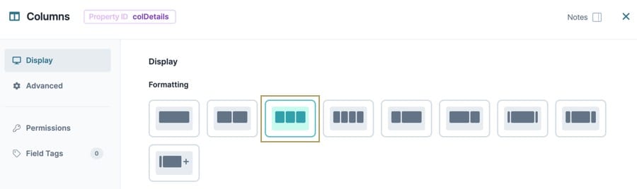
| 2. | In the Property ID field, enter colDetails. |
| 3. | Under Formatting, click the  (Triple) Button. (Triple) Button. |
| 4. | Click Save Component. |
Configure the Text Field Components
Here you'll configure three Text Field components associated with your First Name, Middle Name, and Last Name fields.
| 1. | Drag a Text Field component onto your canvas, placing it in column1 of the colDetails Columns component. |
| 2. | In the Property ID field, enter firstName. |
| 3. | In the Label Text field, enter First Name. |
| 4. | Click Save Component. |
| 5. | Repeat this process with two more Text Field components, placing them in column2 and column3 of the colDetails Columns component. |
| 6. | Enter the following Property ID and Label Text values for the two Text Field components: |
|
Property ID |
Label Text |
|---|---|
|
middleName |
Middle Name |
|
lastName |
Last Name |
| 7. | Click Save Component. |
| 8. | Save your module. |
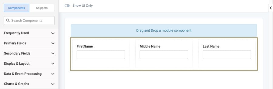
Your module looks like the following in Express View:

Resources
