Text Field Component
Overview
The Text Field component is part of the core range of input components. Next to Buttons, text input components like Text Field and Text Area, are some of the most-frequently used inputs.
The Text Field component allows for alphanumeric responses (both letters and numbers). But keep in mind that Unqork also has a dedicated Number component. So, use a Text Field when responses might use only letters or combinations of letters and numbers. A Number component is better when collecting something like your end-user's age. And, if you can narrow down your end-user's options, you might use a Dropdown, Radio Buttons, or Date Input component.
You can find the component under the Primary Fields group to the left of the Module Builder.
Learning Objectives
About the Configuration Window
To learn more about general component settings, view our General Component Settings article.
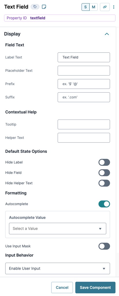
Display Settings
Field Text
|
Setting |
Description |
|---|---|
|
Label Text |
Label Text conveys what the input component is and what information it displays. Enter the purpose of the corresponding component or field. User-friendly labels make your module more accessible. Keep labels short and descriptive (a word or two) using title case. For longer entries, use sentence case. |
|
Placeholder Text |
A short prompt telling end-users the expected value of an input field. For example: Enter your Social Security Number. Placeholder Text displays inside the input field until the end-user begins an entry. |
|
Prefix |
Alphanumeric characters append to the start of the value entered in the field. If called by another component, the prefix stores with the value. |
|
Suffix |
Alphanumeric characters that append to the end of the value entered in the field. If called by another component, the suffix stores with the value. |
Contextual Help
|
Setting |
Description |
|---|---|
|
Tooltip |
A short hint that displays when an end-user positions their cursor over the |
|
Helper Text |
A quick tip describing the expected value of an input field. Unlike a Tooltip, Helper Text stays visible under the input field and displays on a single line. |
 (
(Default State Options
|
Setting |
Description |
|---|---|
|
Hide Label |
Setting Hide Label to (ON) hides Label Text from displaying in Express View Express View is how your end-user views your application. Express View also lets you preview your applications to test your configuration and view the styling. This is also the view your end-users will see when interacting with your application. After configuring a module, click Preview in the Module Builder to interact with the module in Express View.. Your Label Text still displays in the Module Builder. By default, this setting is set to (OFF). |
|
Disable User Input |
When set to (ON), end-users cannot interact with or edit the Express View's input field or element. When end-users hover over the field, their cursor changes to alert them to the status change. By default, Disable User Input is set to (OFF). |
|
Read Only View |
When set to (ON), the component is display-only. If another component sends content to the field, the end-user can view that content. Otherwise, end-users see the word None. By default, the Read Only View toggle is set to (OFF). |
|
Hide Field |
Displays or hides the component from view. Setting Hide Field to (ON) hides the component in Express View. Setting it to (OFF) displays the component. The component is always visible in the Module Builder. By default, Hide Field is set to (OFF). |
|
Hide Helper Text |
Stops Helper Text from displaying in Express View. By default, the Hide Helper Text toggle is set to (OFF). |
| Disable Browser Autocomplete |
Setting the toggle to (ON) stops the browser from autofilling the field. When a user clicks the field, they must enter the value instead of having it autofill by the browser. Use this setting in all fields containing sensitive data. Some browsers might not support this setting. By default, the Disable Browser Autofill toggle is set to (OFF). |
Formatting
|
Setting |
Description |
|---|---|
|
Autocomplete |
Autocomplete detects end-user End-users, also known as Express Users, are the individuals accessing an application through Express View. In most cases, end-users are the customers using the product. data saved in a browser and uses it to fill relevant fields. For example, in Express View Express View is how your end-user views your application. Express View also lets you preview your applications to test your configuration and view the styling. This is also the view your end-users will see when interacting with your application. After configuring a module, click Preview in the Module Builder to interact with the module in Express View., if there is a field labeled First Name, and an end-user clicks into the field, the end-user's browser autofill function suggests first names saved to the browser. By default, Autocomplete is set to (ON). |
|
Autocomplete Value |
When Autocomplete is set to (ON), the Autocomplete Value drop-down displays. Use this drop-down to select an ARIA role to better direct the autocomplete feature when an end-user clicks on a field. For example, selecting address-line1 helps the browser determine that the field should autofill with the first line of an address. To learn more about supported ARIA values in Unqork, view our Autocomplete reference guide. |
|
Use Input Mask |
Setting the Use Input Mask toggle to (ON) makes the Input Mask and Format Data With Mask options available. Setting the toggle to (OFF) hides these options from view. By default, the Use Input Mask toggle is set to (OFF). |
|
Input Mask |
An Input Mask is a string of characters that indicates the format of a valid input. Use an Input Mask when the format of the input value must be consistent. Use 9 to require a number, a to require a letter, and * to require an alphanumeric character. For example, you might use an input mask with a field that stores a Social Security Number (999-99-9999) or a formatted username (aa9999). |
|
Format Data With Mask |
Stores your data with the input mask formatting applied. Setting the Format Data With Mask toggle to (ON) activates the feature. Setting the toggle to (OFF) stores your data without the input mask formatting applied. By default, the Format Data With Mask toggle is set to (OFF). |
Input Behavior
| Setting | Description |
|---|---|
|
Input Behavior |
Controls how end-users End-users, also known as Express Users, are the individuals accessing an application through Express View. In most cases, end-users are the customers using the product. interact with the component. Choose from the following options:
|
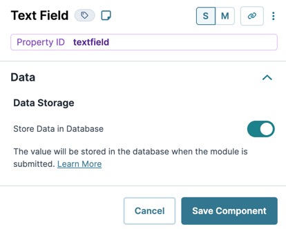
Data Settings
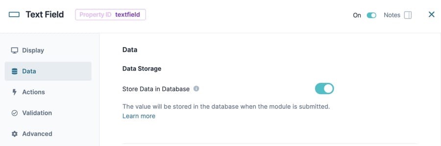
Data Storage
|
Setting |
Description |
|---|---|
|
Store Data in Database |
The Store Data in Database setting affects how data persists through your application. When set to (ON), Unqork stores values entered into the field to the database (server-side submission). This occurs in three scenarios:
By default, workflows persist data from all fields in the client-side submission when navigating between screens. However, only values from fields with Store Data in Database enabled store in the server-side submission. Set the toggle to (OFF) when you don’t want to store the values from this field in the database. When using a Plug-In to remote execute a module, ensure data moving between modules is persistent. You can optionally enable Store Data in Database for components in the source module. But any components in the API module whose values are included in an API response must have Store Data in Database enabled. When a component’s data is not persistent, the data isn't included in an API call's response. So, Plug-Ins or external services requesting data from the API module can't receive non-persistent data in the response. Store Data in Database also affects what data is tracked using Unqork’s built-in tracker. When the Enable Tracker and Track Value toggles are set to (ON) in Module Settings, only values from fields with Store Data in Database enabled are tracked. |
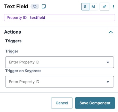
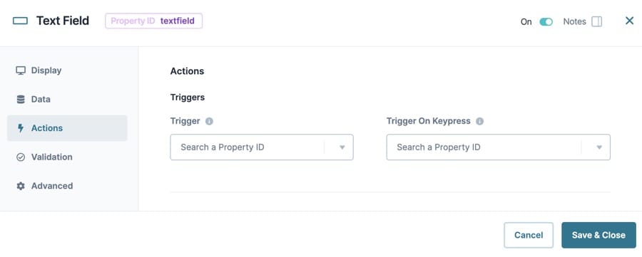
Actions Settings
Triggers
|
Setting |
Description |
|---|---|
|
Trigger |
To set up a trigger, enter the Property ID A Property ID is the unique field ID used by Unqork to track and link components in your module. of your chosen logic component into this field. When the end-user performs an action on the current component, the triggered component fires. |
|
Trigger on Keypress |
A variation of the trigger setting. With this setting, the triggered component fires on every keystroke made inside the current component. |
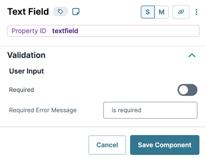
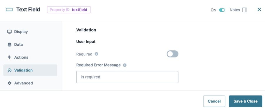
Validation Settings
User Input
|
Setting |
Description |
|---|---|
|
Required |
When set to (ON), the end-user must enter a value in the component's visible fields. When set to (OFF), the input is optional. By default, Required is set to (OFF). |
|
Required Error Message |
A custom error message that displays below a required field. The error message displays when the end-user tries to save or submit the module without completing the required field. |
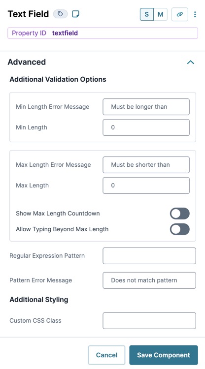
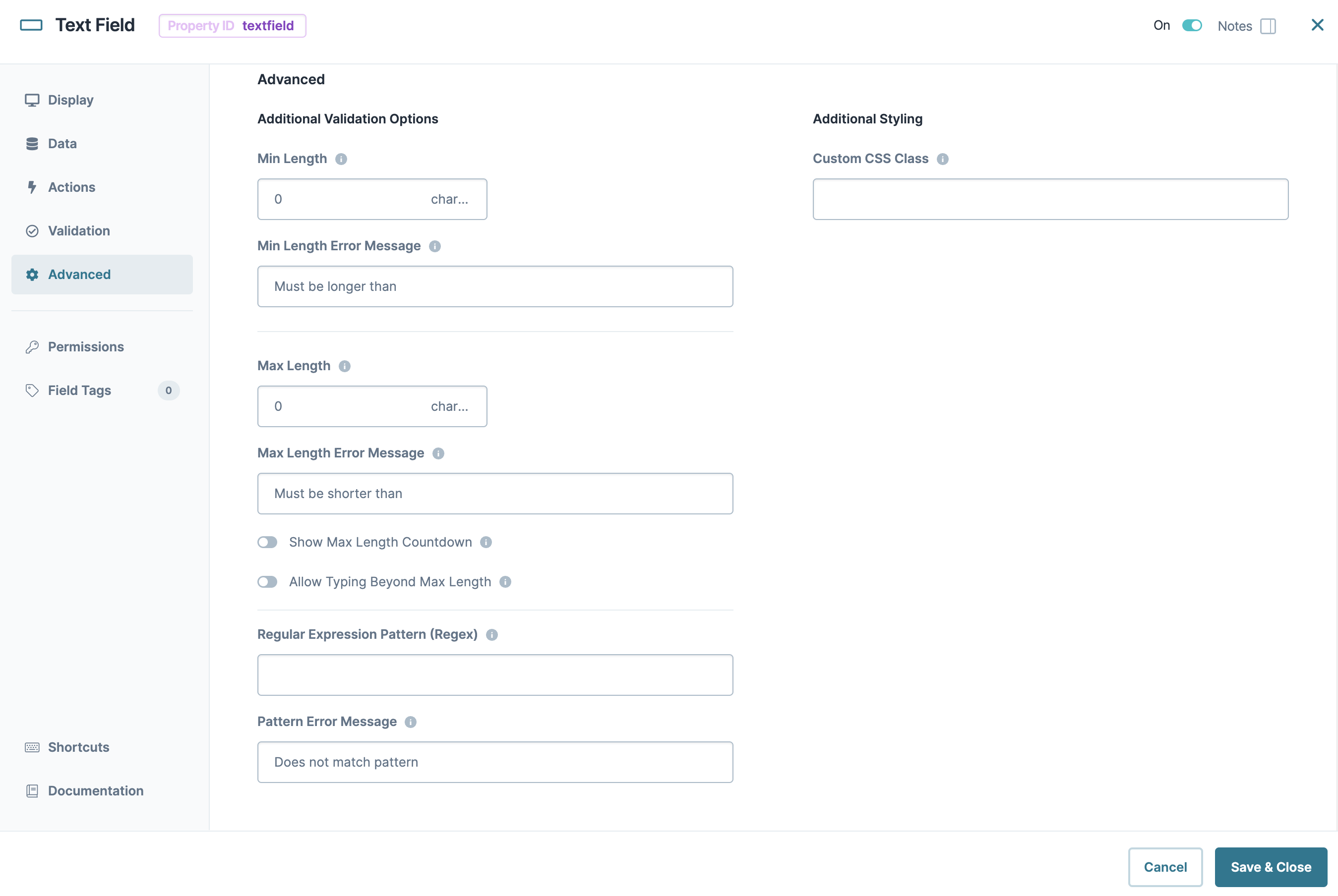
Advanced Settings
Additional Validation Options
|
Setting |
Description |
|---|---|
|
Min/Max Length |
Sets the minimum or the maximum number of characters an end-user must enter for valid input. |
|
Min/Max Length Error Message |
A custom error message that displays below the input field. The error message displays when the entry doesn't meet the minimum or maximum character length rule. |
|
Show Max Length Countdown |
When set to (ON), a character countdown displays below the input field showing the number of characters left before reaching maximum length. By default, the Show Maximum Length toggle is set to (OFF). |
|
Allow Typing Beyond Maximum Length |
When set to (ON), the end-user can continue typing past the field’s fixed maximum length. If the end-user's input exceeds the maximum length, an error message displays below the input field. By default, the Allow Typing Beyond Maximum Length toggle is set to (OFF). |
|
Regular Expression Pattern |
The Regular Expression pattern that the field's value must match to be valid. To learn about Regular Expression patterns, view our Regex in Unqork article. |
|
Pattern Error Message |
An error message that displays if the value does not meet the Regular Expression pattern. |
Additional Styling
|
Setting |
Description |
|---|---|
|
Custom CSS Class |
Enter a Custom CSS Cascading Style Sheets (CSS) is a style sheet language used for presenting how a HTML or XML document looks to end-users. Class to apply to your component. Custom CSS lets you maintain a consistent look and feel when the field or element is part of a template or multiple modules. Updated CSS styling applies to all components that reference this custom class name. |
Adding a Text Field Component
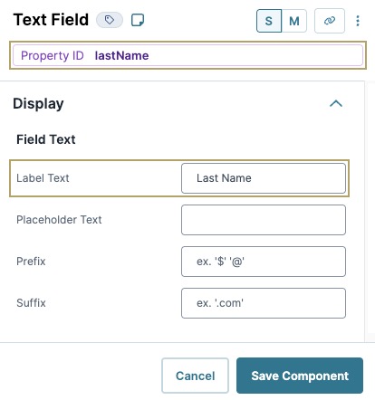
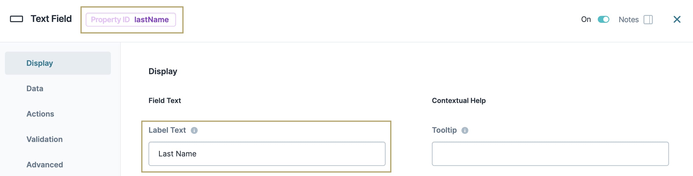
As an example, create a Text Field for an applicant's last name. These instructions assume that you have an open module saved with a title.
| 1. | Drag and drop a Text Field component onto the canvas. |
| 2. | In the Property ID A Property ID is the unique field ID used by Unqork to track and link components in your module. field, enter lastName. |
| 3. | In the Label Text Label Text conveys what the input component is and what information it displays. Enter the purpose of the corresponding component or field. field, enter Last Name. |
| 4. | Click Save Component. |
| 5. | Save your module. |
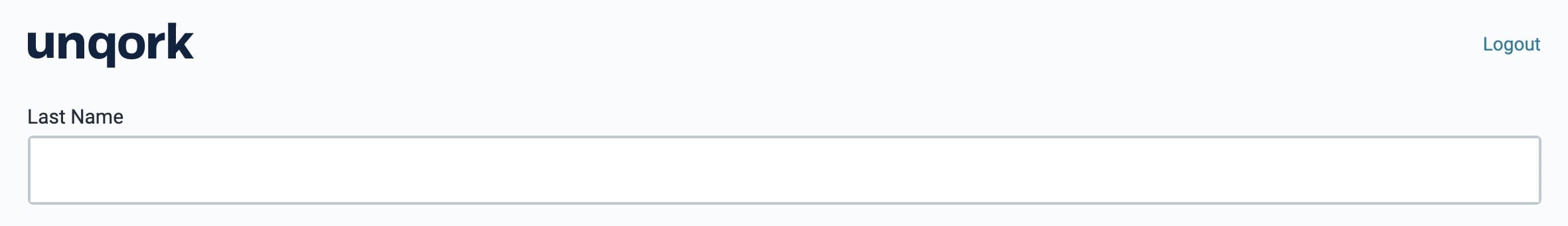
Preview your module in Express View Express View is how your end-user views your application. Express View also lets you preview your applications to test your configuration and view the styling. This is also the view your end-users will see when interacting with your application. After configuring a module, click Preview in the Module Builder to interact with the module in Express View.. You'll see the following functionality:
Structure of a Text Field Component's Data
A text field component stores its data as a string when viewed in the developer console.

Currently, Unqork doesn't support values entering or rendering text values greater than 1024 characters in a submission.

Overview
The Text Field component is part of the core range of input components. Next to Buttons, text input components like Text Field and Text Area, are some of the most-frequently used inputs.
Text Field components display alphanumeric values that can fit on a single line. Use a Text Field component for short-form information, like allowing end-users End-users, also known as Express Users, are the individuals accessing an application through Express View. In most cases, end-users are the customers using the product. to enter their name. You can also use a Text Field component to display values another component passes to it.
Text Fields are perfect for short but open-ended responses. For example, use a Text Field to collect your end-user's name. It's impossible to create a list of names to cover everyone who might use your application, so it's best to use a Text Field. This lets your end-user type their name while still limiting the length of their response. A Text Field component only occupies a single text line when placed in a column.
The Text Field component allows for alphanumeric responses (both letters and numbers). But keep in mind that Unqork also has a dedicated Number component. So, use a Text Field when responses might use only letters or combinations of letters and numbers. A Number component is better when collecting something like your end-user's age. And, if you can narrow down your end-user's options, you might use a Dropdown, Radio Buttons, or Date Input component.
Here are some common examples of when to use the Text Field component:
-
To collect an end-user's data, such as their first and last names.
-
As an input for end-users to answer a question.
-
To display data pulled from another part of the module.
You can find the component under the Primary Fields group to the left of the Module Builder.
About the Configuration Window
To learn more about general component settings and those that display when a component is associated with Data Models, view our General Component Settings article.
Display Panel
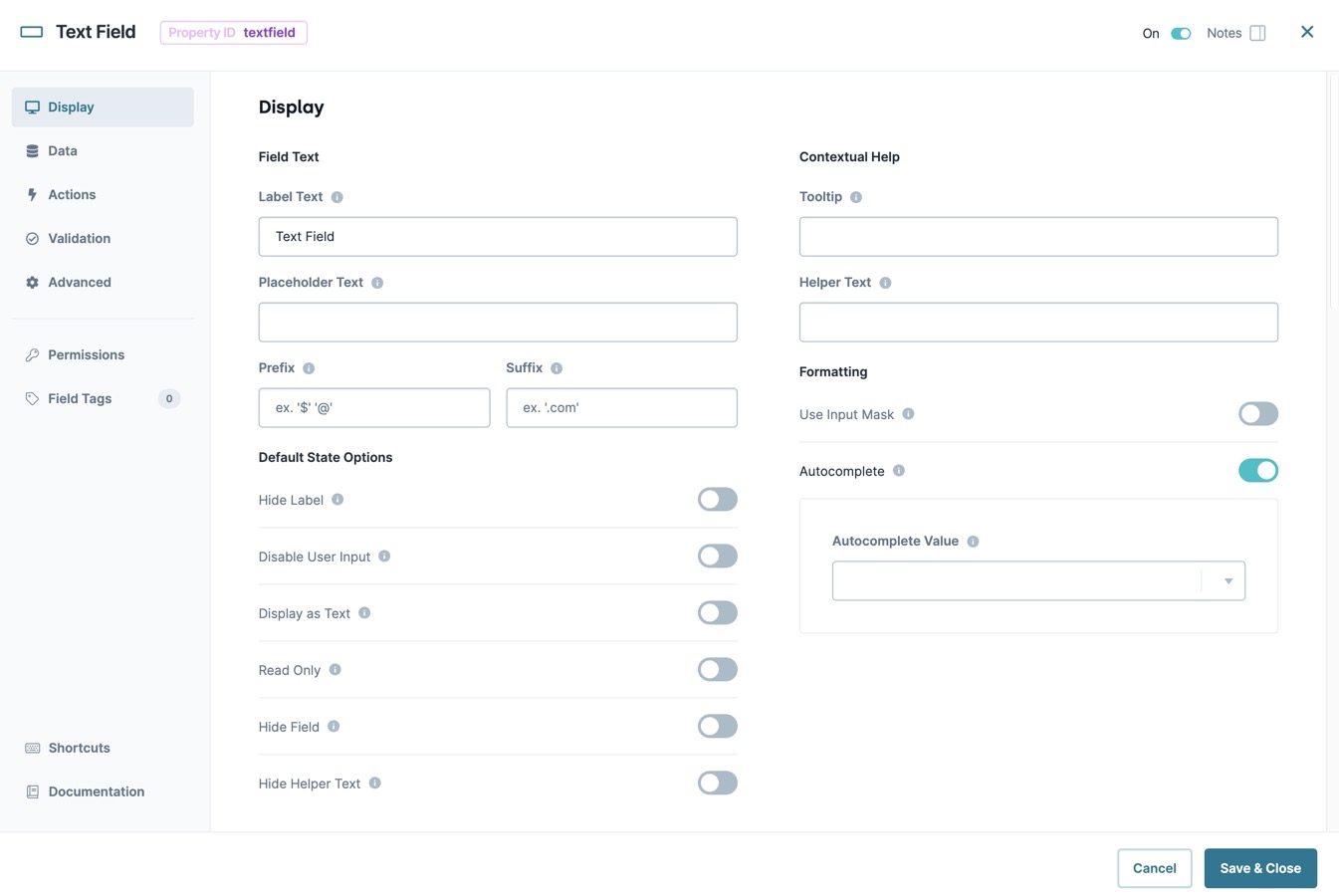
Field Text
|
Setting |
Description |
|---|---|
|
Label Text |
Label Text conveys what the input component is and what information it displays. Enter the purpose of the corresponding component or field. User-friendly labels make your module more accessible. Keep labels short and descriptive (a word or two) using title case. For longer entries, use sentence case. |
|
Placeholder Text |
A short prompt telling end-users the expected value of an input field. For example: Enter your Social Security Number. Placeholder Text displays inside the input field until the end-user begins an entry. |
|
Prefix |
Alphanumeric characters append to the start of the value entered in the field. If called by another component, the prefix stores with the value. |
|
Suffix |
Alphanumeric characters that append to the end of the value entered in the field. If called by another component, the suffix stores with the value. |
Default State Options
|
Setting |
Description |
|---|---|
|
Hide Label |
Setting Hide Label to (ON) hides Label Text from displaying in Express View Express View is how your end-user views your application. Express View also lets you preview your applications to test your configuration and view the styling. This is also the view your end-users will see when interacting with your application. After configuring a module, click Preview in the Module Builder to interact with the module in Express View.. Your Label Text still displays in the Module Builder. By default, this setting is set to (OFF). |
|
Disable User Input |
When set to (ON), end-users cannot interact with or edit the Express View's input field or element. When end-users hover over the field, their cursor changes to alert them to the status change. By default, Disable User Input is set to (OFF). |
|
Read Only View |
When set to (ON), the component is display-only. If another component sends content to the field, the end-user can view that content. Otherwise, end-users see the word None. By default, the Read Only View toggle is set to (OFF). |
|
Hide Field |
Displays or hides the component from view. Setting Hide Field to (ON) hides the component in Express View. Setting it to (OFF) displays the component. The component is always visible in the Module Builder. By default, Hide Field is set to (OFF). |
|
Hide Helper Text |
Stops Helper Text from displaying in Express View. By default, the Hide Helper Text toggle is set to (OFF). |
Contextual Help
|
Setting |
Description |
|---|---|
|
Tooltip |
A short hint that displays when an end-user positions their cursor over the |
|
Helper Text |
A quick tip describing the expected value of an input field. Unlike a Tooltip, Helper Text stays visible under the input field and displays on a single line. |
Formatting
|
Setting |
Description |
|---|---|
|
Use Input Mask |
Setting the Use Input Mask toggle to (ON) makes the Input Mask and Format Data With Mask options available. Setting the toggle to (OFF) hides these options from view. By default, the Use Input Mask toggle is set to (OFF). |
|
Input Mask |
An Input Mask is a string of characters that indicates the format of a valid input. Use an Input Mask when the format of the input value must be consistent. Use 9 to require a number, a to require a letter, and * to require an alphanumeric character. For example, you might use an input mask with a field that stores a Social Security Number (999-99-9999) or a formatted username (aa9999). |
|
Format Data With Mask |
Stores your data with the input mask formatting applied. Setting the Format Data With Mask toggle to (ON) activates the feature. Setting the toggle to (OFF) stores your data without the input mask formatting applied. By default, the Format Data With Mask toggle is set to (OFF). |
|
Disable Browser Autofill |
Setting the toggle to (ON) stops the browser from autofilling the field. When a user clicks the field, they must enter the value instead of having it autofill by the browser. Use this setting in all fields containing sensitive data. Some browsers might not support this setting. By default, the Disable Browser Autofill toggle is set to (OFF). |
Autocomplete
| Setting | Description |
|---|---|
|
Autocomplete |
Autocomplete detects end-user End-users, also known as Express Users, are the individuals accessing an application through Express View. In most cases, end-users are the customers using the product. data saved in a browser and uses it to fill relevant fields. For example, in Express View Express View is how your end-user views your application. Express View also lets you preview your applications to test your configuration and view the styling. This is also the view your end-users will see when interacting with your application. After configuring a module, click Preview in the Module Builder to interact with the module in Express View., if there is a field labeled First Name, and an end-user clicks into the field, the end-user's browser autofill function suggests first names saved to the browser. By default, Autocomplete is set to (ON). |
|
Autocomplete Value |
When Autocomplete is set to (ON), the Autocomplete Value drop-down displays. Use this drop-down to select an ARIA role to better direct the autocomplete feature when an end-user clicks on a field. For example, selecting address-line1 helps the browser determine that the field should autofill with the first line of an address. To learn more about supported ARIA values in Unqork, view our Autocomplete reference guide. |
Data Panel
Data Storage
|
Setting |
Description |
|---|---|
|
Store Data in Database |
The Store Data in Database setting affects how data persists through your application. When set to (ON), Unqork stores values entered into the field to the database (server-side submission). This occurs in three scenarios:
By default, workflows persist data from all fields in the client-side submission when navigating between screens. However, only values from fields with Store Data in Database enabled store in the server-side submission. Set the toggle to (OFF) when you don’t want to store the values from this field in the database. When using a Plug-In to remote execute a module, ensure data moving between modules is persistent. You can optionally enable Store Data in Database for components in the source module. But any components in the API module whose values are included in an API response must have Store Data in Database enabled. When a component’s data is not persistent, the data isn't included in an API call's response. So, Plug-Ins or external services requesting data from the API module can't receive non-persistent data in the response. Store Data in Database also affects what data is tracked using Unqork’s built-in tracker. When the Enable Tracker and Track Value toggles are set to (ON) in Module Settings, only values from fields with Store Data in Database enabled are tracked. |
Actions Panel
Triggers
|
Setting |
Description |
|---|---|
|
Trigger |
To set up a trigger, enter the Property ID A Property ID is the unique field ID used by Unqork to track and link components in your module. of your chosen logic component into this field. When the end-user performs an action on the current component, the triggered component fires. |
|
Trigger on Keypress |
A variation of the trigger setting. With this setting, the triggered component fires on every keystroke made inside the current component. |
Validation Panel
User Input
|
Setting |
Description |
|---|---|
|
Required |
When set to (ON), the end-user must enter a value in the component's visible fields. When set to (OFF), the input is optional. By default, Required is set to (OFF). |
|
Required Error Message |
A custom error message that displays below a required field. The error message displays when the end-user tries to save or submit the module without completing the required field. |
Advanced Panel
Additional Validation Options
|
Setting |
Description |
|---|---|
|
Min/Max Length |
Sets the minimum or the maximum number of characters an end-user must enter for valid input. |
|
Min/Max Length Error Message |
A custom error message that displays below the input field. The error message displays when the entry doesn't meet the minimum or maximum character length rule. |
|
Show Max Length Countdown |
When set to (ON), a character countdown displays below the input field showing the number of characters left before reaching maximum length. By default, the Show Maximum Length toggle is set to (OFF). |
|
Allow Typing Beyond Maximum Length |
When set to (ON), the end-user can continue typing past the field’s fixed maximum length. If the end-user's input exceeds the maximum length, an error message displays below the input field. By default, the Allow Typing Beyond Maximum Length toggle is set to (OFF). |
|
Regular Expression Pattern |
The Regular Expression pattern that the field's value must match to be valid. To learn about Regular Expression patterns, view our Regex in Unqork article. |
|
Pattern Error Message |
An error message that displays if the value does not meet the Regular Expression pattern. |
Additional Styling
|
Setting |
Description |
|---|---|
|
Custom CSS Class |
Enter a Custom CSS Cascading Style Sheets (CSS) is a style sheet language used for presenting how a HTML or XML document looks to end-users. Class to apply to your component. Custom CSS lets you maintain a consistent look and feel when the field or element is part of a template or multiple modules. Updated CSS styling applies to all components that reference this custom class name. |
Adding a Text Field Component
As an example, create a Text Field for an applicant's last name. These instructions assume that you have an open module saved with a title.
| 1. | Drag and drop a Text Field component onto the canvas. |
| 2. | In the Property ID A Property ID is the unique field ID used by Unqork to track and link components in your module. field, enter lastName. |
| 3. | In the Label Text Label Text conveys what the input component is and what information it displays. Enter the purpose of the corresponding component or field. field, enter Last Name. |
| 4. | Click Save & Close. |
| 5. | Save your module. |
Preview your module in Express View Express View is how your end-user views your application. Express View also lets you preview your applications to test your configuration and view the styling. This is also the view your end-users will see when interacting with your application. After configuring a module, click Preview in the Module Builder to interact with the module in Express View.. You'll see the following functionality:
Structure of a Text Field Component's Data
A text field component stores its data as a string when viewed in the developer console.
Currently, Unqork doesn't support values entering or rendering text values greater than 1024 characters in a submission.
Resources
