Overview
Structuring modules helps maintain simplicity for creators, and presents a unified experience for end-users. Creators structure components by uniformly organizing a module's layout. This includes placing input and output components above and below your logic components and using Display & Layout components to group your components by relationship.
Display and Layout Components
Unqork uses grouping and layout components that add structure to your modules. Examples of organization components include .png) Columns, Panel, Table,
Columns, Panel, Table, .png) Navigation, and Field Group. These components help you nest other components. You'll find these components in the Display & Layout component group of the Module Builder.
Navigation, and Field Group. These components help you nest other components. You'll find these components in the Display & Layout component group of the Module Builder.
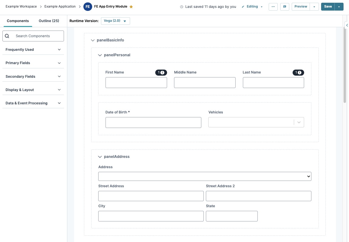
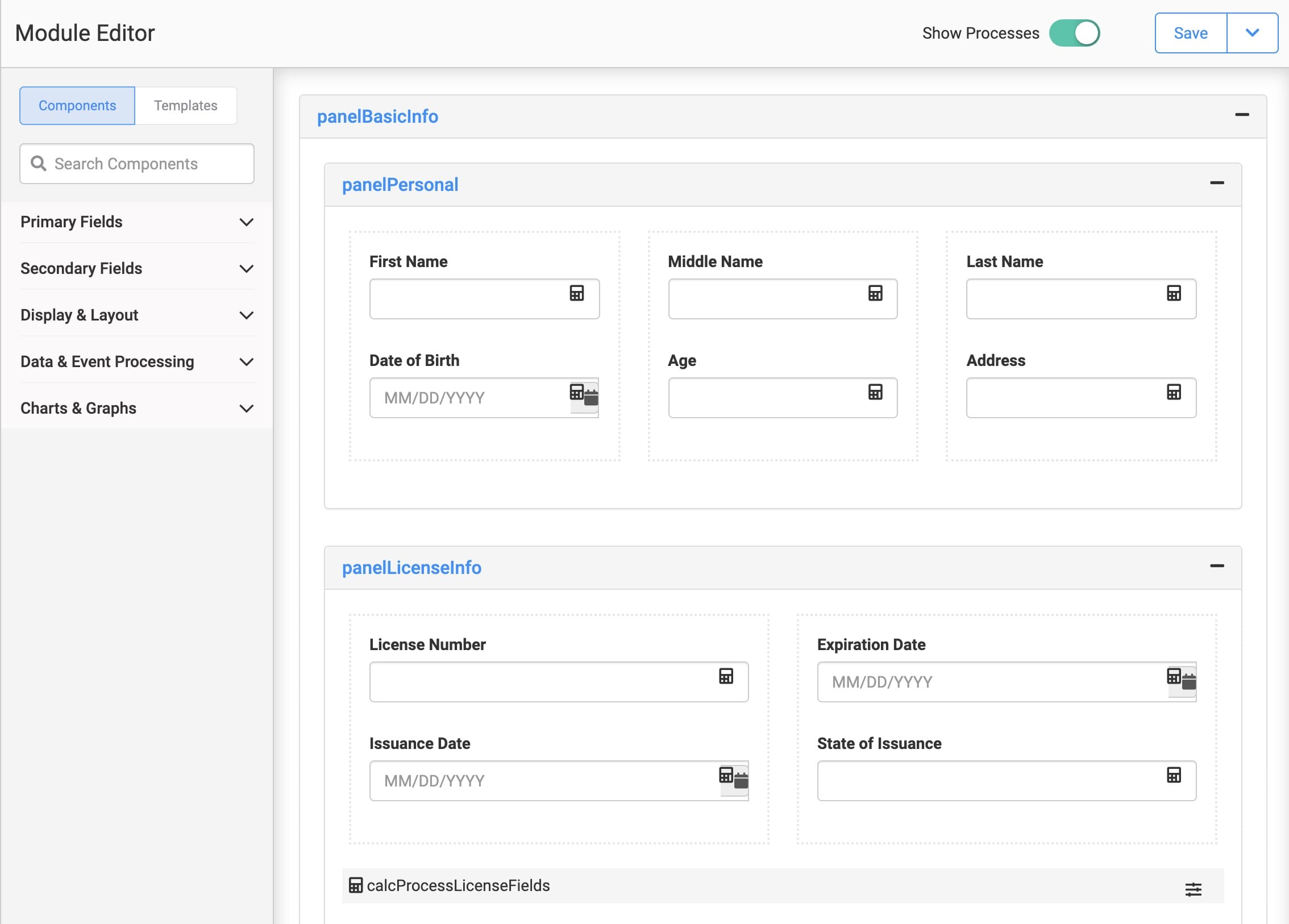
The image below shows how the Panel and Columns components organize other components into easy-to-read groups.
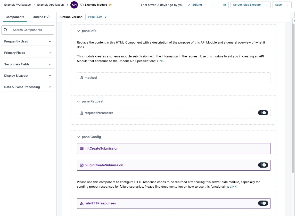
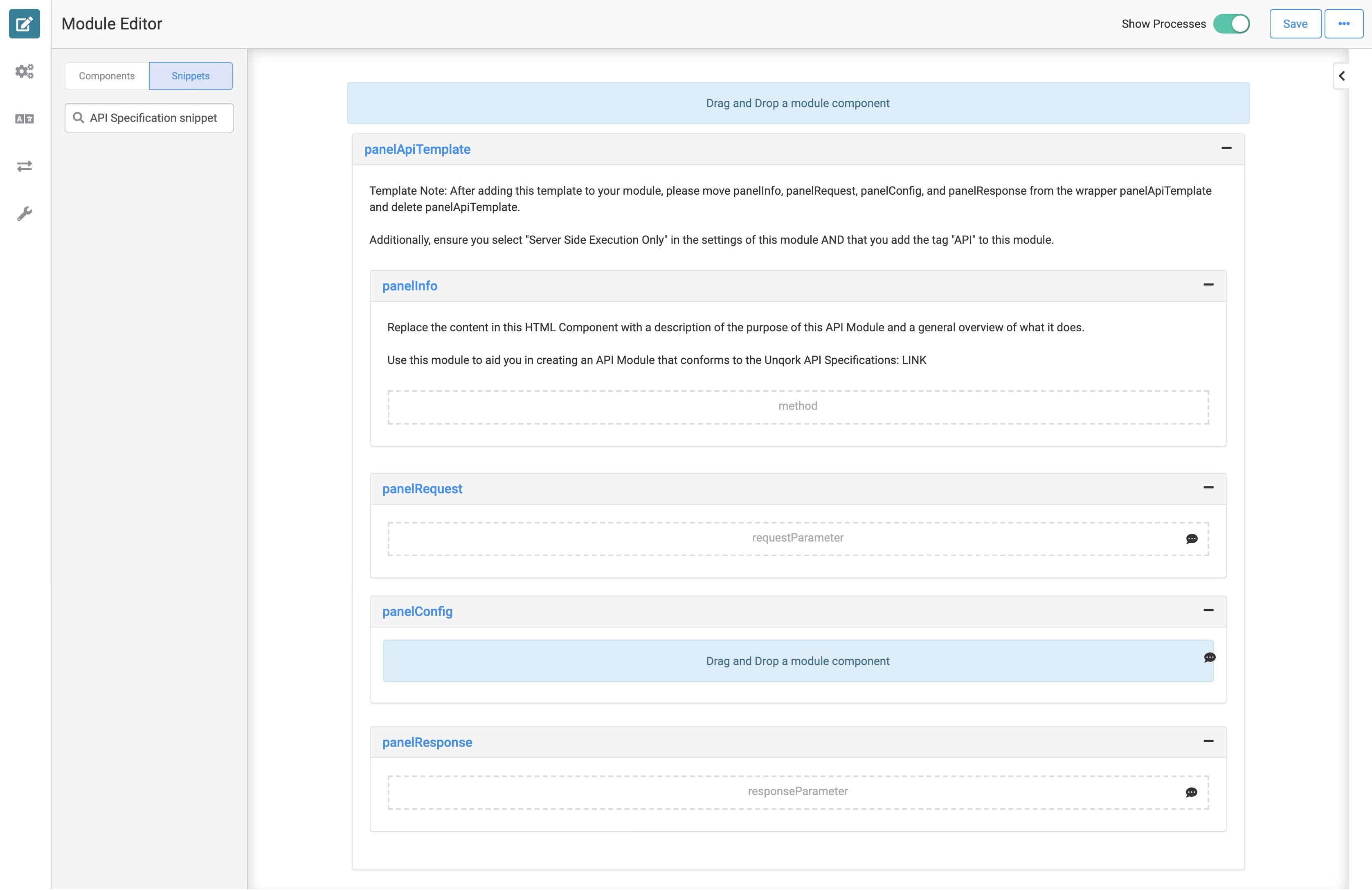
Many of the Unqork snippets also have Panels and other organizational configurations. These configurations will help guide you when using a snippet. For instance, here's how the API Module looks in the Module Builder:
Unless your module only has a few components, always include structural components. Using these components improve not only your experience but also your end-user's experience.
Adding Logic to Your Module
One benefit of structural components is that they let you apply logic to a group of settings. One example is setting a Panel component to hidden. This hides all the components in the Panel. You can then configure the whole Panel to show when the end-user performs a certain action.
There are also best practices when configuring logic and  Plug-In components. Logic components include the
 .png) Calculator, Decisions, and Data Workflow components. Each component requires inputs, outputs, and the specific logic you'll need for your module. Some best practices are:
Calculator, Decisions, and Data Workflow components. Each component requires inputs, outputs, and the specific logic you'll need for your module. Some best practices are:
Placing input components above their logic component in the Module Builder. This could be an Initializer that triggers a
Plug-In component.Placing output components below their logic component in the Module Builder. This could be a Hidden component that contains a Data Workflow output.
Group all components involved with a Data Workflow around that Data Workflow component.
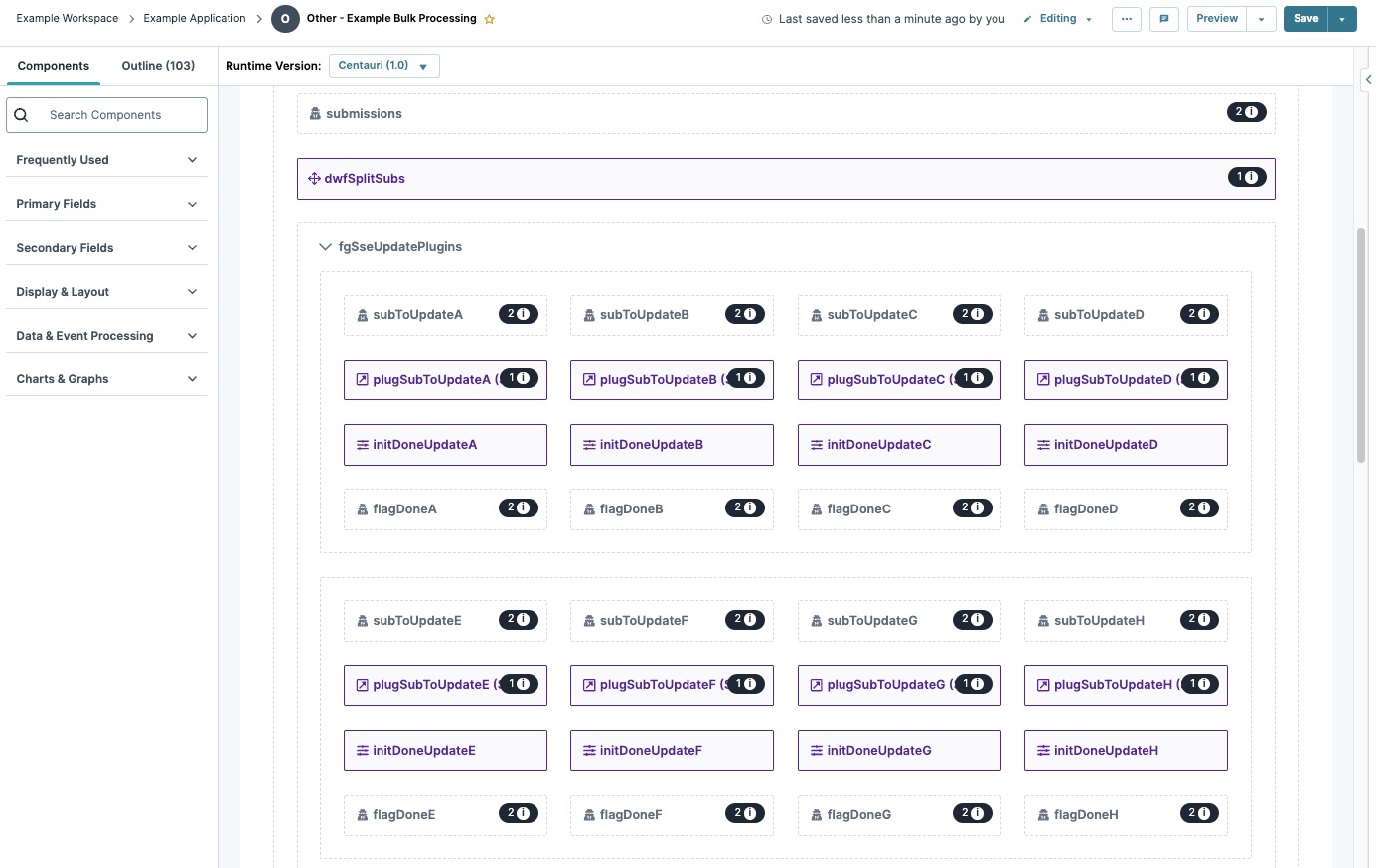
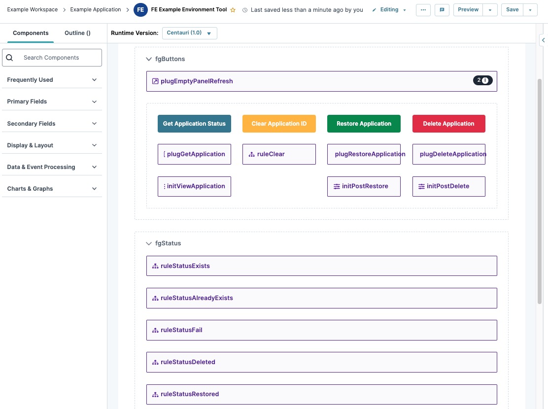
Here's a great example of the organization of logic components for a complex bulk processingmodule:
Improved Creator Experience
Adding structure to your modules improves your Creator experience by:
Making it easier for others to read and understand your module.
Making it easier to find specific components in your module.
Improving the ability to troubleshoot and make changes to your module.
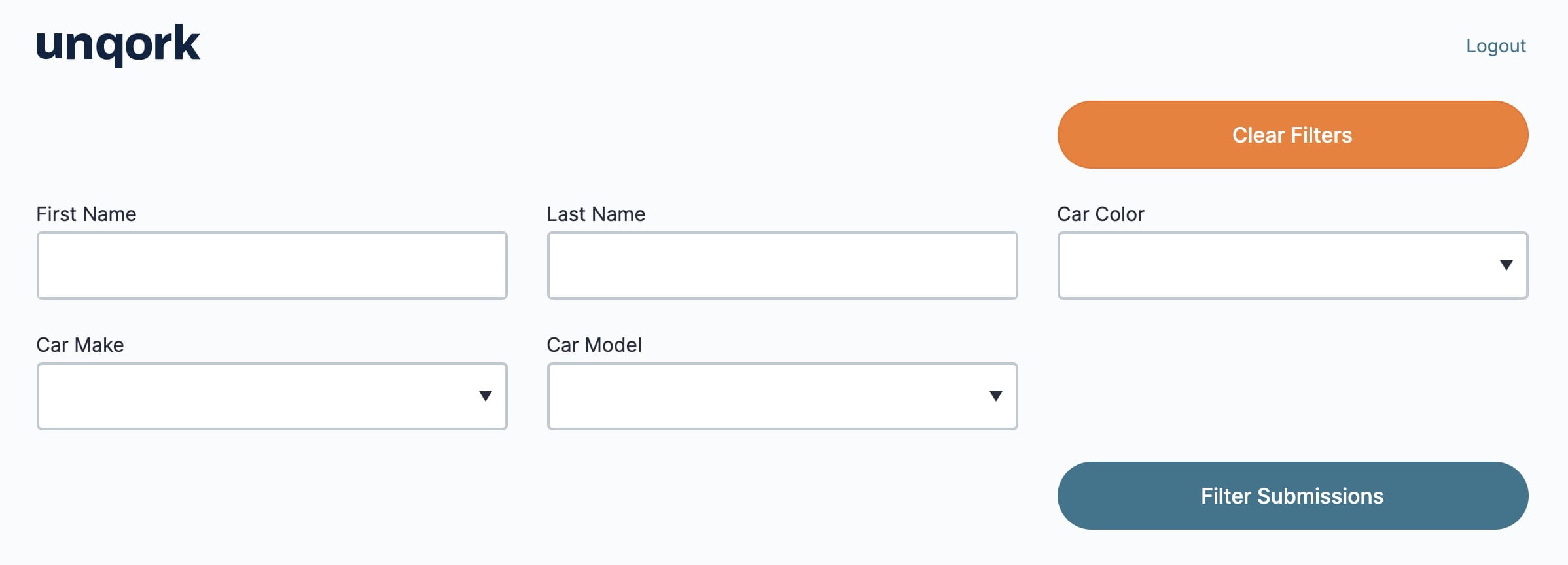
The image below shows a variety of components for an Application Management application. Take note of the column organization and grouping of components that share function.
Improved End-User Experience
Formalizing structure improves your end-user's experience by:
Giving your end-user guidance on completing the application process.
Organizing content in a readable way.
Improving your end-user's efficiency in filling out fields.
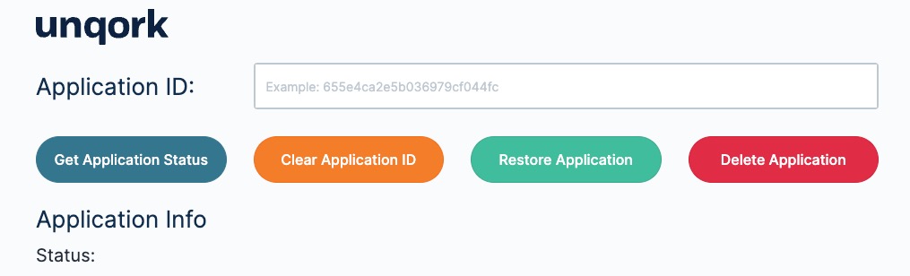
Let's look at the previous Application Management module in Express View. The previous image shows how well organized the module is on the back-end. But, it should be just as organized on the front-end. In the image below, end-users immediately know it's an Application Management tool. They can also easily follow the fields, drop-downs, and functions of the buttons.
Overview
Structuring Components in a module helps maintain simplicity for creators, and presents a unified experience for end-users. Creators structure components by uniformly organizing a module's layout. This includes placing input and output components above and below your logic components and using Display & Layout components to group your components by relationship.
Display and Layout Components
Unqork uses grouping and layout components that add structure to your modules. Examples of organization components include Columns, Panel, Table, Navigation, and Field Group. These components help you nest other components. You'll find these components in the Display & Layout component group of the Module Builder.
The image below shows how the Panel and Columns components organize other components into easy-to-read groups.
Many of the Unqork snippets also have Panels and other organizational configurations. These configurations will help guide you when using a snippet. For instance, here's how the API Module looks in the Module Builder:
Unless your module only has a few components, always include structural components. Using these components improve not only your experience but also your end-user's experience.
Adding Logic to Your Module
One benefit of structural components is that they let you apply logic to a group of settings. One example is setting a Panel component to hidden. This hides all the components in the Panel. You can then configure the whole Panel to show when the end-user performs a certain action.
There are also best practices when configuring logic and Plug-In components. Logic components include the Calculator, Decisions, and Data Workflow components. Each component requires inputs, outputs, and the specific logic you'll need for your module. Some best practices are:
Placing input components above their logic component in the Module Builder. This could be an Initializer that triggers a
Plug-In component.Placing output components below their logic component in the Module Builder. This could be a Hidden component that contains a Data Workflow output.
Group all components involved with a Data Workflow around that Data Workflow component.
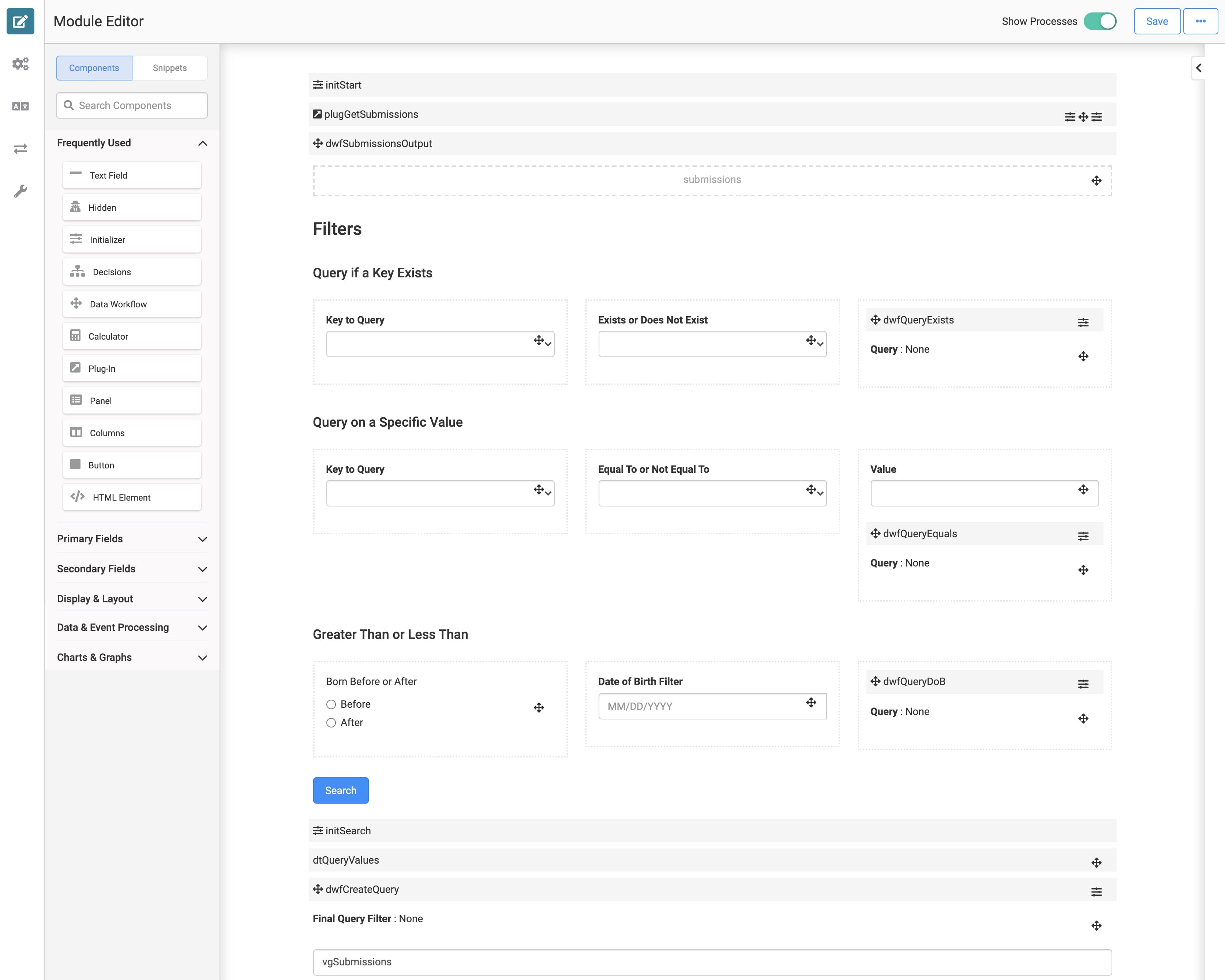
Here's a great example of the organization of logic components for a complex filtering module:
Improved Creator Experience
Adding structure to your modules improves your creator experience by:
Making it easier for others to read and understand your module.
Making it easier to find specific components in your module.
Improving the ability to troubleshoot and make changes to your module.
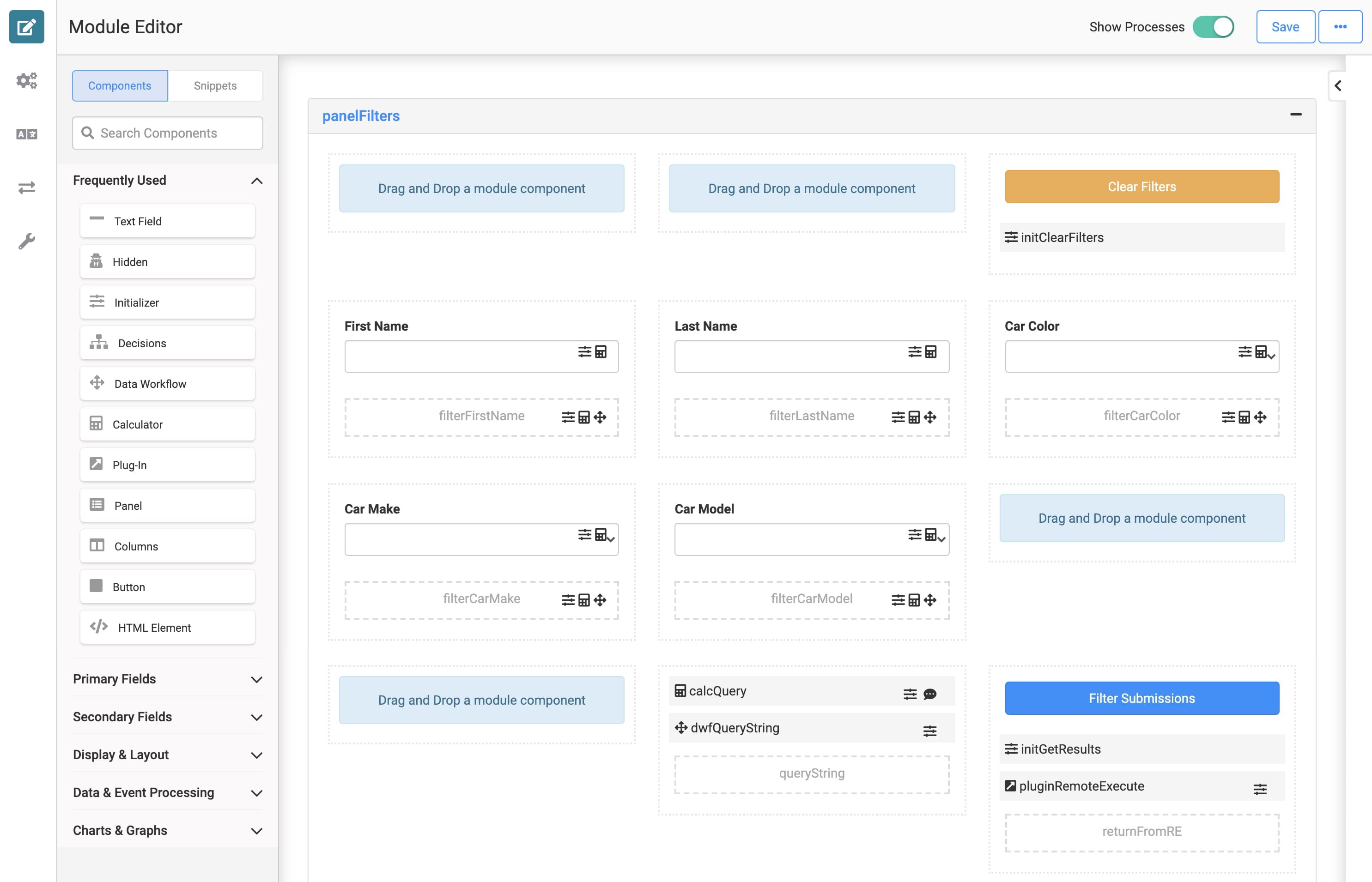
The image below shows a variety of components for a vehicle registration application. Take note of the column organization and grouping of components that share function.
Improved End-User Experience
Formalizing structure improves your end-user's experience by:
Giving your end-user guidance on completing the application process.
Organizing content in a readable way.
Improving your end-user's efficiency in filling out fields.
Let's look at the previous vehicle registration module in Express View. The previous image shows how well organized the module is on the back-end. But, it should be just as organized on the front-end. In the image below, end-users immediately know it's a filtering dashboard. They can also easily follow the fields, drop-downs, and functions of the buttons.