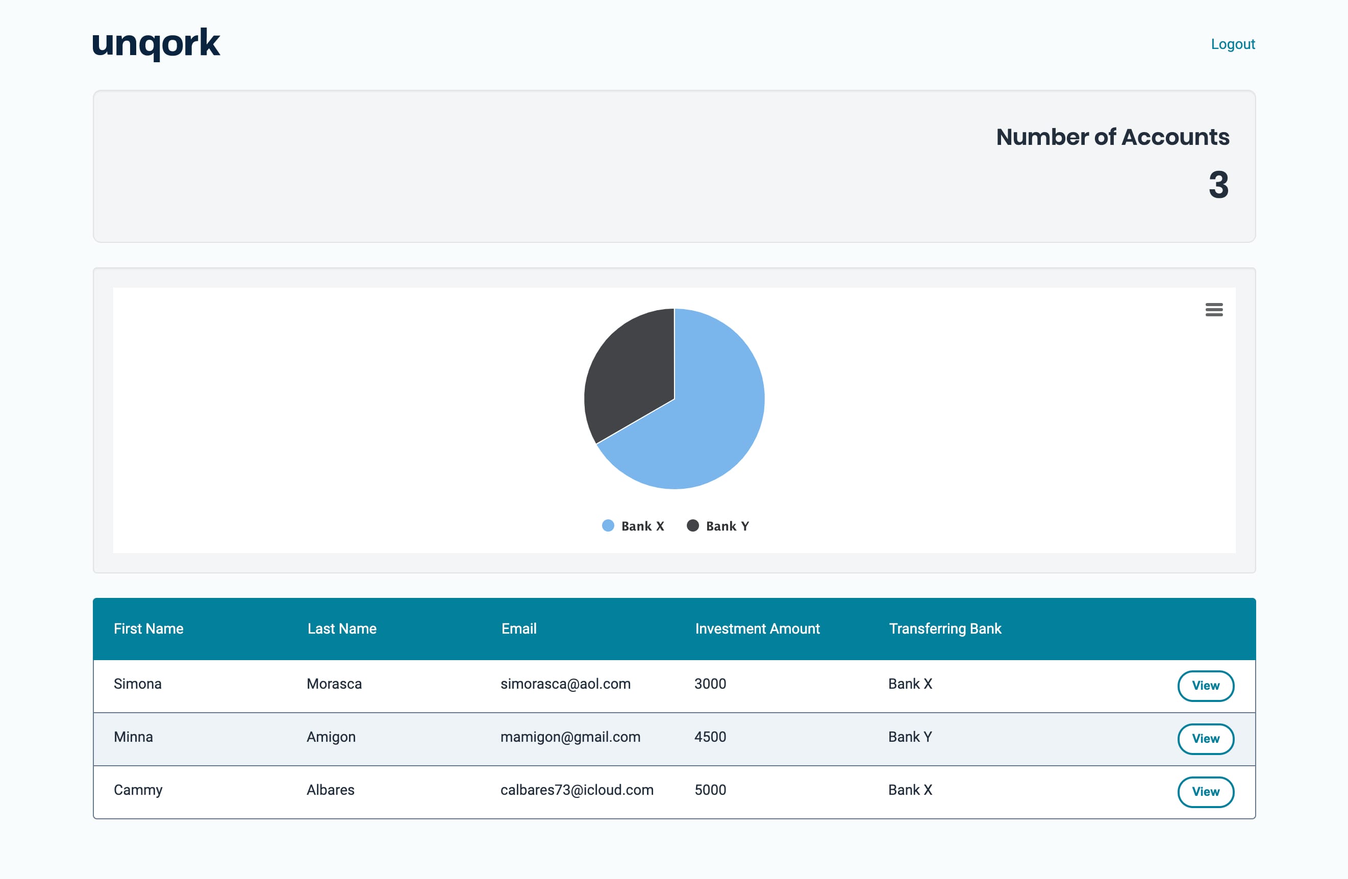
Data visualization tools, like charts, are a great way to gather insights from a data set. The Chart component makes it easy to add different types of charts to your dashboard. In this example, you'll learn how to add a pie chart to your dashboard. The pie chart will display the number of accounts that are transferring funds from a given bank.
This how-to guide also includes steps for building a dashboard with an action button and a KPI widget. The dashboard retrieves submissions from the following source module: https://training.unqork.io/#/form/5eb482f3c8368d0210c74cbf/edit.
These instructions assume you have a new module open, saved, and with a title.
Select the tab that corresponds to your Unqork Designer experience:
Preconfiguration
Configure the Panel Component
This Panel component acts as a container for the components that follow.
In the Module Builder, drag and drop a Panel component onto your canvas.
In the Property ID field, enter
panelDashboard.Click Save Component.
Configure the Initializer Component
This Initializer component triggers the Plug-In components that you'll set up later.
Drag and drop an Initializer component inside your Panel component.
In the Property ID and Canvas Label Text fields, enter
initStart.From the Trigger Type drop-down, select New Submission.
In the Outputs table, enter the following:
Property ID
Type
Value
pluginGetSubmissions
trigger
GO
.png)
Click Save Component.
Configure the Hidden Component
This is the first of four Hidden components in this configuration. It stores the module ID of your source module. You can retrieve the module ID from the source module’s hyperlink as follows: https://training.unqork.io/#/form/5eb482f3c8368d0210c74cbf/edit.
Drag and drop a Hidden component onto your canvas, placing it below your Initializer component.
In the Property ID and Label Text fields, enter
moduleId.Set Store Data in Database to
.png) (ON).
(ON).In the Default Value field, enter
5eb482f3c8368d0210c74cbf. This is the source module's module ID.Click Save Component.
Configure the Plug-In Component
This Plug-In component uses an API to retrieve submissions and display them in your dashboard.
Drag and drop a Plug-In component onto your canvas, placing it below the
moduleIdHidden component.In the Property ID and Canvas Label Text fields, enter
pluginGetSubmissions.From the Internal Services drop-down, select List Submissions for Dashboard.
In the Inputs table, enter the following:
#
Property ID
Mapping
1
moduleId
moduleId
2
'firstName,middleName,lastName,email,dateOfBirth'
fields
3
'investmentAmount,transferringBank'
fields
The first row references the module ID stored in the
moduleIdHidden component. The second and third rows determine which fields you're displaying in the dashboard. Here, you’ll retrieve thefirstName,middleName,lastName,email,dateOfBirth,investmentAmount, andtransferringBankfields. The values entered in the Mapping column (moduleIdandfields) are native values to Unqork.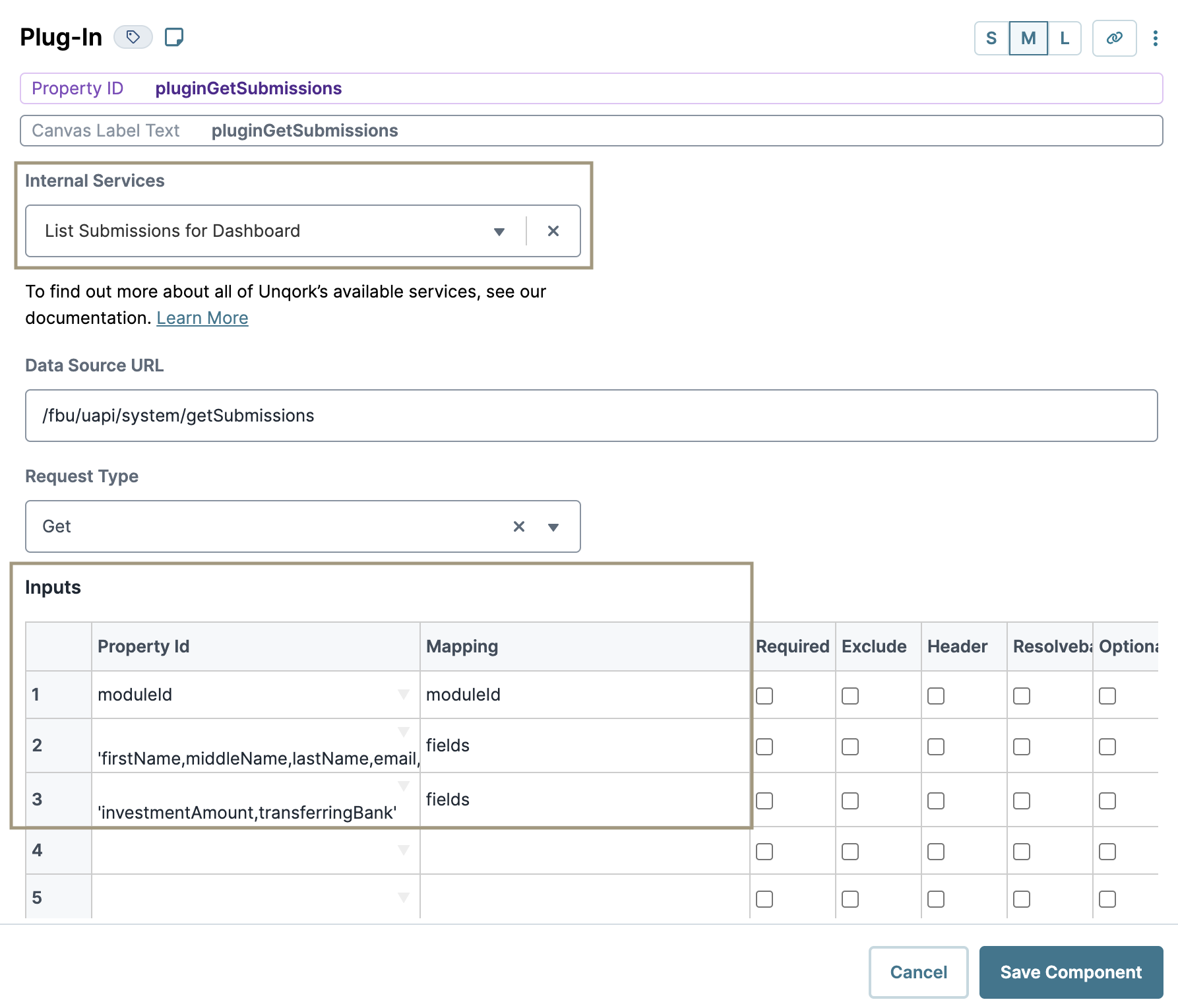
In the Post Trigger field, enter
dwfProcessSubmissions. Doing so tells thedwfProcessSubmissionsData Workflow component you’ll add later to fire as soon as the Plug-In component retrieves submissions.Click Save Component.
Configure the Hidden Component
The second Hidden component stores the submission ID.
Drag and drop a Hidden component onto your canvas, placing it below your Plug-In component.
In the Property ID and Label Text fields, enter
submissionId.Set Store Data in Database to
.png) (ON).
(ON).Click Save Component.
Configure the ViewGrid Component
Next, let's add a ViewGrid component to display your dashboard.
Drag and drop a ViewGrid component onto the canvas, placing it below the
submissionIdHidden component.In the Property ID field, enter
gridView.In the Canvas Label Text field, enter
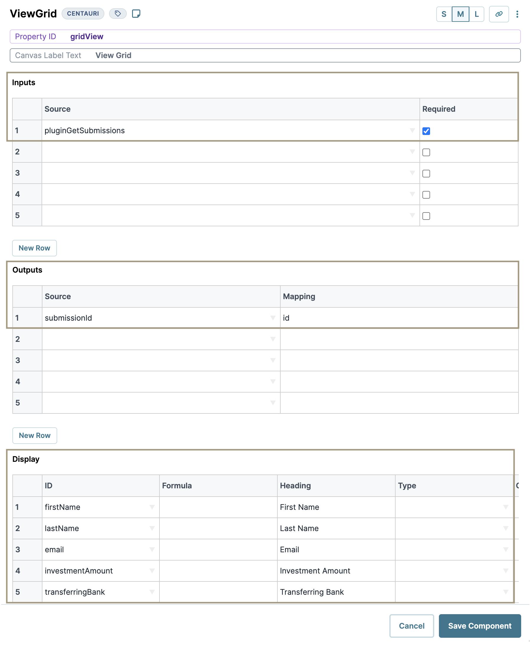
View Grid.In the Inputs table, enter the following:
#
Source
Required
1
pluginGetSubmissions
.png) (checked)
(checked)In the Outputs table, enter the following:
#
Source
Mapping
1
submissionId
id
In the Display table, enter the following:
#
ID
Formula
Heading
1
firstName
First Name
2
lastName
Last Name
3
email
Email
4
investmentAmount
Investment Amount
5
transferringBank
Transferring Bank
In the Action field, enter
View.In the Event field, enter
View.Click Save Component.
Configure the Decisions Component
This Decisions component provides the trigger for your dashboard's View button.
Drag and drop a Decisions component onto the canvas, placing it below your ViewGrid component.
In the Property ID and Canvas Label Text fields, enter
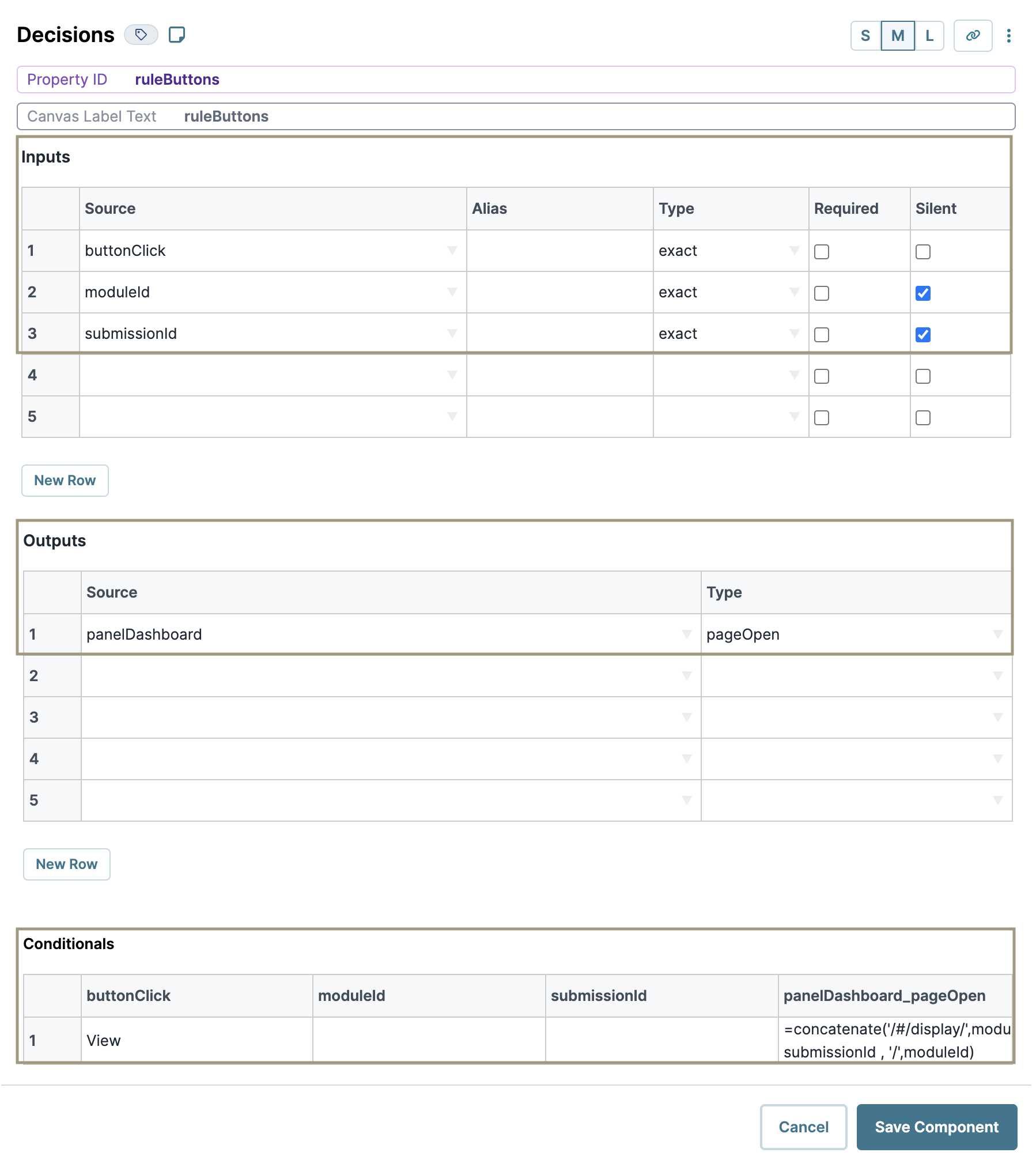
ruleButtons.In the Inputs table, enter the following:
#
Property ID
Type
Required
Silent
1
buttonClick
exact
.png) (unchecked)
(unchecked).png) (unchecked)
(unchecked)2
moduleId
exact
.png) (unchecked)
(unchecked).png) (checked)
(checked)3
submissionId
exact
.png) (unchecked)
(unchecked).png) (checked)
(checked)Every row in the Inputs table gets an associated column in the Conditionals table. If an input does not have a value in its Conditionals column, Unqork sets it to silent. In the next steps, you won't add values to the moduleId and submissionId columns. You'll only be using these inputs in the panelDashboard_pageOpen conditional. So, you can mark these values as silent, or let Unqork do it for you.
In the Outputs table, enter the following:
#
Property ID
Type
1
panelDashboard
pageOpen
In the Conditionals table, enter the following:
#
buttonClick
moduleId
submissionId
panelDashboard_pageOpen
1
View
=concatenate('/#/display/',moduleId,'/', submissionId , '/',moduleId)
Click Save Component.
Configure the Hidden Component
This Hidden component stores the value submissions, acting as a replica of the pluginGetSubmissions Plug-In component. You'll reference the submissions Hidden component in the Data Workflow components that you'll create next.
Drag and drop a Hidden component onto your canvas, placing it below the
panelDashboardPanel component.In the Property ID and Label Text fields, enter
submissions.Set Store Data in Database to
.png) (ON).
(ON).Click Save Component.
Configure the Data Workflow Component
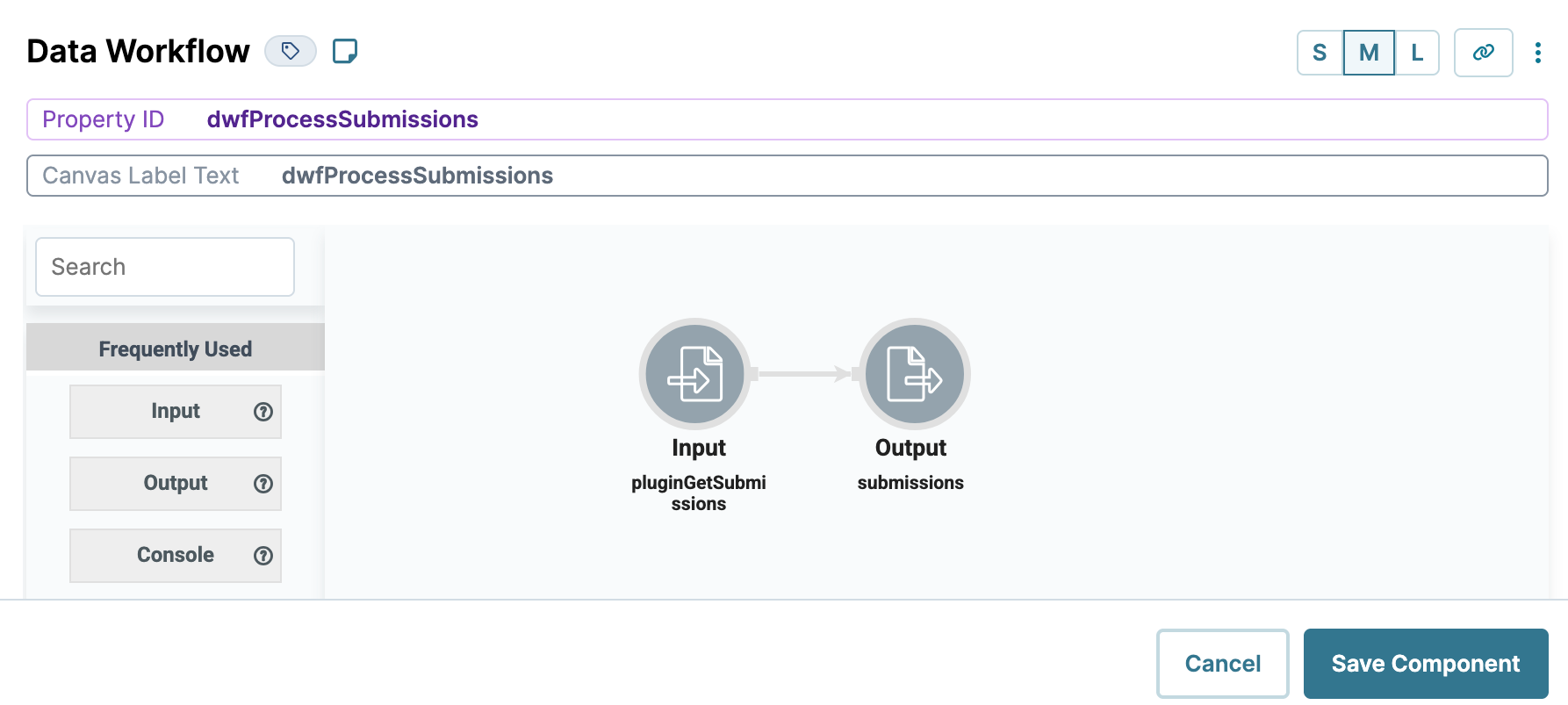
This Data Workflow creates a replica of the pluginGetSubmissions Plug-In component, stored in the submissions Hidden component.
Drag and drop a Data Workflow component onto your canvas, placing it below your
submissionsHidden component.In the Property ID and Canvas Label Text fields, enter
dwfProcessSubmissions.
Configure the Input Operator
Drag and drop an Input operator onto your Data Workflow canvas.
Configure the operator's Info window as follows:
Setting
Value
Category
Input
Component
pluginGetSubmissions
Required
Yes
Source
Default
Configure the Output Operator
Drag and drop an Output operator onto your Data Workflow canvas.
Configure the operator's Info window as follows:
Setting
Value
Category
Output
Component
submissions
Action
value
Connect the output port (right) of the Input operator to the input port (left) of the Output operator.
Click Save Component.
Configure the Hidden Component
This Hidden component stores the KPI count that you'll create in your dwfKPI Data Workflow. You'll use this value in your KPI widget.
Drag and drop a Hidden component onto your canvas, placing it below the
dwfProcessSubmissionsData Workflow component.In the Property ID and Label Text fields, enter
hiddenKpi.Set Store Data in Database to
.png) (ON).
(ON).Click Save Component.
Configure the Data Workflow Component
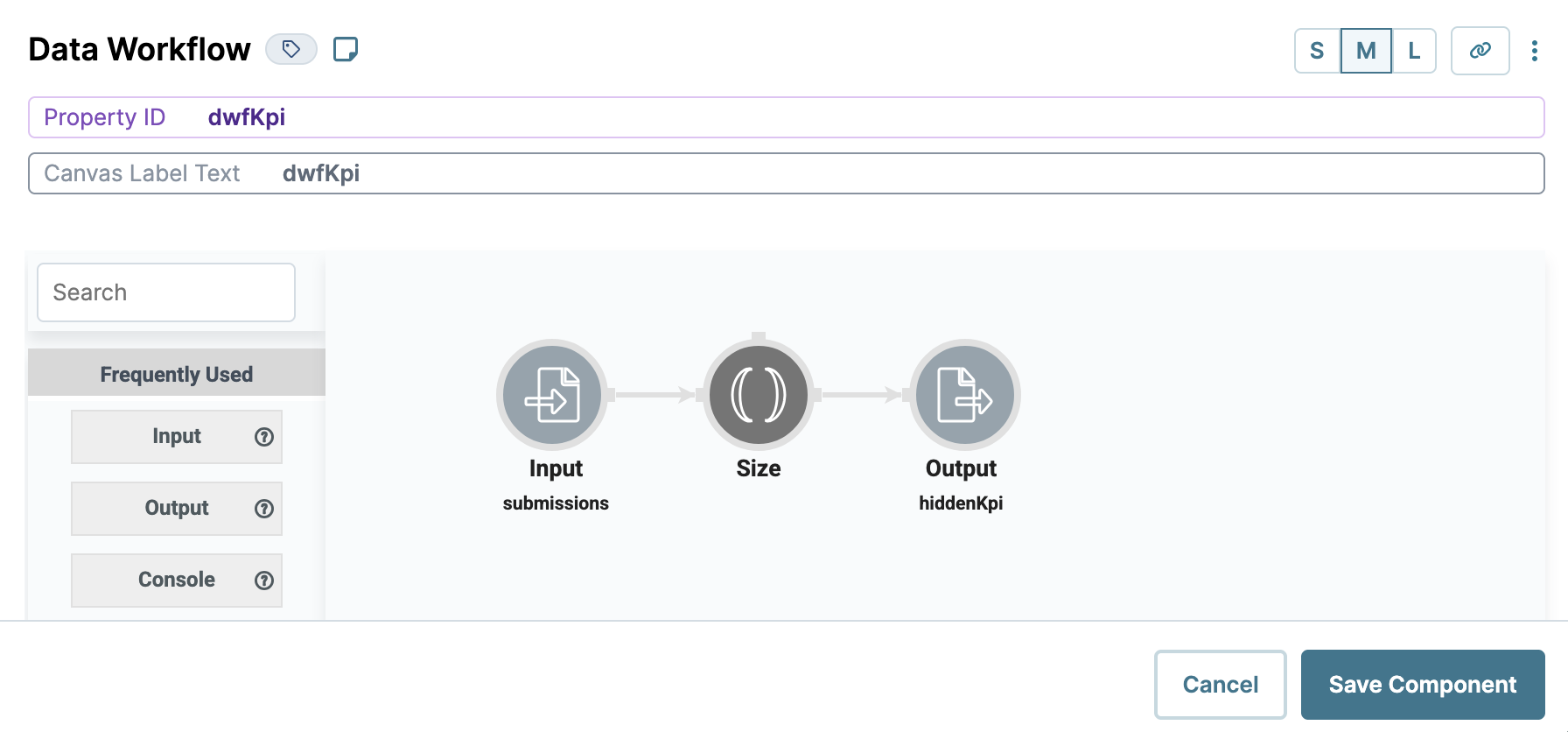
Next, you’ll add your second Data Workflow component. This component counts your submissions using a Size operator. The result of your calculation displays in your KPI dashboard widget.
Drag and drop a Data Workflow component onto your canvas, placing it below the
hiddenKpiHidden component.In the Property ID and Canvas Label Text fields, enter
dwfKpi.Set the Trigger Type as Watch.
Configure the Input Operator
Drag and drop an Input operator onto your Data Workflow canvas.
Configure the operator's Info window as follows:
Setting
Value
Category
Input
Component
submissions
Required
Yes
Source
Default
Configure the Size Operator
The Size operator counts the structure where it’s attached. In this example, it'll count the number of arrays (values) in the Input submissions.
Drag and drop a Size operator onto your Data Workflow canvas. You don't need any configuration for this operator.
Connect the output port (right) of the Input operator to the input port (left) of the Size operator.
Configure the Output Operator
Drag and drop an Output operator onto your Data Workflow canvas.
Configure the operator's Info window as follows:
Setting
Value
Category
Output
Component
hiddenKpi
Action
value
Connect the output port (right) of the Size operator to the input port (left) of the Output operator.
Click Save Component.
Configure the KPI Component
Next, you’ll add a KPI component to display the number of accounts on your dashboard.
Drag and drop a KPI component onto your canvas, placing it above the
panelDashboardPanel component.In the Property ID and Label Text fields, enter
kpiAccounts.In the KPI Title field, enter
Number of Accounts. This title displays above the KPI value on the dashboard.In the Inputs table, enter
hiddenKpi.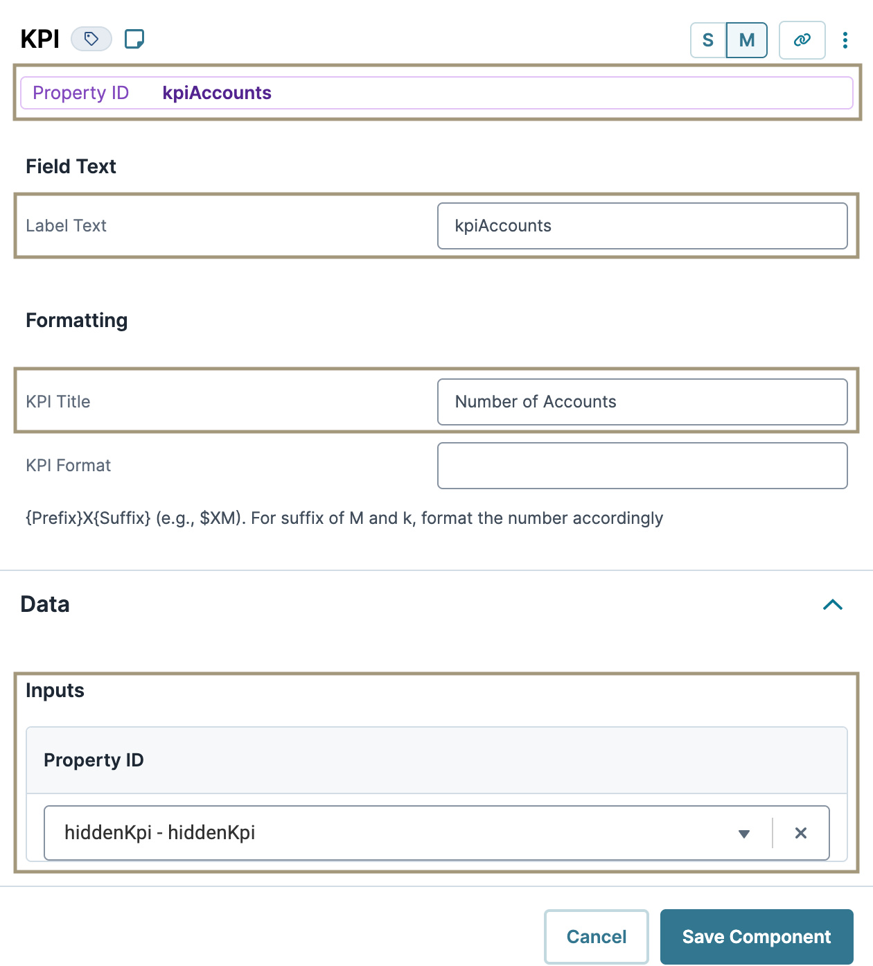
Click Save Component.
Configuration
Configure the Hidden Component
This Hidden component stores the pie chart data that your dwfCreatePieChart Data Workflow outputs. You'll use this data in your Chart component.
Drag and drop a Hidden component onto your canvas, placing it below the
dwfKPIData Workflow component.In the Property ID and Label Text fields, enter
pieChartData.Set Store Data in Database to
.png) (ON).
(ON).Click Save Component.
Configure the Data Workflow Component
This Data Workflow component will clean, filter, and combine your transferringBank data, then output it to pieChartData Hidden component.
Drag and drop a Data Workflow component onto your canvas, placing it below your
pieChartDataHidden component.In the Property ID and Canvas Label Text fields, enter
dwfCreatePieChart.
Configure the Input Operator
Drag and drop an Input operator onto your Data Workflow canvas.
Configure the operator's Info window as follows:
Setting
Value
Category
Input
Component
submissions
Required
Yes
Source
Default
Configure the Clean Keys Operator
The Clean Keys operator lets you fill in data that's missing, empty, or both. The values from the transferringBank data are what you'll display in your Chart component. So, you’ll use a Clean Keys operator to ensure any missing or empty values do not affect the data visualization. Here, you're filling in missing or empty values with '__NULL__'.
Drag and drop a Clean Keys operator onto your Data Workflow canvas.
Configure the operator's Info window as follows:
Setting
Value
Category
Clean Keys
Label
Fill If
Missing or Empty
Keys
transferringBank
Fill With
'__NULL__'
Connect the output port (right) of the Input operator to the input port (left) of the Clean Keys operator.
Configure the Filter Operator
Drag and drop a Filter operator onto your Data Workflow canvas.
Configure the operator's Info window as follows:
Setting
Value
Category
Filter
Label
Do Not Sanitize Formula
.png) (checked)
(checked)Expression
transferringBank='__NULL__'
Here, you're filtering out any
'__NULL__'values that the Clean Keys operator assigned. That way, no missing or emptytransferringBankvalues display in your Chart component.Connect the output port (right) of the Clean Keys operator to the input port (left) of the Filter operator.
Configure the Aggregate Operator
The Aggregate operator summarizes all the transferringBank values after the Filter operator clears the '__NULL__' values.
Drag and drop an Aggregate operator onto your Data Workflow canvas.
Configure the operator's Info window as follows:
Setting
Value
Category
Aggregate By
Label
Aggregation Type
Count By
Join Group Keys?
No
Group Key
transferringBank
Value Key
count
Here, you're using the Count By Aggregation Type and
transferringBankGroup Key. These settings tell the operator to look at yourtransferringBankvalues and count unique values. In this example, how manyBank XandBank Yvalues.Connect the lower output port (right) of the Filter operator to the input port (left) of the Aggregate operator.
Configure the Output Operator
Drag and drop an Output operator onto your Data Workflow canvas.
Configure the operator's Info window as follows:
Setting
Value
Category
Output
Component
pieChartData
Action
value
Connect the output port (right) of the Aggregate operator to the input port (left) of the Output operator.
.png)
Click Save Component.
Update the Data Workflow Component
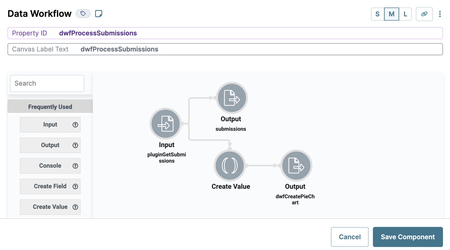
Next, update your dwfProcessSubmissions Data Workflow component, so it can trigger your dwfCreatePieChart Data Workflow component.
Open the
dwfProcessSubmissionsData Workflow component settings drawer.
Configure the Create Value Operator
Drag and drop a Create Value operator onto your Data Workflow canvas.
Configure the operator's Info window as follows:
Setting
Selection
Category
Create Value
Label
Expression/Value
'GO'
Connect the output port (right) of the Input operator to the argument port (top) of the Create Value operator.
Configure the Output Operator
Drag and drop an Output operator onto your Data Workflow canvas.
Configure the operator's Info window as follows:
Setting
Selection
Category
Output
Component
dwfCreatePieChart
Action
trigger
Connect the output port (right) of the Create Value operator to the input port (left) of the Output operator.
Click Save Component.
Configure the Chart Component
Lastly, you'll add a Chart component to display the pieChartData Hidden component’s data as a pie chart on your dashboard.
Drag and drop a Chart component onto your canvas, placing it above
panelDashboardPanel component.In the Property ID and Label Text fields, enter
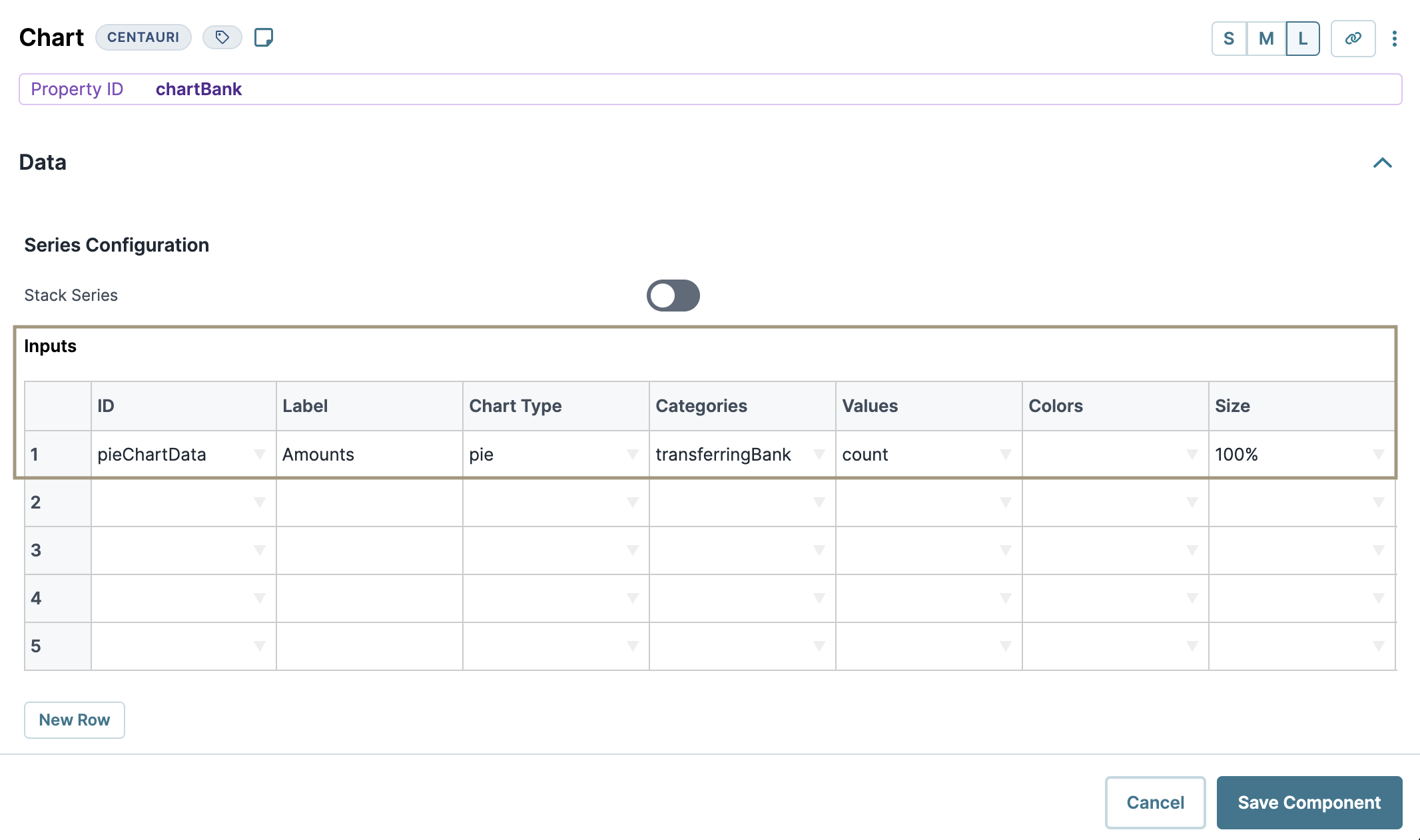
chartBank.In the Inputs table, enter the following:
ID
Label
Chart Type
Categories
Values
Colors
Size
Inner Size
pieChartData
Amounts
pie
transferringBank
count
100%
You can also create donut charts using the pie chart type. Use the Inner Size column to adjust the size of the donut cutout, for example, 50%.
Navigate to the component’s Advanced settings.
Set Show Legend to
.png) (ON). Doing so adds a legend to your Chart.
(ON). Doing so adds a legend to your Chart.Click Save Component.
Save your module.
Here's how your completed dashboard looks in the Module Builder:
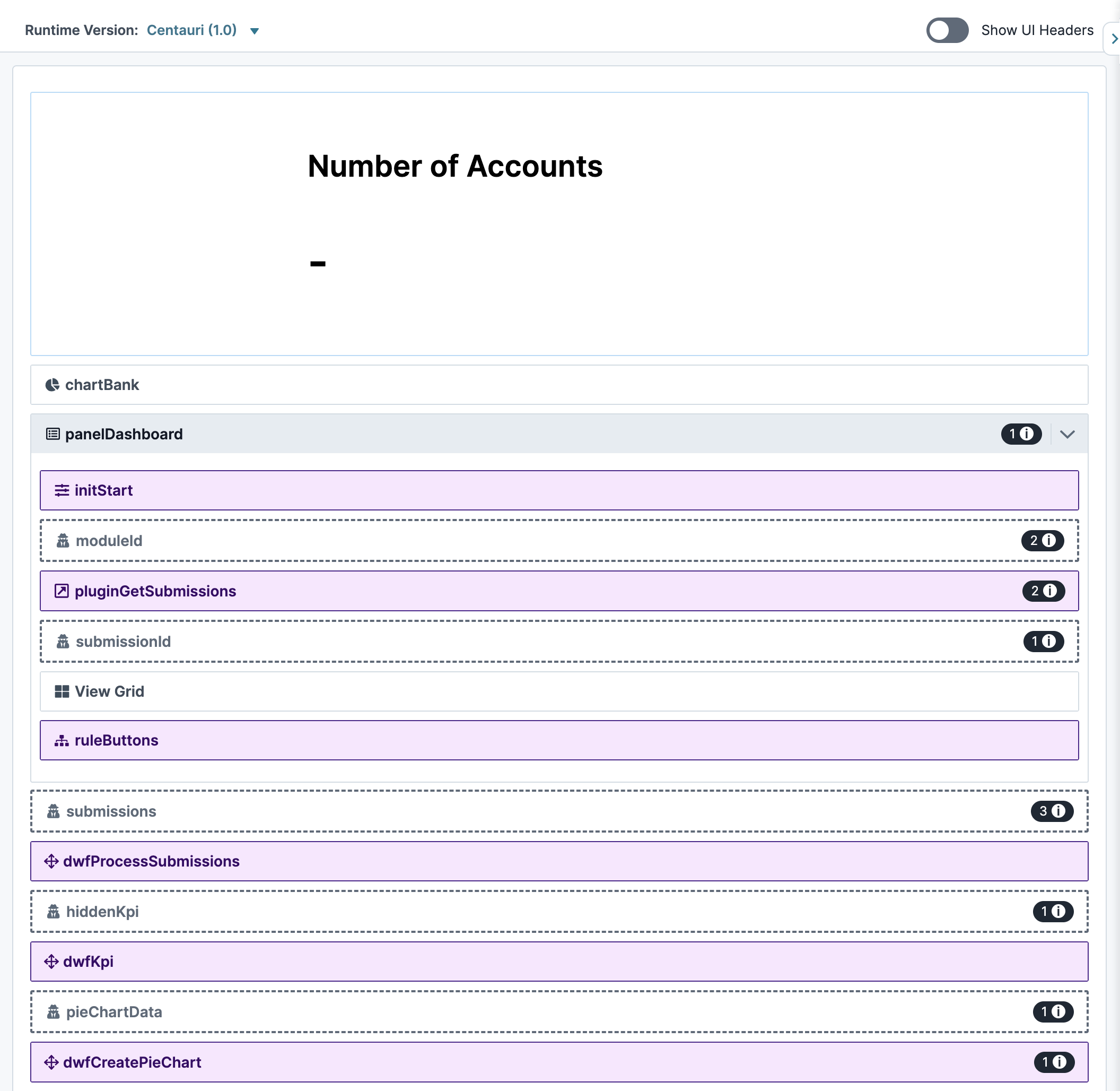
Here's how your completed dashboard with a functioning KPI and pie chart looks in Express View:

Preconfiguration
Configure the Panel Component
This Panel component acts as a container for the components that follow.
In the Module Builder, drag and drop a Panel component onto your canvas.
In the Property ID field, enter
panelDashboard.Click Save.
Configure the Initializer Component
This Initializer component triggers the Plug-In components that you'll set up later.
Drag and drop an Initializer component inside the Panel component.
In the Property ID and Label Text fields, enter
initStart.From the Trigger Type drop-down, select New Submission.
In the Outputs table, enter the following:
#
Property ID
Type
Value
1
pluginGetSubmissions
trigger
GO
.jpg)
Click Save & Close.
Configure the Hidden Component
This is the first of four Hidden components in this configuration. It stores the module ID of your source module. You can retrieve the module ID from the source module’s hyperlink as follows: https://training.unqork.io/#/form/5eb482f3c8368d0210c74cbf/edit.
Drag and drop a Hidden component onto your canvas, placing it below the Initializer component.
In the Property ID and Label Text fields, enter
moduleId.In the Default Value field, enter
5eb482f3c8368d0210c74cbf. This is the source module's module ID.Click Save.
Configure the Plug-In Component
This Plug-In component uses an API to retrieve submissions and display them in your dashboard.
Drag and drop a Plug-In component onto your canvas, placing it below the
moduleIdHidden component.In the Property ID and Canvas Label Text fields, enter
pluginGetSubmissions.Set the Trigger Type as Manual.
In the Post Trigger field, enter
dwfProcessSubmissions. Doing so tells thedwfProcessSubmissionsData Workflow component you’ll add later to fire as soon as the Plug-In component retrieves submissions.In the Inputs table, enter the following:
Property ID
Mapping
moduleId
moduleId
'firstName,middleName,lastName,email,dateOfBirth'
fields
'investmentAmount,transferringBank'
fields
The first row references the module ID stored in the
moduleIdHidden component. The second and third rows determine which fields you're displaying in the dashboard. Here, you’ll retrieve thefirstName,middleName,lastName,email,dateOfBirth,investmentAmount, andtransferringBankfields. The values entered in the Mapping column (moduleIdandfields) are native values to Unqork.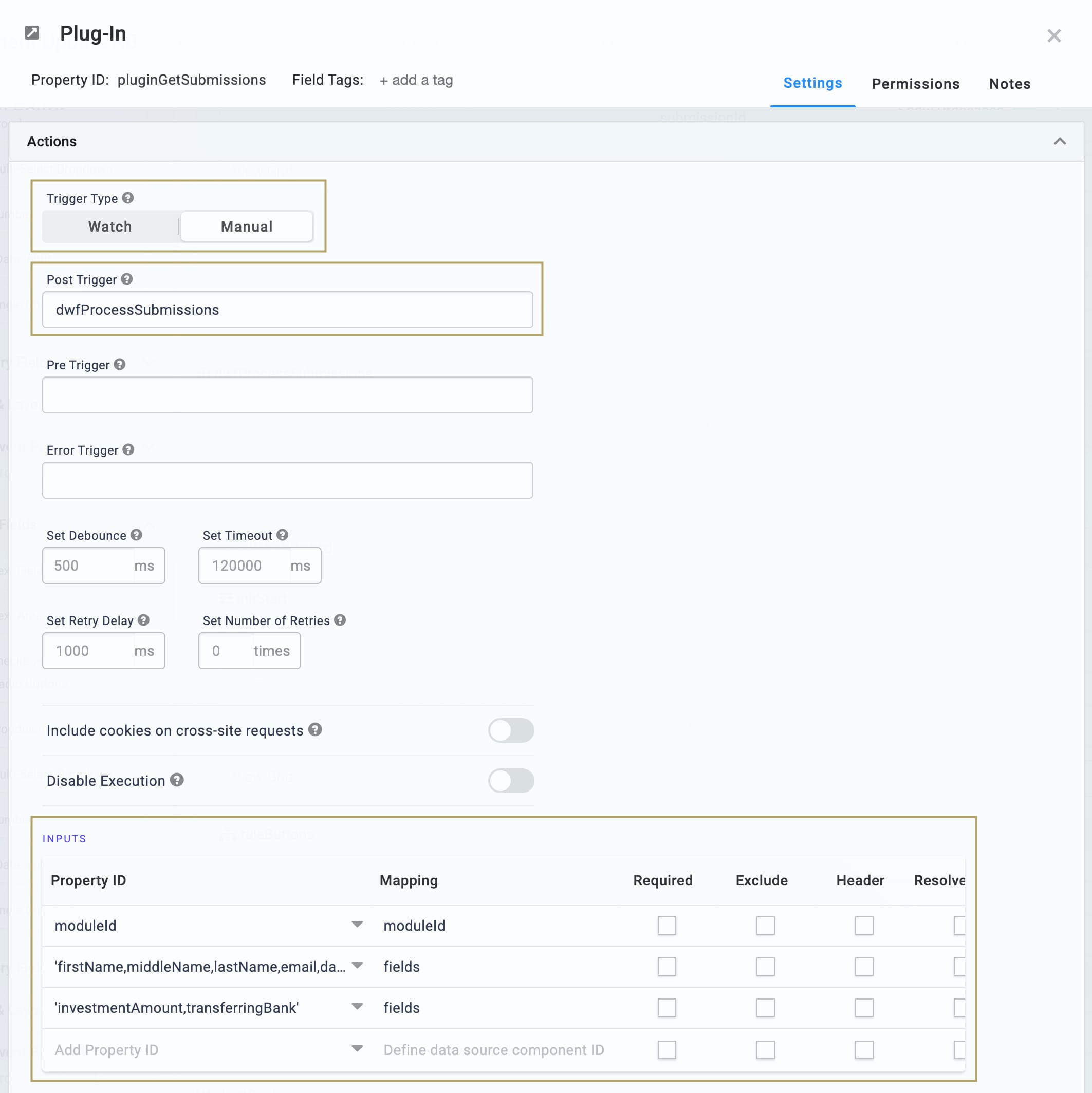
From the Internal Services drop-down, select List Submissions for Dashboard.
.jpg)
Click Save.
Configure the Hidden Component
The second Hidden component stores the submission ID.
Drag and drop a Hidden component onto your canvas, placing it below your Plug-In component.
In the Property ID and Label Text fields, enter
submissionId.Click Save.
Configure the ViewGrid Component
Next, let's add a ViewGrid component to display your dashboard.
Drag and drop a ViewGrid component onto the canvas, placing it below the
submissionIdHidden component.In the Label field, enter
View Grid.In the Property Name field, enter
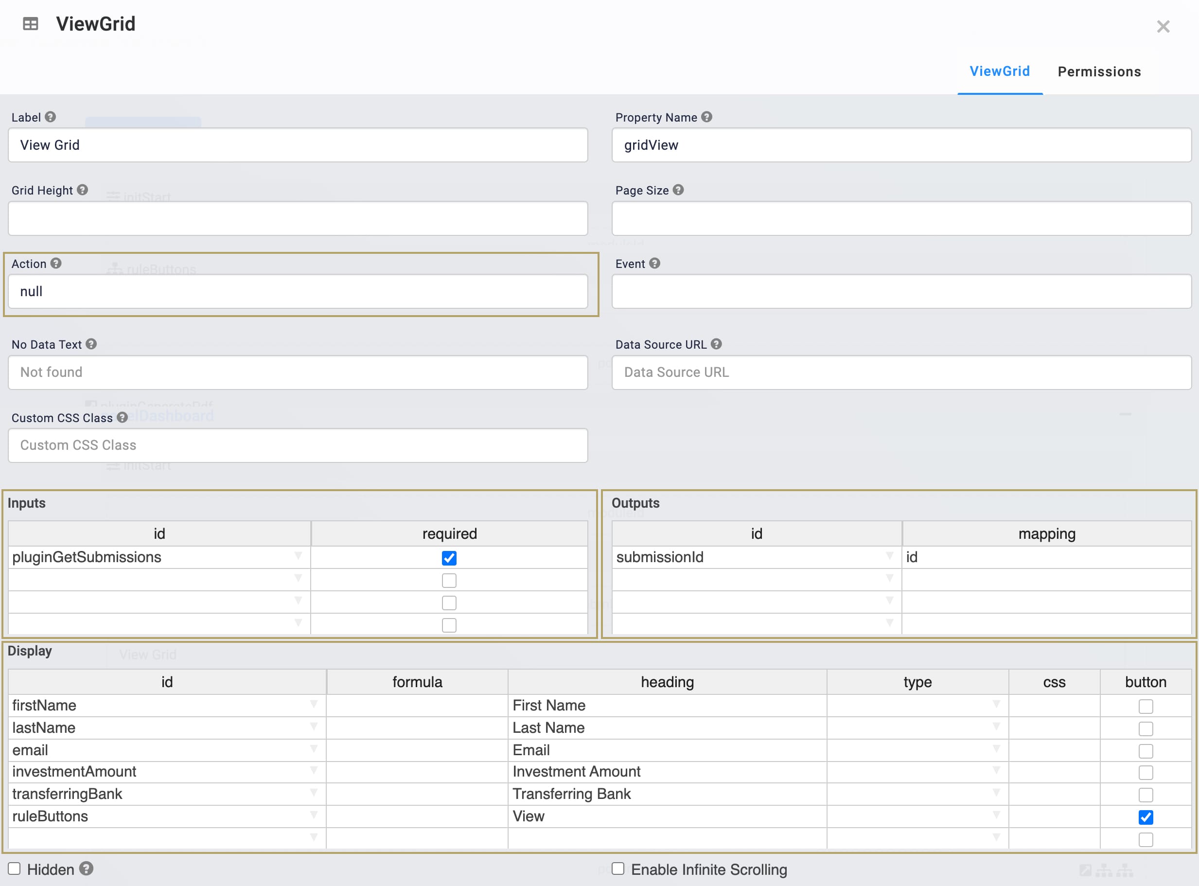
gridView.In the Action field, enter
View.In the Event field, enter
View.In the Inputs table, enter the following:
ID
Required
pluginGetSubmissions
.png) (checked)
(checked)In the Outputs table, enter the following:
ID
Mapping
submissionId
id
In the Display table, enter the following:
ID
Formula
Heading
firstName
First Name
lastName
Last Name
email
Email
investmentAmount
Investment Amount
transferringBank
Transferring Bank
Click Save.
Configure the Decisions Component
This Decisions component provides the trigger for your dashboard's View button.
Drag and drop a Decisions component onto the canvas, placing it below your ViewGrid component.
In the Property ID and Canvas Label Text fields, enter
ruleButtons.In the Inputs table, enter the following:
Property ID
Type
Required
Silent
buttonClick
exact
.png) (unchecked)
(unchecked).png) (unchecked)
(unchecked)moduleId
exact
.png) (unchecked)
(unchecked).png) (checked)
(checked)submissionId
exact
.png) (unchecked)
(unchecked).png) (checked)
(checked)Every row in the Inputs table gets an associated column in the Conditionals table. If an input does not have a value in its Conditionals column, Unqork sets it to silent. In the next steps, you won't add values to the moduleId and submissionId columns. You'll only be using these inputs in the panelDashboard_pageOpen conditional. So, you can mark these values as silent, or let Unqork do it for you.
In the Outputs table, enter the following:
Property ID
Type
panelDashboard
pageOpen
In the Micro Decisions table, enter the following:
buttonClick
moduleId
submissionId
panelDashboard_pageOpen
View
=concatenate('/#/display/',moduleId,'/', submissionId , '/',moduleId)
.jpg)
Click Save.
Configure the Hidden Component
This Hidden component stores the value submissions, acting as a replica of the pluginGetSubmissions Plug-In component. You'll reference the submissions Hidden component in the Data Workflow components that you'll create next.
Drag and drop a Hidden component onto your canvas, placing it below the
panelDashboardPanel component.In the Property ID and Label Text fields, enter
submissions.Click Save.
Configure the Data Workflow Component
This Data Workflow creates a replica of the pluginGetSubmissions Plug-In component, stored in the submissions Hidden component.
Drag and drop a Data Workflow component onto your canvas, placing it below your
submissionsHidden component.In the Canvas Label Text and Property Name fields, enter
dwfProcessSubmissions.From the Trigger Type drop-down, select Manual.
Configure the Input Operator
Drag and drop an Input operator onto your Data Workflow canvas.
Configure the operator's Info window as follows:
Setting
Selection
Category
Input
Component
pluginGetSubmissions
Required
Yes
Source
Default
Configure the Output Operator
Drag and drop an Output operator onto your Data Workflow canvas.
Configure the operator's Info window as follows:
Setting
Selection
Category
Output
Component
submissions
Action
value
Connect the output port (right) of the Input operator to the input port (left) of the Output operator.
.png)
Click Save.
Configure the Hidden Component
This Hidden component stores the KPI count that you'll create in your dwfKPI Data Workflow. You'll use this value in your KPI widget.
Drag and drop a Hidden component onto your canvas, placing it below the
dwfProcessSubmissionsData Workflow component.In the Property ID and Label Text fields, enter
hiddenKpi.Click Save.
Configure the Data Workflow Component
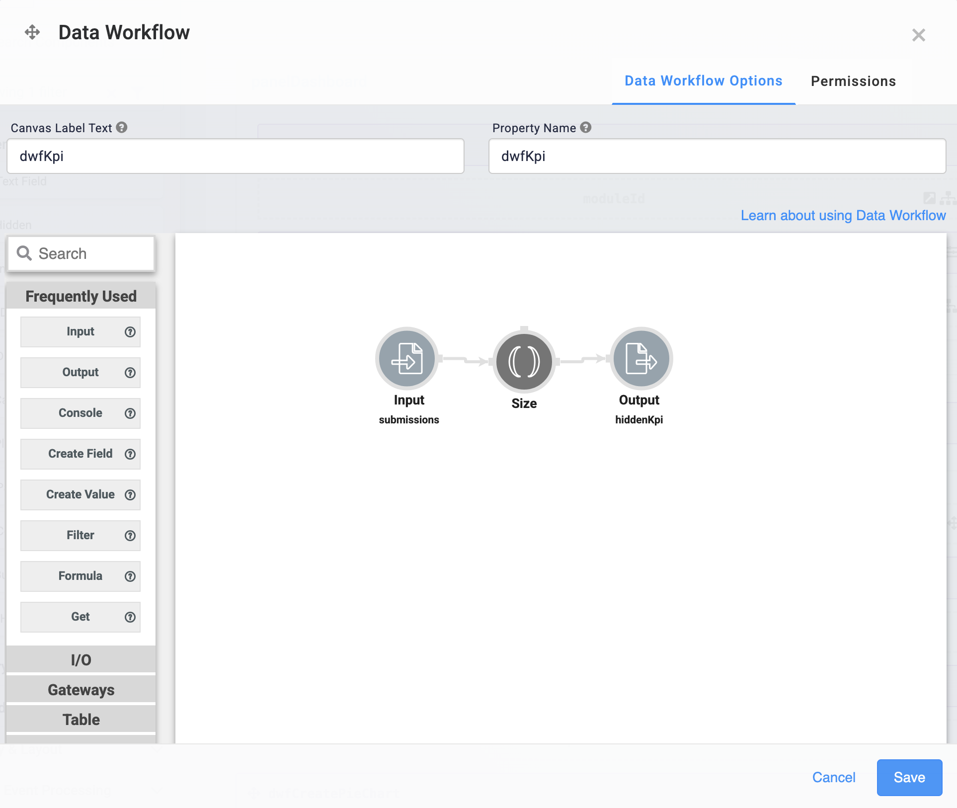
Next, you’ll add your second Data Workflow component. This component counts your submissions using a Size operator. The result of your calculation displays in your KPI dashboard widget.
Drag and drop a Data Workflow component onto your canvas, placing it below the
hiddenKpiHidden component.In the Canvas Label Text and Property Name fields, enter
dwfKpi.From the Trigger Type drop-down, select Watch.
Configure the Input Operator
Drag and drop an Input operator onto your Data Workflow canvas.
Configure the operator's Info window as follows:
Setting
Value
Category
Input
Component
submissions
Required
Yes
Source
Default
Configure the Size Operator
The Size operator counts the structure where it’s attached. In this example, it'll count the number of arrays (values) in the Input submissions.
Drag and drop a Size operator onto your Data Workflow canvas. You don't need any configuration for this operator.
Connect the output port (right) of the Input operator to the input port (left) of the Size operator.
Configure the Output Operator
Drag and drop an Output operator onto your Data Workflow canvas.
Configure the operator's Info window as follows:
Setting
Value
Category
Output
Component
hiddenKpi
Action
value
Connect the output port (right) of the Size operator to the input port (left) of the Output operator.
Click Save.
Configure the KPI Component
Next, you’ll add a KPI component to display the number of accounts on your dashboard.
Drag and drop a KPI component onto your canvas, placing it above the
panelDashboardPanel component.In the Property ID and Label fields, enter
kpiAccounts.In the KPI Title field, enter
Number of Accounts. This title displays above the KPI value on the dashboard.In the Inputs table, enter
hiddenKpi.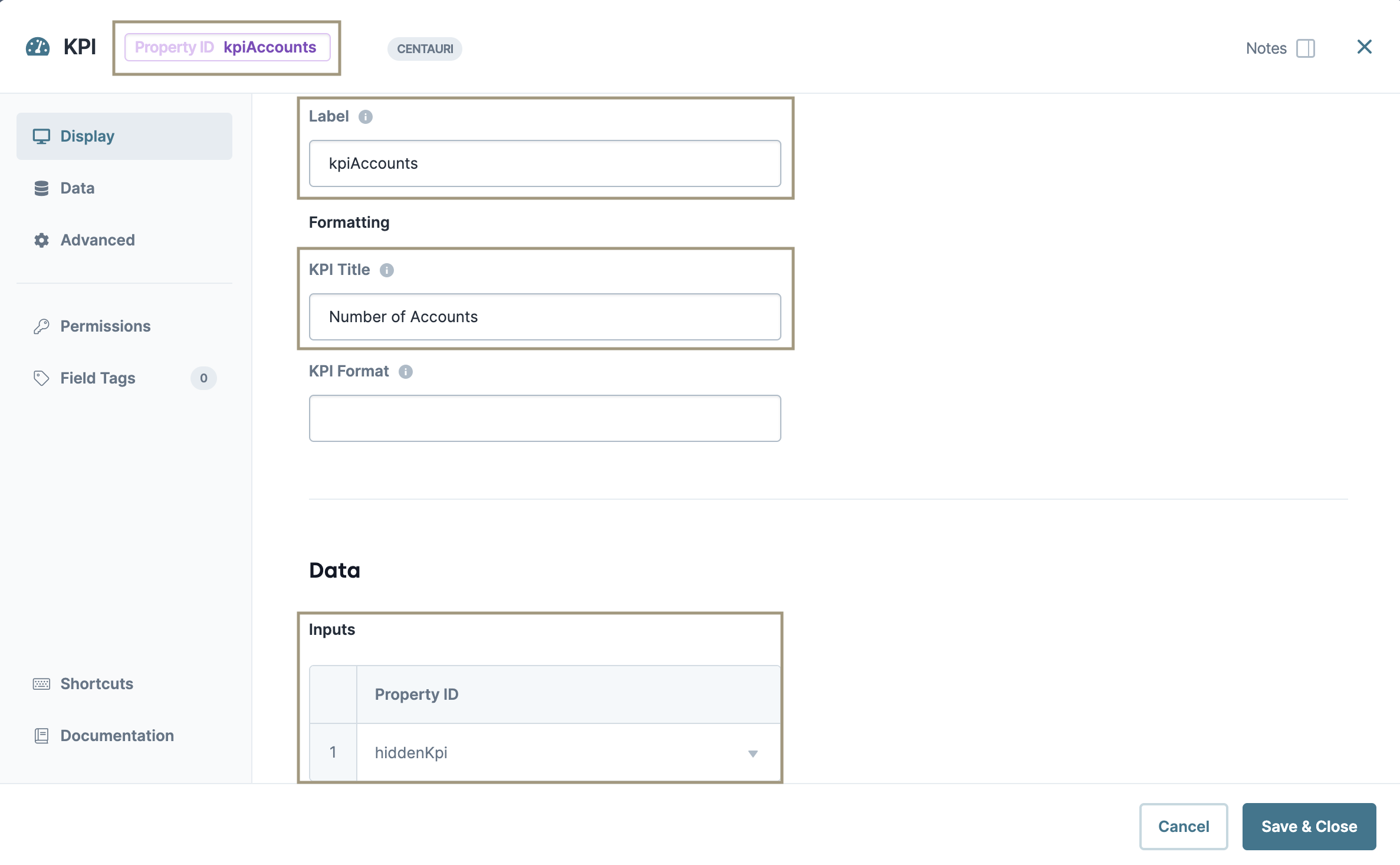
Click Save & Close.
Configuration
Configure the Hidden Component
This Hidden component stores the pie chart data that your dwfCreatePieChart Data Workflow outputs. You'll use this data in your Chart component.
Drag and drop a Hidden component onto your canvas, placing it below the
dwfKPIData Workflow component.In the Property ID and Label Text fields, enter
pieChartData.Click Save.
Configure the Data Workflow Component
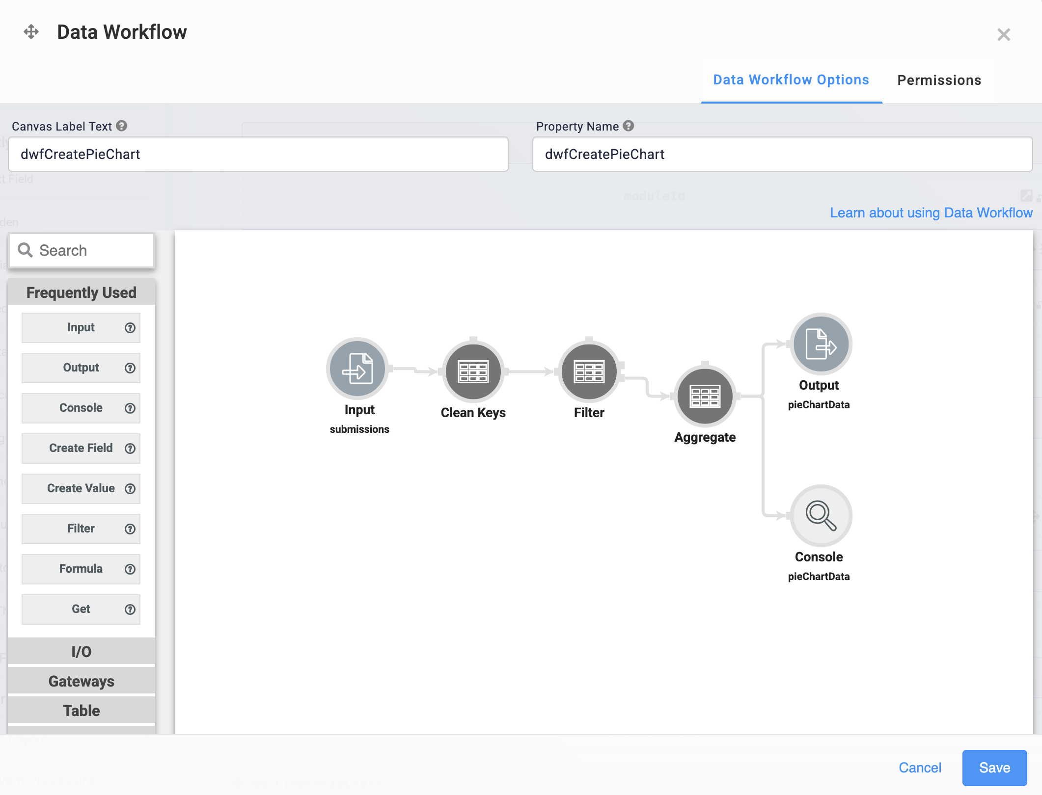
This Data Workflow component will clean, filter, and combine your transferringBank data, then output it to pieChartData Hidden component.
Drag and drop a Data Workflow component onto your canvas, placing it below your
pieChartDataHidden component.In the Canvas Label Text and Property Name fields, enter
dwfCreatePieChart.From the Trigger Type drop-down, select Manual.
Configure the Input Operator
Drag and drop an Input operator onto your Data Workflow canvas.
Configure the operator's Info window as follows:
Setting
Value
Category
Input
Component
submissions
Required
Yes
Source
Default
Configure the Clean Keys Operator
The Clean Keys operator lets you fill in data that's missing, empty, or both. The values from the transferringBank data are what you'll display in your Chart component. So, you’ll use a Clean Keys operator to ensure any missing or empty values do not affect the data visualization. Here, you're filling in missing or empty values with '__NULL__'.
Drag and drop a Clean Keys operator onto your Data Workflow canvas.
Configure the operator's Info window as follows:
Setting
Value
Category
Clean Keys
Label
Fill If
Missing or Empty
Keys
transferringBank
Fill With
'__NULL__'
Connect the output port (right) of the Input operator to the input port (left) of the Clean Keys operator.
Configure the Filter Operator
Drag and drop a Filter operator onto your Data Workflow canvas.
Configure the operator's Info window as follows:
Setting
Value
Category
Filter
Label
Do Not Sanitize Formula
.png) (checked)
(checked)Expression
transferringBank='__NULL__'
Here, you're filtering out any
'__NULL__'values that the Clean Keys operator assigned. That way, no missing or emptytransferringBankvalues display in your Chart component.Connect the output port (right) of the Clean Keys operator to the input port (left) of the Filter operator.
Configure the Aggregate Operator
The Aggregate operator summarizes all the transferringBank values after the Filter operator clears the '__NULL__' values.
Drag and drop an Aggregate operator onto your Data Workflow canvas.
Configure the operator's Info window as follows:
Setting
Value
Category
Aggregate By
Label
Aggregation Type
Count By
Join Group Keys?
No
Group Key
transferringBank
Value Key
count
Here, you're using the Count By Aggregation Type and
transferringBankGroup Key. These settings tell the operator to look at yourtransferringBankvalues and count unique values. In this example, how manyBank XandBank Yvalues.Connect the output (bottom right-hand side) port of the Filter operator, to the input (left-hand side) port of the Aggregate operator.
Configure the Output Operator
Drag and drop an Output operator onto your Data Workflow canvas.
Configure the operator's Info window as follows:
Setting
Value
Category
Output
Component
pieChartData
Action
value
Connect the lower output port (right) of the Aggregate operator to the input port (left) of the Output operator.
Click Save.
Update the Data Workflow Component
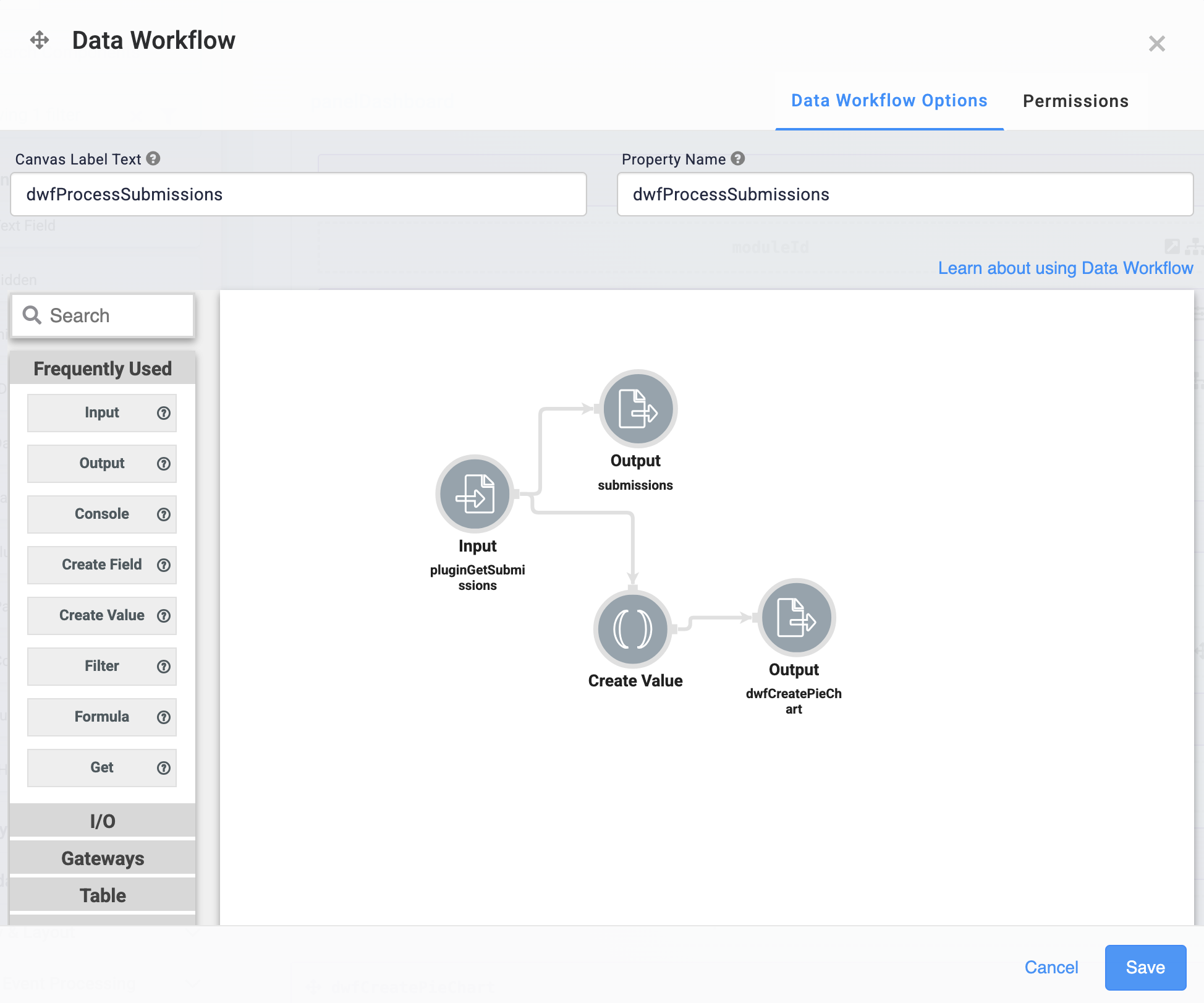
Next, update your dwfProcessSubmissions Data Workflow component, so it can trigger your dwfCreatePieChart Data Workflow component.
Open the
dwfProcessSubmissionsData Workflow component settings.
Configure the Create Value Operator
Drag and drop a Create Value operator onto your Data Workflow canvas.
Configure the operator's Info window as follows:
Setting
Selection
Category
Create Value
Label
Expression/Value
'GO'
Connect the output port (right) of the Input operator to the argument port (top) of the Create Value operator.
Configure the Output Operator
Drag and drop an Output operator onto your Data Workflow canvas.
Configure the operator's Info window as follows:
Setting
Selection
Category
Output
Component
dwfCreatePieChart
Action
trigger
Connect the output port (right) of the Create Value operator to the input port (left) of the Output operator.
Click Save.
Configure the Chart Component
Lastly, you'll add a Chart component to display the pieChartData Hidden component’s data as a pie chart on your dashboard.
Drag and drop a Chart component onto your canvas, placing it above the
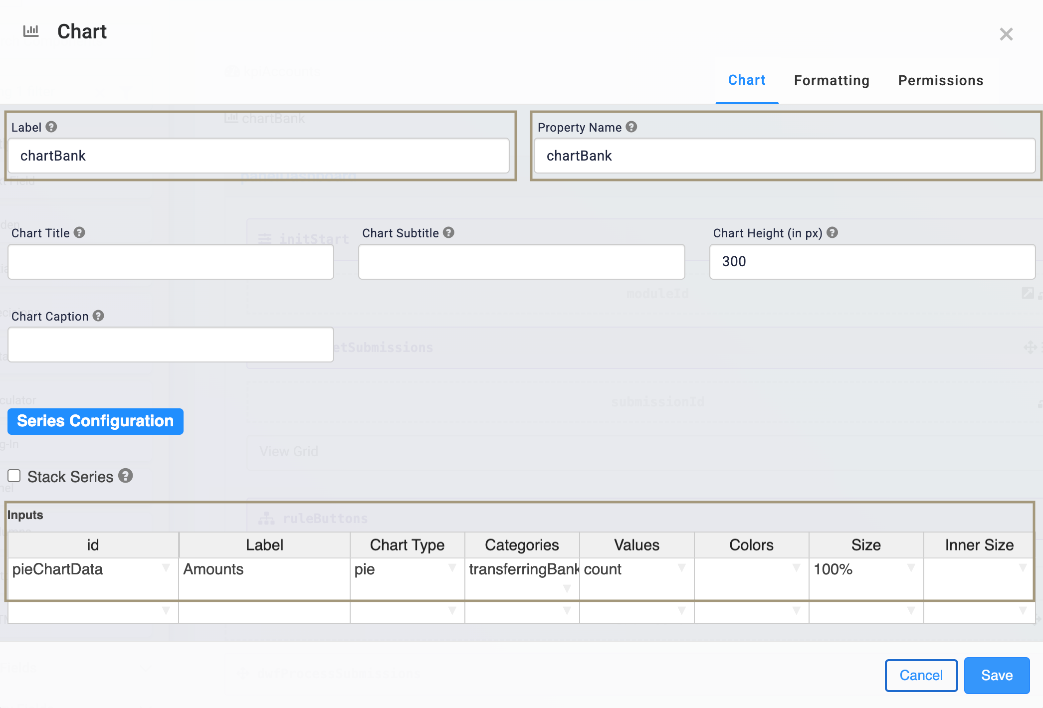
panelDashboardPanel component.In the Label and Property Name fields, enter
chartBank.In the Inputs table, enter the following:
ID
Label
Chart Type
Categories
Values
Colors
Size
Inner Size
pieChartData
Amounts
pie
transferringBank
count
100%
You can also create donut charts using the pie chart type. Use the Inner Size column to adjust the size of the donut cutout, for example, 50%.
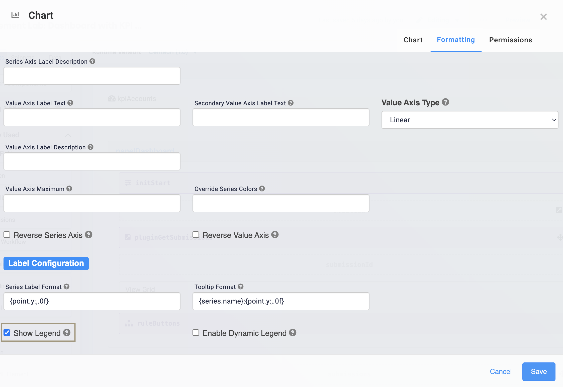
Click the Formatting tab of the configuration window.
Select Show Legend. Doing so adds a legend to your Chart component.
Click Save.
Save your module.
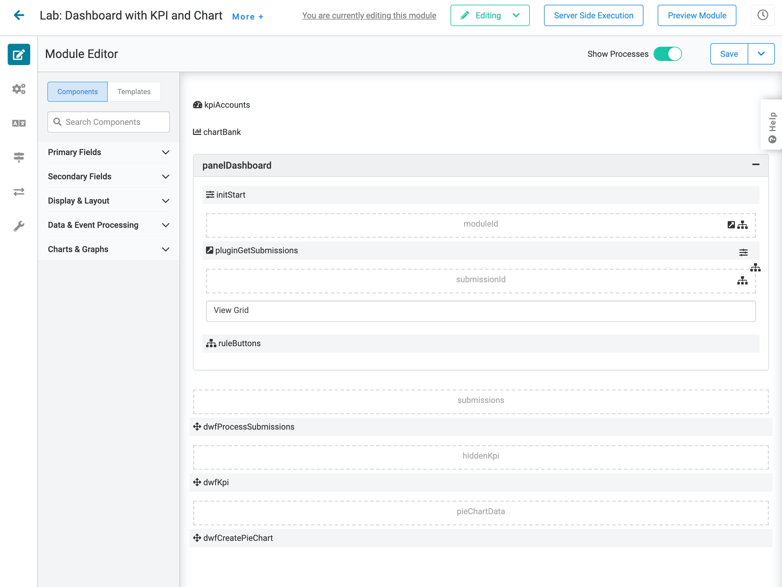
Here's how your completed dashboard looks in the Module Builder:
Here's how your completed dashboard with a functioning KPI and pie chart looks in Express View:
