A proxy module adds a layer of security to a remote execute. A remote execute in Unqork executes a module behind the scenes or on the server-side. While a remote execute increases security, it can leave data vulnerable to manipulation in the underlying code. A proxy module ensures your remote execute is fully secure.
What Is a Proxy Module?
A proxy module sits between a Front-End module and a Remote Execute or API module. Passing data through a proxy module force-validates the Front-End module’s data after submission. By force-validating, you ensure the data maintains its original form without manipulation.
For roles that need to initiate the remote execute from an Express module, enhance proxy module security by setting the permissions to
Write.
Creating a Proxy Module
Learn how to create a proxy module in UDesigner or Classic Designer by clicking on the tabs below:
UDesigner Proxy Module Prerequisites
This how-to guide assumes you have a Front-End module that collects the name, phone number, and email address of your end-user, with Property IDs of name, phone, and email, respectively.
To ensure security, add a proxy module with the same name, phone number, and email address fields as your Front-End module. The only difference is that your proxy module keeps all these fields hidden.
To begin, you need the following modules already configured:
A Front-End module with name, phone, and email data fields.
An API module to perform your necessary remote execute.
To prevent users from directly executing the API module outside of the proxy module, set the API module permissions to
No Accessfor all roles.
Ensure both modules exist in the same application.
Set Up Server Side Execution
Enable the Server Side Execution Only setting to ensure the proxy module is inaccessible in Express View.
At the top right of the Module Builder, click the
.png) (ellipsis) button.
(ellipsis) button.Select Module Settings.
Set Server Side Execution Only to
 (ON).
(ON).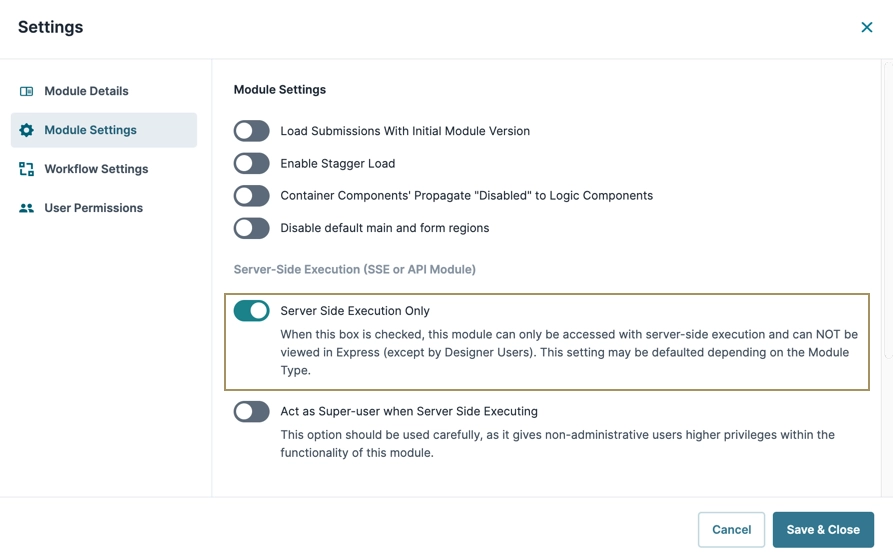
Click Save & Close.
Configure the Display & Layout Components
For this example, add three Panel components to serve as containers for the components.
Configure the Panel Components
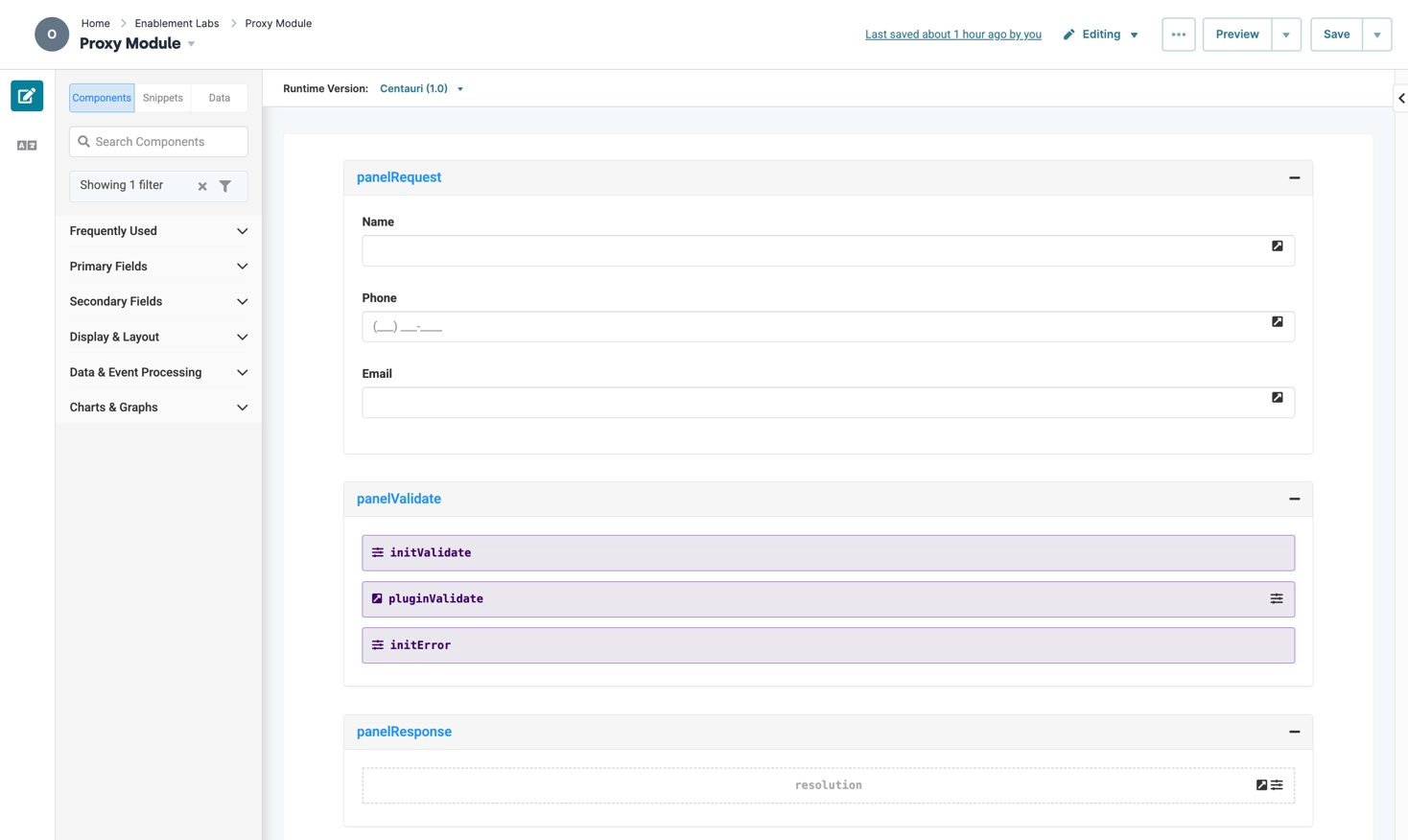
The panelRequest Panel component manages the data carried over from your Front-End module. The panelValidate Panel component manages the remote execute trigger. And, the panelResponse Panel component manages error handling.
In your proxy module, drag and drop three Panel components onto your canvas.
In the Property ID and Canvas Label Text fields, enter the following for each Panel component:
#
Property ID
Canvas Label Text
1
panelRequest
panelRequest
2
panelValidate
panelValidate
3
panelResponse
panelResponse
Click Save Component after adding each component.
Data Field Configuration
Next, add a range of data components to store the name, phone, and email values. For this how-to guide, the same fields are named as the previous ones in your Front-End module. For other use cases, ensure that the fields expected in your Front-End module are created in the proxy module.
Configure the name Text Field Component
First, configure the Text Field component to store the end-user's name.
Drag and drop a Text Field component into the
panelRequestPanel component.In the Property ID field, enter
name.In the Label Text field, enter
Name.Set Hide Field to
 (ON).
(ON).Click Save Component.
Configure the phone Phone Number Component
Configure the Phone Number component to store the end-user's phone number.
Drag and drop a Phone Number component into the
panelRequestPanel component.In the Property ID field, enter
phone.In the Label Text field, enter
Phone.Set Hide Field to
 (ON).
(ON).Click Save Component.
Configure the email Email Component
Configure the Email component to store the end-user's email address.
Drag and drop an Email component into the
panelRequestPanel component.In the Property ID field, enter
email.In the Label Text field, enter
Email.Set Hide Field to
 (ON).
(ON).Click Save Component.
Validation Configuration
Next, set up an Initializer and Plug-In components to perform the validation.
Configure the initValidate Initializer Component
Next, set up the first of two Initializer components. This first Initializer triggers a Plug-In component that you'll add later.
Drag and drop an Initializer component into the
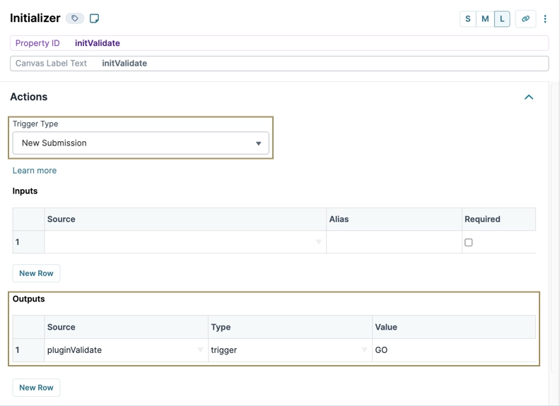
panelValidatePanel component.In the Property ID and Canvas Label Text fields, enter
initValidate.From the Trigger Type drop-down, select New Submission.
In the Outputs table, enter the following:
#
Property ID
Type
Value
1
pluginValidate
trigger
GO
The Property ID in the Outputs table corresponds to the Plug-In component you'll add in the next section. The Property ID you use in the Outputs table must match the Plug-In component’s Property ID.
Click Save Component.
Configure the initError Initializer Component
Now, set up the second Initializer component to display an error message if the Plug-In component fails.
Drag and drop an Initializer component into the
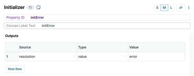
panelValidatePanel component.In the Property ID and Canvas Label Text fields, enter
initError.In the Outputs table, enter the following:
#
Property ID
Type
Value
1
resolution
value
error
The Property ID in the Outputs table corresponds to the Hidden component you'll add later. The Property ID you use in the Outputs table must match the Hidden component’s Property ID.
Click Save Component.
Configure the pluginValidate Plug-In Component
Now that you have your Initializer components, add a Plug-In component to force-validate the data from your Front-End module as it’s transmitted.
Drag and drop a Plug-In component between your Initializer components in the
panelValidatePanel component.In the Property ID and Canvas Label Text fields, enter
pluginValidate.From the Internal Services drop-down, select Execute Module.
From the Module drop-down, select your API module.
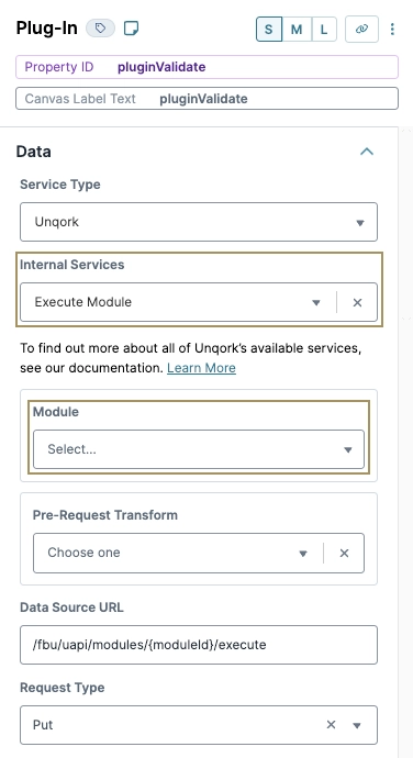
In the Inputs table, enter the following:
#
Property ID
Mapping
1
name
dataName
2
phone
dataPhone
3
email
dataEmail
4
'true'
validate
Values in the Property ID column must match the Property IDs of the components copied from your Front-End module. Values in the Mapping column must match the Property IDs with data added, in the format
data.PropertyID.In the Outputs table, enter the following:
#
Property ID
Mapping
1
resolution
data.resolved.resolution
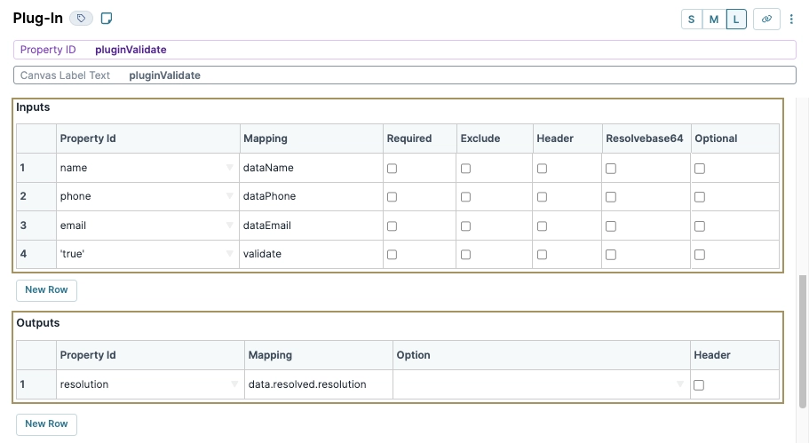
Navigate to the Actions settings.
In the Error Trigger field, enter
initError.Click Save Component.
Error Handling Configuration
Next, you'll add a Hidden component to serve as the error handler.
Configure the Hidden Component
This Hidden component populates an error message that only displays to your end-user when your Plug-In component fails.
Drag and drop a Hidden component into the
panelResponsePanel component.In the Property ID and Canvas Label Text fields, enter
resolution.Click Save Component.
Save your module.
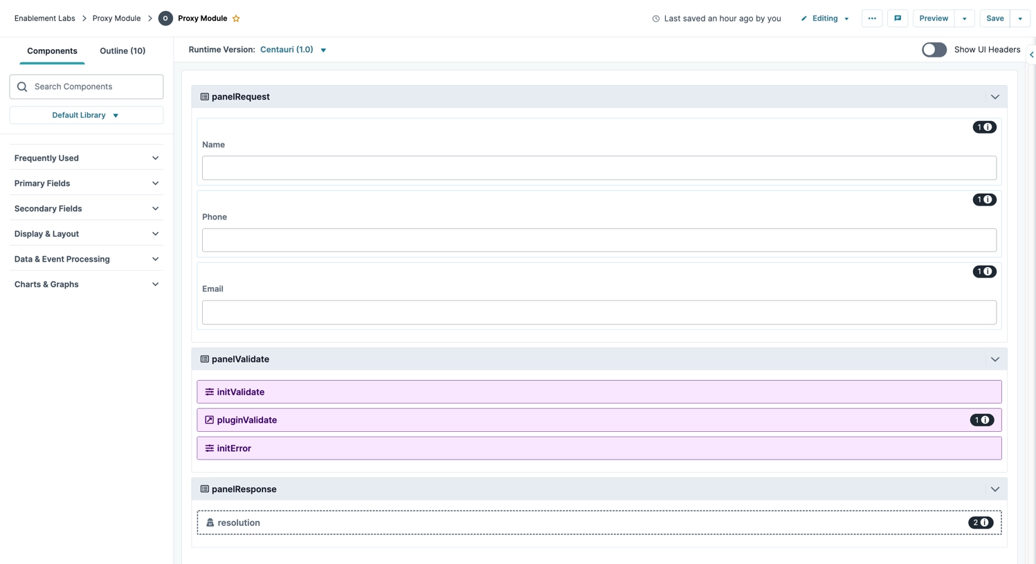
Here's how your completed proxy module looks in the Module Builder:
Classic Designer Proxy Module Prerequisites
This how-to guide assumes you have a Front-End module that collects the name, phone number, and email address of your end-user, with Property IDs of name, phone, and email, respectively.
To ensure security, add a proxy module with the same name, phone number, and email address fields as your Front-End module. The only difference is that your proxy module keeps all these fields hidden.
To begin, you need the following modules already configured:
A Front-End module with name, phone, and email data fields.
An API module to perform your necessary remote execute.
To prevent users from directly executing the API module outside of the proxy module, set the API module permissions to
No Accessfor all roles.
Ensure both modules exist in the same application.
Set Up Server Side Execution
Enable the Server Side Execution Only setting to ensure the proxy module is inaccessible in Express View.
At the top right of the Module Builder, click the
.png) (ellipsis) button.
(ellipsis) button.Select Settings.
Set Server Side Execution Only to
 (ON).
(ON).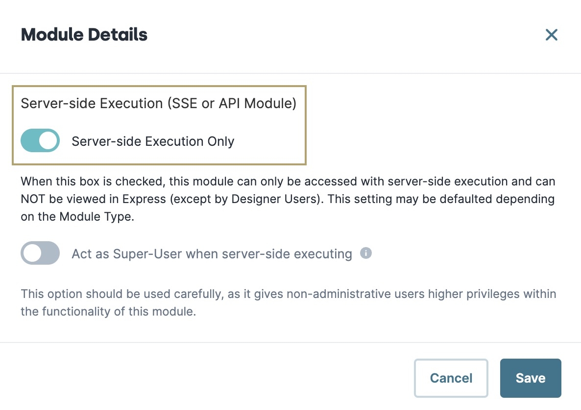
Click Save. The Module Builder updates, replacing the Preview button with the Server-Side Execution button.
Display and Layout Configuration
For this example, add three Panel components to serve as containers for the components.
Configure the Panel Components
The panelRequest Panel component manages the data carried over from your Front-End module. The panelValidate Panel component manages the remote execute trigger. And, the panelResponse Panel component manages error handling.
In your proxy module, drag and drop three Panel components onto your canvas.
In the Property ID and Label Text fields, enter the following for each Panel component:
#
Property ID
Label Text
1
panelRequest
panelRequest
2
panelValidate
panelValidate
3
panelResponse
panelResponse
Save & Close each component as you add it.
Data Field Configuration
Next, add a range of data components to store the name, phone, and email values. For this how-to guide, the same fields are named as the previous ones in your Front-End module. For other use cases, ensure that the fields expected in your Front-End module are created in the proxy module.
Configure the name Text Field Component
First, configure the Text Field component to store the end-user's name.
Drag and drop a Text Field component into the
panelRequestPanel component.In the Property ID field, enter
name.In the Label Text field, enter
Name.Set Hide Field to
 (ON).
(ON).Click Save & Close.
Configure the phone Phone Number Component
Configure the Phone Number component to store the end-user's phone number.
Drag and drop a Phone Number component into the
panelRequestPanel component.In the Property ID field, enter
phone.In the Label Text field, enter
Phone.Set Hide Field to
 (ON).
(ON).Click Save & Close.
Configure the email Email Component
Configure the Email component to store the end-user's email address.
Drag and drop an Email component into the
panelRequestPanel component.In the Property ID field, enter
email.In the Label Text field, enter
Email.Set Hide Field to
 (ON).
(ON).Click Save & Close.
Validation Configuration
Next, set up an Initializer and Plug-In components to perform the validation.
Configure the initValidate Initializer Component
Next, set up the first of two Initializer components. This first Initializer triggers a Plug-In component that you'll add later.
Drag and drop an Initializer component into the
panelValidatePanel component.In the Property ID and Canvas Label Text fields, enter
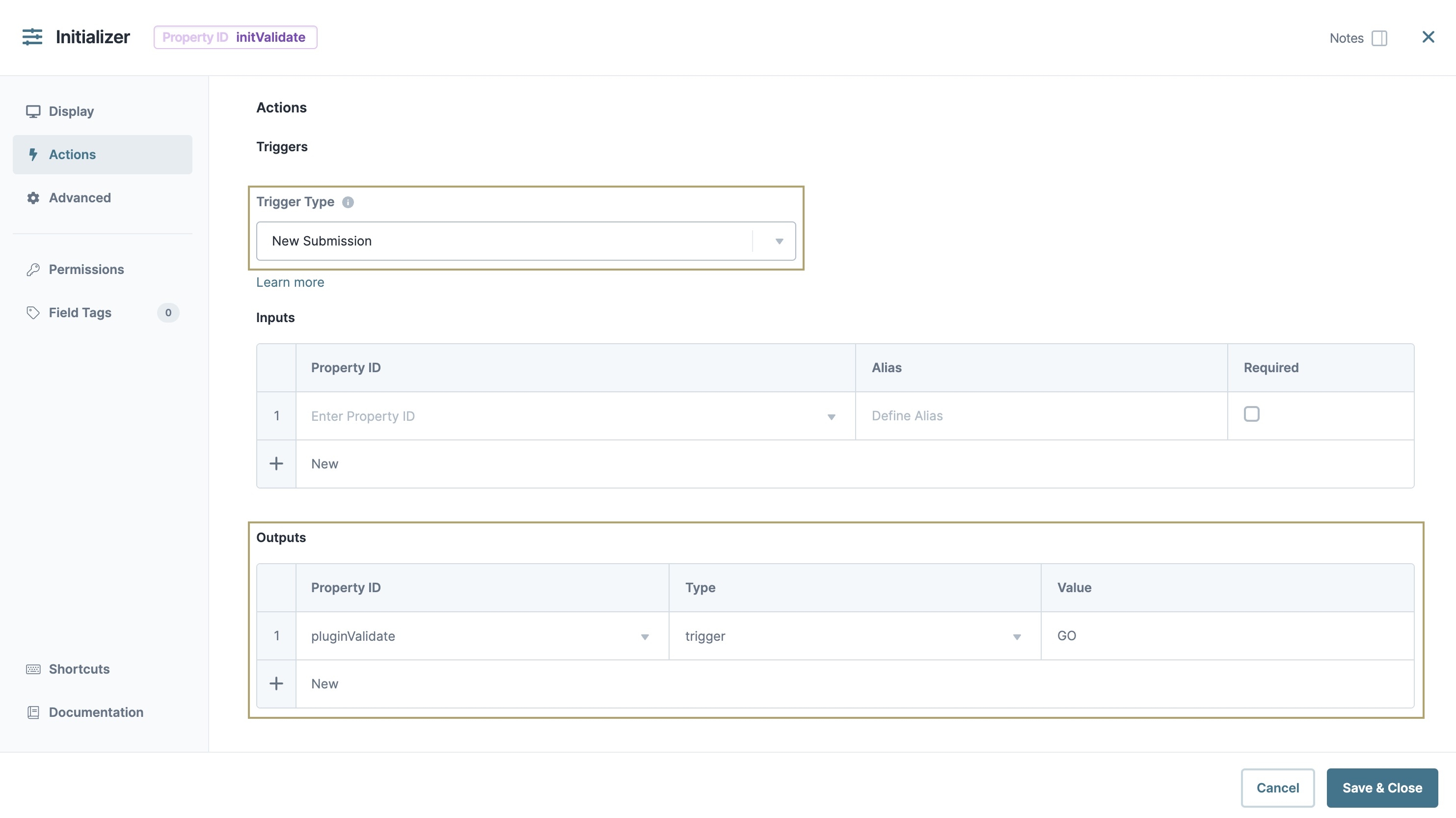
initValidate.To the left of the component's configuration window, select Actions.
From the Trigger Type drop-down, select New Submission.
In the Outputs table, enter the following:
#
Property ID
Type
Value
1
pluginValidate
trigger
GO
The Property ID in the Outputs table corresponds to the Plug-In component you'll add in the next section. The Property ID you use in the Outputs table must match the Plug-In component’s Property ID.
Click Save & Close.
Configure the initError Initializer Component
Now, set up the second Initializer component to display an error message if the Plug-In component fails.
Drag and drop an Initializer component into the
panelValidatePanel component.In the Property ID and Label Text fields, enter
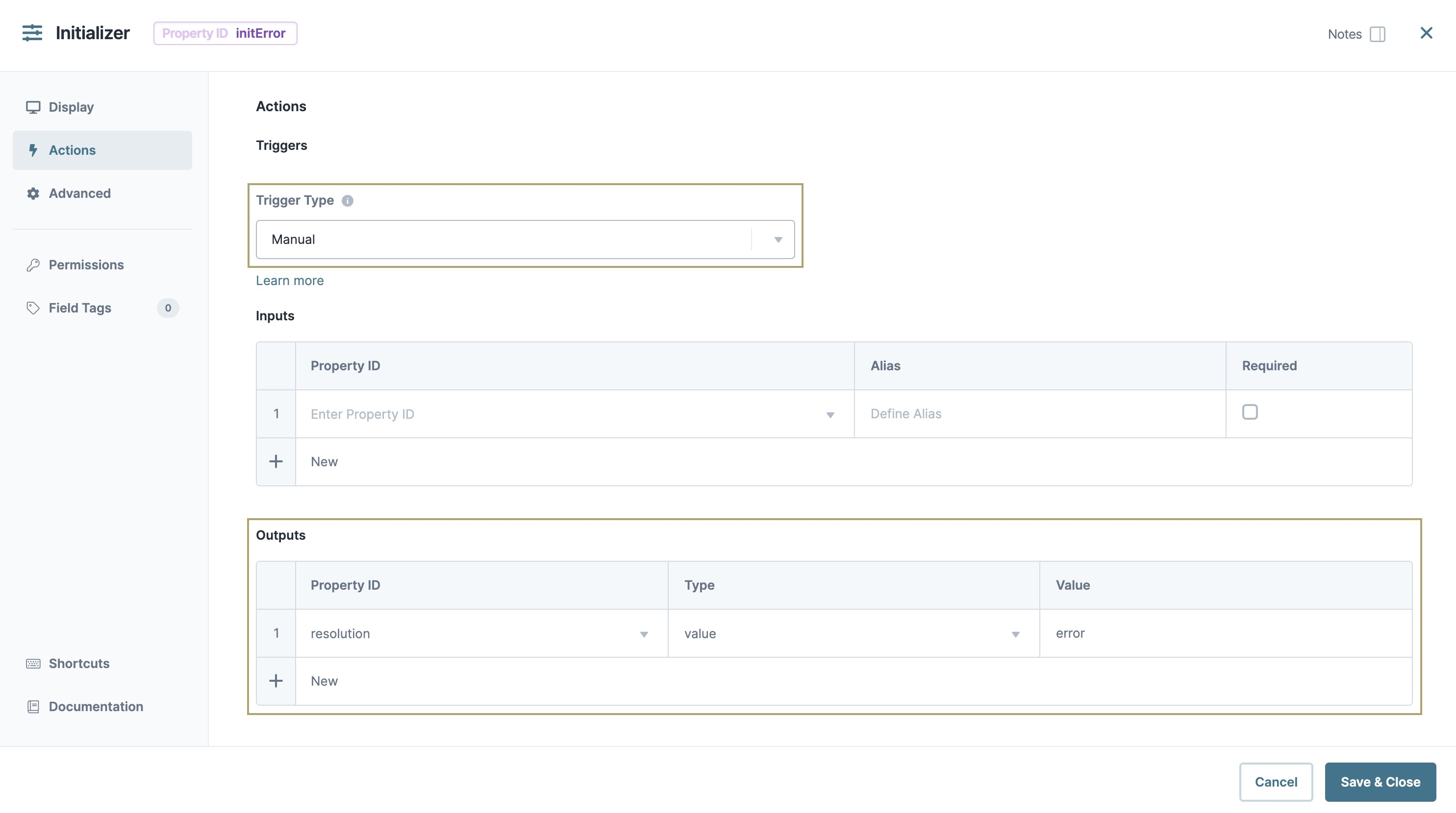
initError.To the left of the component's configuration window, select Actions.
From the Trigger Type drop-down, select Manual.
In the Outputs table, enter the following:
#
Property ID
Type
Value
1
resolution
value
error
The Property ID in the Outputs table corresponds to the Hidden component you'll add later. The Property ID you use in the Outputs table must match the Hidden component’s Property ID.
Click Save & Close.
Configure the pluginValidate Plug-In Component
Now that you have your Initializer components, add a Plug-In component to force-validate the data from your Front-End module as it’s transmitted.
Drag and drop a Plug-In component between your Initializer components in the
panelValidatePanel component.In the Property ID and Canvas Label Text fields, enter
pluginValidate.From the Internal Services drop-down, select Execute Module.
From the Module drop-down, select your API module.
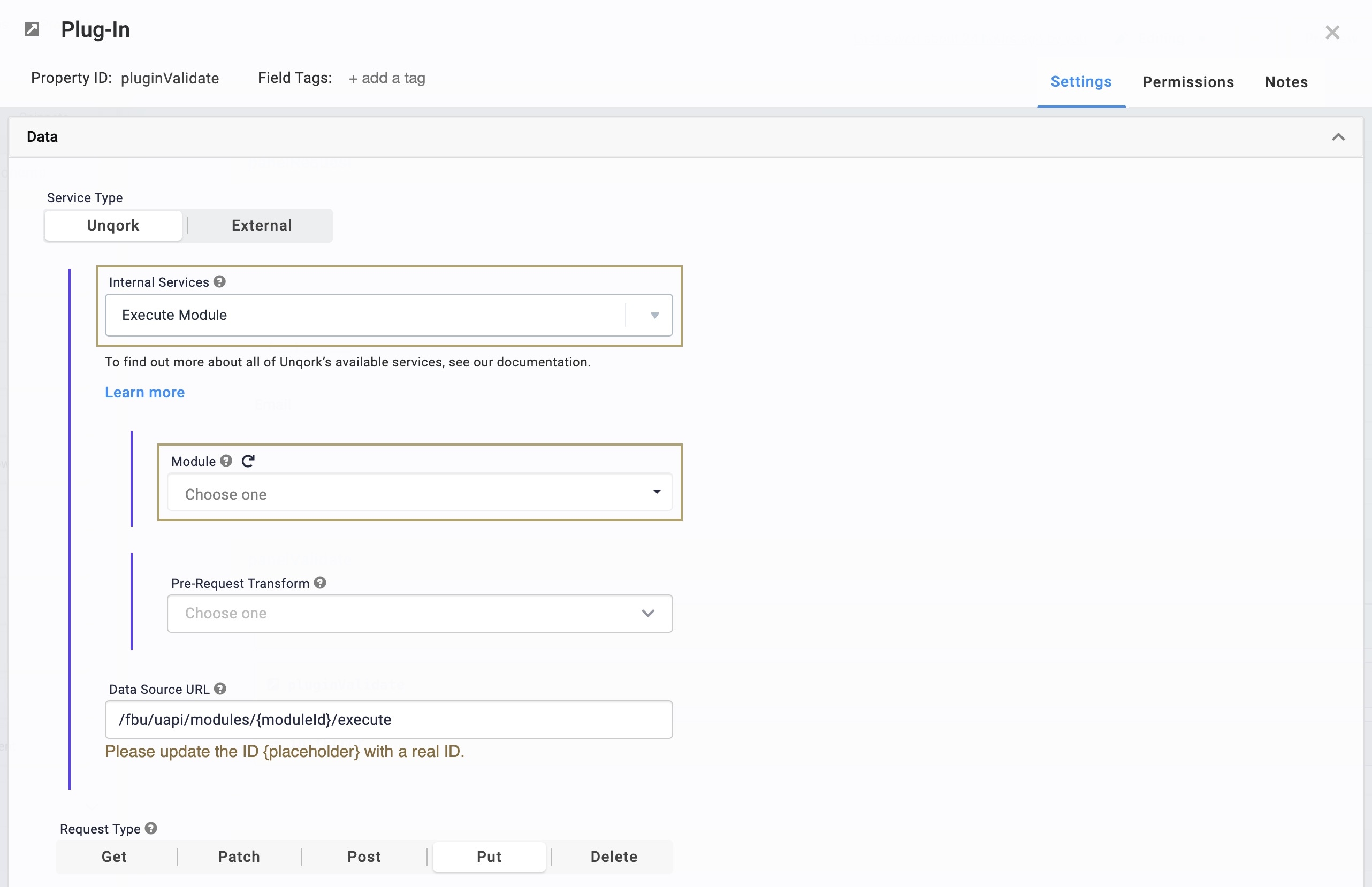
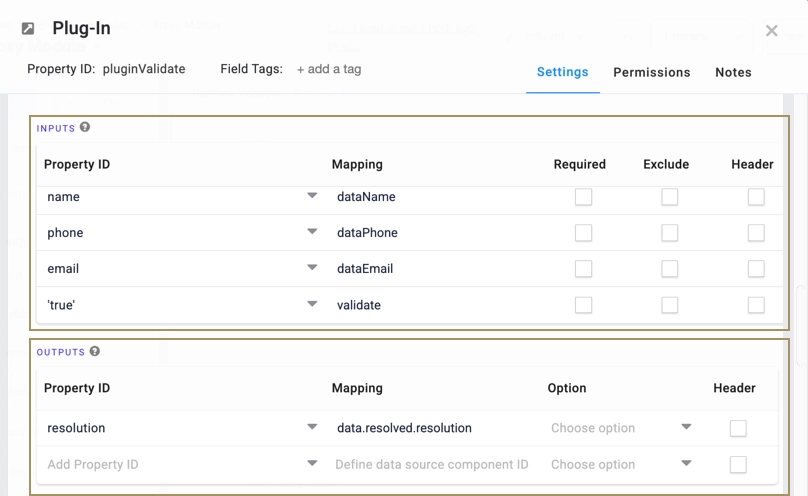
In the Inputs table, enter the following:
Property ID
Mapping
name
dataName
phone
dataPhone
email
dataEmail
'true'
validate
Values in the Property ID column must match the Property IDs of the components copied from your Front-End module. Values in the Mapping column must match the Property IDs with data added, in the format
data.PropertyID.In the Outputs table, enter the following:
Property ID
Mapping
resolution
data.resolved.resolution
Navigate to the Actions settings.
In the Error Trigger field, enter
initError.Click Save.
Error Handling Configuration
Next, you'll add a Hidden component to serve as the error handler.
Configure the Hidden Component
This Hidden component populates an error message that only displays to your end-user when your Plug-In component fails.
Drag and drop a Hidden component into the
panelResponsePanel component.In the Property ID and Canvas Label Text fields, enter
resolution.Click Save & Close.
Save your module.
Here's how your completed proxy module looks in the Module Builder:
