Introduction to the Module Builder
Overview
The Module Builder is one of the core functions of the Unqork Designer Platform. You'll use the Module Builder to configure modules in your applications for end-user End-users, also known as Express Users, are the individuals accessing an application through Express View. In most cases, end-users are the customers using the product. input, logic, and data manipulation. These applications can be as simple as a questionnaire for end-users End-users, also known as Express Users, are the individuals accessing an application through Express View. In most cases, end-users are the customers using the product. to fill out or complex interfaces that can manipulate databases and display dynamic information in a dashboard.
(click image to expand)
What You'll Learn
In this article, you'll learn how to access the Module Builder and navigate its settings and functions.
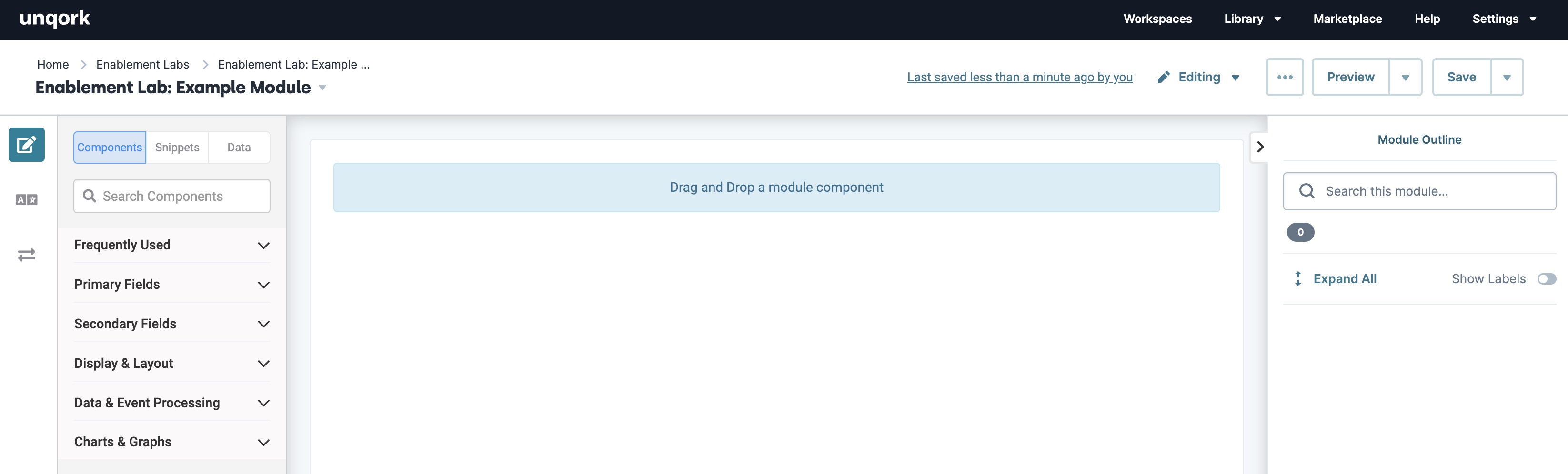
Navigating the Module Builder
The Module Builder is the Designer view or the back-end of your module. From this view, you can modify the module's settings and contents.
Module Header
The module header displays general information, like the name and location of the module. It also provides access to module settings, previewing the module in Express View Express View is how your end-user views your application. Express View also lets you preview your applications to test your configuration and view the styling. This is also the view your end-users will see when interacting with your application. After configuring a module, click Preview in the Module Builder to interact with the module in Express View., server-side executing testing, and saving changes.

Module Header Settings include:
| Setting | Description | |
|---|---|---|
|
1 |
Navigation Breadcrumbs |
These links display where you are in your environment. For example, if you view a module in an application, then the breadcrumbs display as: Home > workspaceName > applicationName. |
|
2 |
Module Type |
Module types include:
|
| 3 | Module Name |
The name you choose for your module. A module's title must be unique to an individual environment. Click the |
|
4 |
Last Saved |
Displays the time and Creator email that last saved the module. If you are the last Creator to save the module, it displays you instead of your Creator email address. Clicking on the Last Save text opens the Module History page. |
| 5 |
Viewing
|
Indicates if you are viewing or editing the module.
|
|
6 |
··· |
Opens the module options drop-down. Click the ··· (ellipsis) button to display the following settings:
To learn more about copying and pasting module definitions, view our How To: Copy and Paste Module Definitions article.
|
|
7 |
|
Click this button to add a comment to the module and tag teammates. |
|
8 |
Preview Server-Side Execution |
Depending on which module type you create, this button either displays as Preview or Server-Side Execution:
|
|
9 |
Save |
Saves recent configuration changes. When you save your module for the first time, Unqork assigns a unique module ID to your module. Click the
|
 (
( /
/ Viewing
 Editing
Module Builder Designer View
The Module Builder Designer View provides the tools needed to create a no-code application. The Designer View consists of the component tray, canvas, and Module Outline. In the image below, the three sections of the Module Builder have been highlighted. Use the tables below to better understand each of these sections.
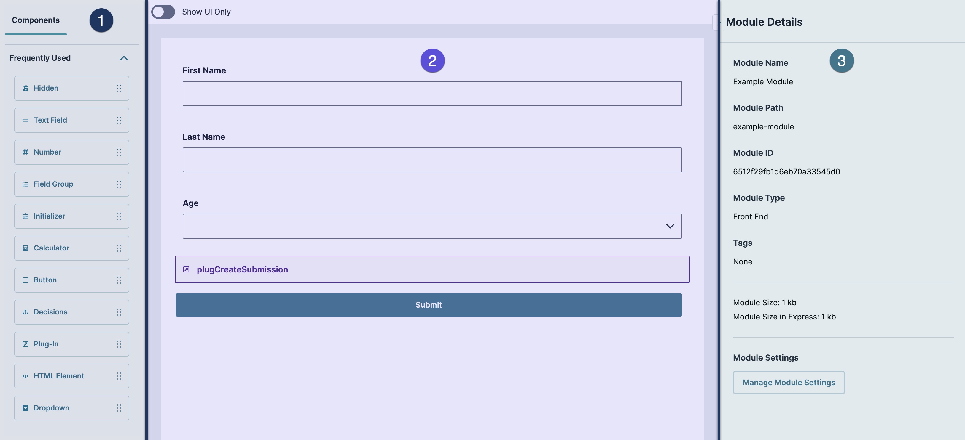
 Component Tray
The Component Tray contains the building blocks of a module. From this tray, components can be selected and dragged onto the canvas. Alternatively, Snippets, which are pre-configured component collections, can also be selected and dragged onto the canvas.
| Setting | Description |
|---|---|
|
Components |
Displays Components in the tray. |
|
Component Library |
Drag and drop component building blocks onto the Module Builder canvas. You'll use components to create fields, layouts, and logic for your application. Unqork organizes components into five categories:
|
 Canvas
The canvas is where you build a module's contents. Add components to the canvas from the component tray, then configure their settings.
| Setting | Description |
|---|---|
|
Show UI Only |
Set this toggle to (ON) to hide all components that Express View users won't see. To learn more about the Show UI Only toggle, view our Module Header: Show UI Only article. |
|
Module Canvas |
The Module Builder Canvas is where components from the component tray are placed. In the canvas view, you can add, remove, copy, paste, or modify components to create individual modules. To learn more about moving and modifying components, view our Component Toolbar Settings article. |
 Module Outline
The Module Outline provides a high-level view of the components of your module. From this list, you can search for components, select ones to highlight on the canvas, or see if there are configuration issues with your components.
To learn more about identifying configuration issues with the Module Outline, view our Real-Time Configuration Analysis Tool article.
| Setting | Description |
|---|---|
|
Module Details |
Displays information specific to the module. The Module Details panel includes:
|
To learn more about the Module Outline tool, view our Module Outline article.
Resources
