How to: Trigger Decisions With Buttons
Overview
The Decisions component includes the following Trigger Types:
-
Watch: The component fires on each new entry made, or action taken on the input component.
-
Manual: The component fires when triggered by another component.
When selecting a Manual Trigger Type, one of the most common components you'll use is a Button component to trigger the Decisions component.
Triggering a Decisions Component
Triggering operations is a straightforward process, even if the operations vary. For a Decisions component, you'll configure it as normal. You'll select Manual as the Trigger Type and make note of the component's Property ID A Property ID is the unique field ID used by Unqork to track and link components in your module.. Then, you'll enter that Property ID A Property ID is the unique field ID used by Unqork to track and link components in your module. into a Button component.
Let's create a sample question to ask your end-user End-users, also known as Express Users, are the individuals accessing an application through Express View. In most cases, end-users are the customers using the product. how many dependents they have. If they have more than three dependents, they'll enter additional information in a Text Area component. You only want that Text Area component to display when necessary, so you'll use a Button component to trigger the Decisions component, hiding or displaying the field.
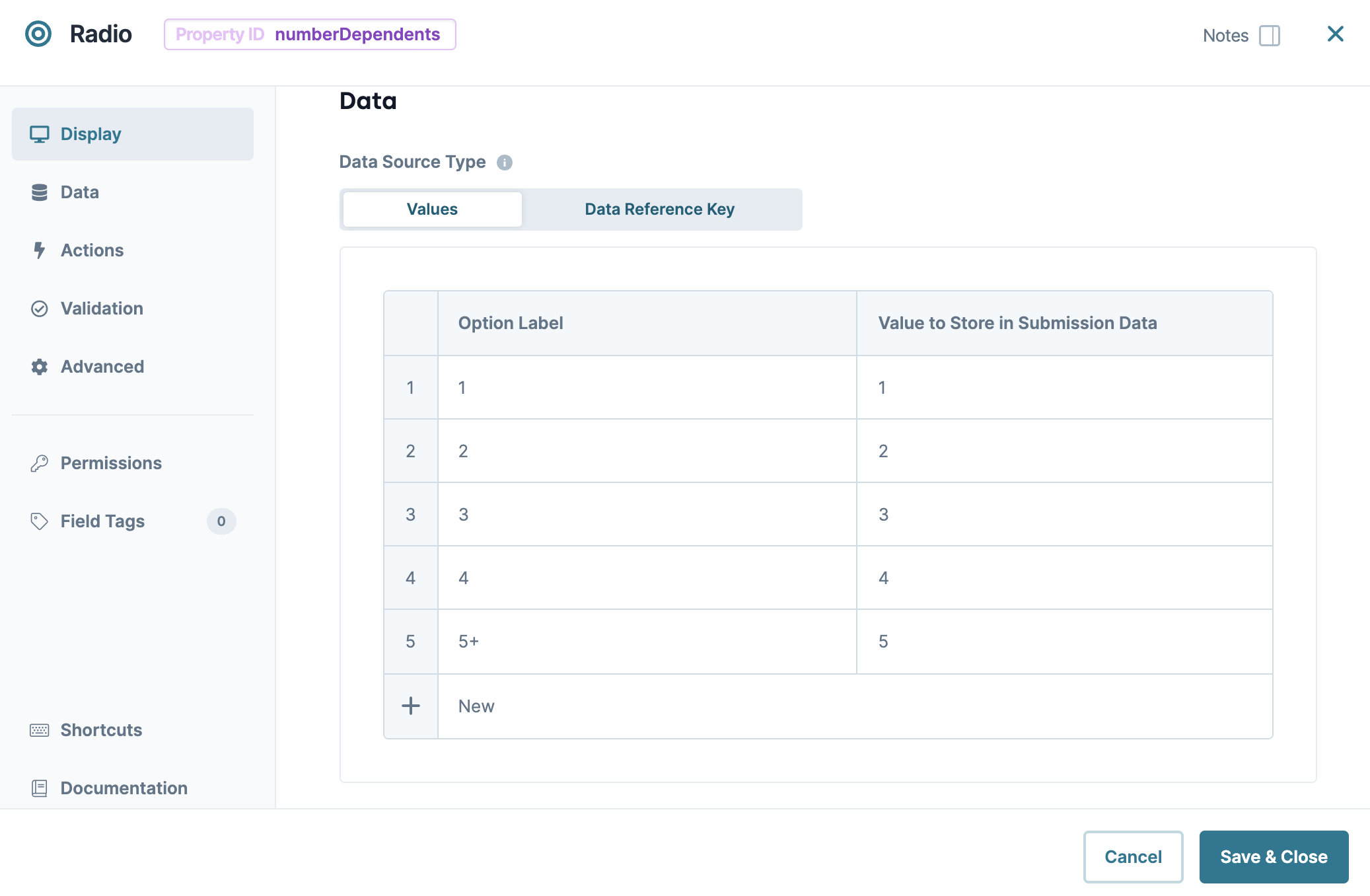
Configure the Radio Buttons Component
First, use a Radio Buttons component to ask your end-user their number of dependents. Later, you'll set this component as the input for your Decisions component.
| 1. | In the Module Builder, drag and drop a Radio Buttons component onto your canvas. |
| 2. | In the Property ID A Property ID is the unique field ID used by Unqork to track and link components in your module. field, enter numberDependents. |
| 3. | In the Label Text Label Text conveys what the input component is and what information it displays. Enter the purpose of the corresponding component or field. field, enter Please select a number of dependents: (More than three will require additional information.). |
| 4. | Navigate to the component's Data settings. |
| 5. | Next to the Values table, click Edit. The Values panel displays. |
| 6. | Underneath the Values table, click New five times. |
| 7. | In the Option Label and Option Value fields, enter the following: |
| # | Option Label | Option Value |
|---|---|---|
|
1 |
1 |
1 |
|
2 |
2 |
2 |
|
3 |
3 |
3 |
|
4 |
4 |
4 |
|
5 |
5+ |
5 |
| 8. | Click Save Component. |
Configure the Text Area Component
Next, let's configure a Text Area component, so your end-user can enter additional information if they have more than three dependents. You'll hide this field so it does not display to the end-user unless necessary. Later, you'll configure a Decisions component to display the Text Area component if the end-user selects three or more dependents.
| 1. | Drag and drop a  Text Area component onto your canvas, placing it below your numberDependents Radio Buttons component. Text Area component onto your canvas, placing it below your numberDependents Radio Buttons component. |
| 2. | In the Property ID A Property ID is the unique field ID used by Unqork to track and link components in your module. field, enter dependentDetails. |
| 3. | In the Label Text Label Text conveys what the input component is and what information it displays. Enter the purpose of the corresponding component or field. field, enter Please provide additional information on all dependents:. |
| 4. | Under Default State Options, set Hide Field to (ON). |
| 5. | Click Save Component. |
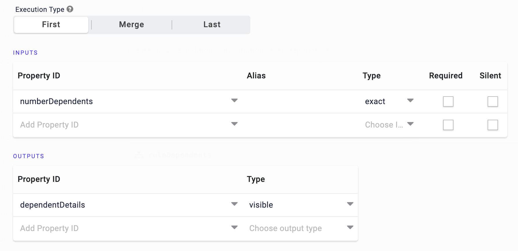
Configure the Decisions Component
Next, add a Decisions component, which relies on your end-user's selection using the Radio Buttons component. So, you'll set the Radio Buttons component as the input and your Test Area component as the output to control whether it's visible or hidden. Then, you'll set the Trigger Type to Manual to control the Decisions component with a button.
| 1. | Drag and drop a Decisions component onto your canvas, placing it below your dependentDetails Text Area component. |
| 3. | Set the Trigger Type to Manual. |
| 4. | Navigate to the component's Actions settings. |
| 5. | Next to Inputs & Outputs, click Edit. |
| 6. | In the Inputs table, enter the following: |
| # | Source | Alias | Type |
|---|---|---|---|
|
1 |
numberDependents |
|
exact |
Setting the Output Type of exact is a good option because there are only two possible values with a Radio Buttons component: yes and no.
| 7. | In the Outputs table, enter the following: |
| # | Source | Type |
|---|---|---|
|
1 |
dependentDetails |
visible |
Setting an Output Type of visible lets you hide or display the field referenced in the Property ID column. In this case, you'll reference your Text Area component.
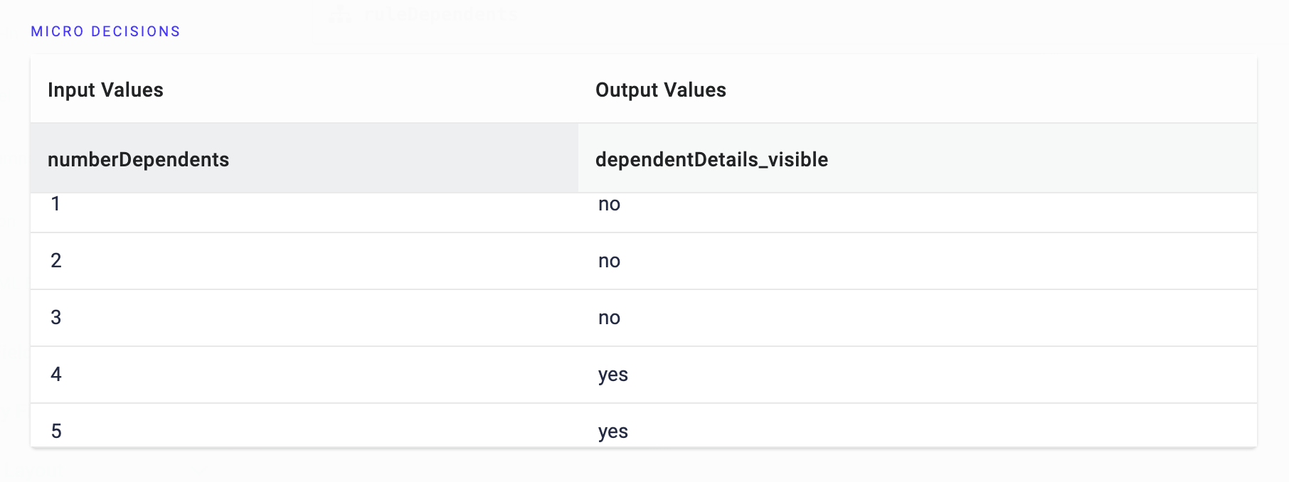
| 8. | Under Conditionals, click Add New Row five times. |
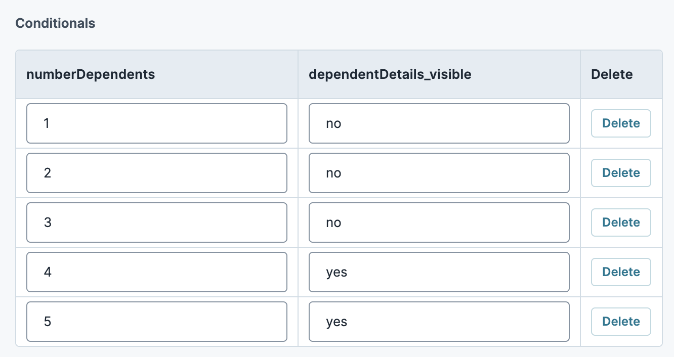
| 9. | In the Conditionals table, enter the following: |
| numberDependents | dependentDetails_Visible | |
|---|---|---|
|
1 |
1 |
no |
|
2 |
2 |
no |
|
3 |
3 |
no |
|
4 |
4 |
yes |
|
5 |
5 |
yes |
| 10. | Click Save Component. |
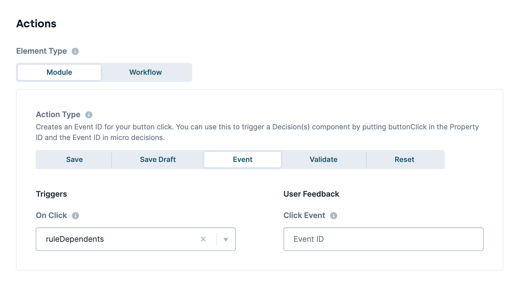
Configure the Button Component
Lastly, let's configure a Button component with an Action Type The action performed by the button when selected. of Event. Then, you'll enter the Property ID A Property ID is the unique field ID used by Unqork to track and link components in your module. of your Decisions component in the On Click field. When your end-user clicks the button, it triggers your Decisions component.
| 1. | Drag and drop a  Button component onto your canvas, placing it below your ruleDependents Decisions component. Button component onto your canvas, placing it below your ruleDependents Decisions component. |
| 2. | In the Property ID A Property ID is the unique field ID used by Unqork to track and link components in your module. field, enter btnDecision. |
| 3. | In the Label Text Label Text conveys what the input component is and what information it displays. Enter the purpose of the corresponding component or field. field, enter Set Dependents. |
| 4. | Set the Action Type The action performed by the button when selected. to Event. |
| 5. | In the On Click field, enter ruleDependents. |
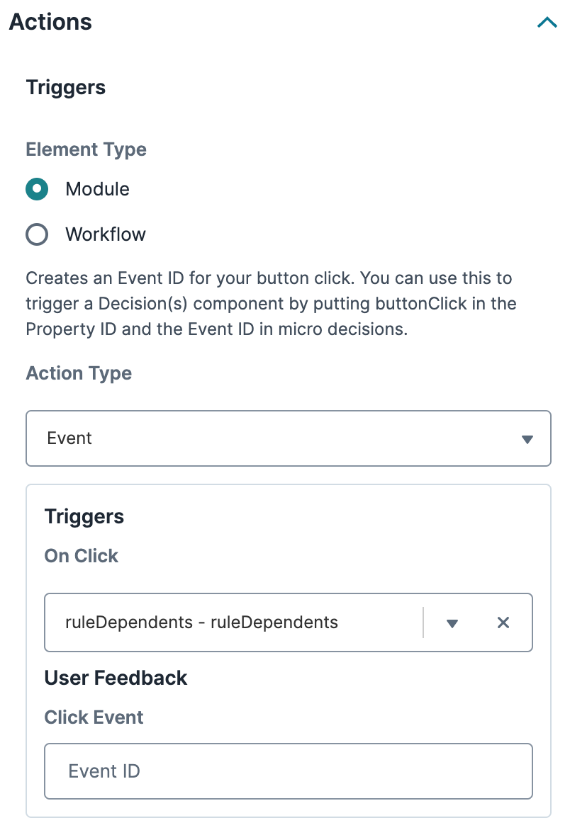
| 6. | Click Save Component. |
| 7. | Save your module. |
Preview your module in Express View Express View is how your end-user views your application. Express View also lets you preview your applications to test your configuration and view the styling. This is also the view your end-users will see when interacting with your application. After configuring a module, click Preview in the Module Builder to interact with the module in Express View., and make a radio button selection. If you click Set Dependents with either 4 or 5+ selected, your Text Area component displays. If you change your selection and click the button again, the Text Area component hides.
Resources

Overview
The Decisions component includes the following Trigger Types:
-
Watch: The component fires on each new entry made, or action taken on the input component.
-
Manual: The component fires when triggered by another component.
When selecting a Manual Trigger Type, one of the most common components you'll use is a Button component to trigger the Decisions component.
Triggering a Decisions Component
Triggering operations is a straightforward process, even if the operations vary. For a Decisions component, you'll configure it as normal. You'll select Manual as the Trigger Type and make note of the component's Property ID A Property ID is the unique field ID used by Unqork to track and link components in your module.. Then, you'll enter that Property ID A Property ID is the unique field ID used by Unqork to track and link components in your module. into a Button component.
Let's create a sample question to ask your end-user End-users, also known as Express Users, are the individuals accessing an application through Express View. In most cases, end-users are the customers using the product. how many dependents they have. If they have more than three dependents, they'll enter additional information in a Text Area component. You only want that Text Area component to display when necessary, so you'll use a Button component to trigger the Decisions component, hiding or displaying the field.
Configure the Radio Buttons Component
First, use a Radio Buttons component to ask your end-user their number of dependents. Later, you'll set this component as the input for your Decisions component.
| 1. | In the Module Builder, drag and drop a Radio Buttons component onto your canvas. |
| 2. | In the Property ID A Property ID is the unique field ID used by Unqork to track and link components in your module. field, enter numberDependents. |
| 3. | In the Label Text Label Text conveys what the input component is and what information it displays. Enter the purpose of the corresponding component or field. field, enter Please select a number of dependents: (More than three will require additional information.). |
| 4. | Enter the following Option Label and Value to Store in Submission Data values: |
|
|
Option Label |
Value to Store in Submission Data |
|---|---|---|
|
1 |
1 |
1 |
|
2 |
2 |
2 |
|
3 |
3 |
3 |
|
4 |
4 |
4 |
|
5 |
5+ |
5 |
| 5. | Click Save & Close. |
Configure the Text Area Component
Next, let's configure a Text Area component, so your end-user can enter additional information if they have more than three dependents. You'll hide this field so it does not display to the end-user unless necessary. Later, you'll configure a Decisions component to display the Text Area component if the end-user selects three or more dependents.
| 1. | Drag and drop a Text Area component onto your canvas, placing it below your numberDependents Radio Buttons component. |
| 2. | In the Property ID A Property ID is the unique field ID used by Unqork to track and link components in your module. field, enter dependentDetails. |
| 3. | In the Label Text Label Text conveys what the input component is and what information it displays. Enter the purpose of the corresponding component or field. field, enter Please provide additional information on all dependents:. |
| 4. | Under Default State Options, set Hide Field to (ON). |
| 5. | Click Save & Close. |
Configure the Decisions Component
Next, add a Decisions component, which relies on your end-user's selection using the Radio Buttons component. So, you'll set the Radio Buttons component as the input and your Test Area component as the output to control whether it's visible or hidden. Then, you'll set the Trigger Type to Manual to control the Decisions component with a button.
| 1. | Drag and drop a Decisions component onto your canvas, placing it below your dependentDetails Text Area component. |
| 3. | In the component's configuration window, click  Actions. Actions. |
| 4. | Set the Trigger Type to Manual. |
| 5. | In the INPUTS table, enter the following: |
|
|
Property ID |
Alias |
Type |
|---|---|---|---|
|
1 |
numberDependents |
|
exact |
Setting the Output Type of exact is a good option because there are only two possible values with a Radio Buttons component: yes and no.
| 6. | Complete the OUTPUTS table as follows: |
|
|
Property ID |
Type |
|---|---|---|
|
1 |
dependentDetails |
visible |
Setting an Output Type of visible lets you hide or display the field referenced in the Property ID column. In this case, you'll reference your Text Area component.
| 7. | In the MICRO DECISIONS table, enter the following: |
| Input Values | Output Values | |
|---|---|---|
| numberDependents | dependentDetails_Visible | |
|
1 |
1 |
no |
|
2 |
2 |
no |
|
3 |
3 |
no |
|
4 |
4 |
yes |
|
5 |
5 |
yes |
| 8. | Click Save & Close. |
Configure the Button Component
Lastly, let's configure a Button component with an Action Type The action performed by the button when selected. of Event. Then, you'll enter the Property ID A Property ID is the unique field ID used by Unqork to track and link components in your module. of your Decisions component in the On Click field. When your end-user clicks the button, it triggers your Decisions component.
| 1. | Drag and drop a Button component onto your canvas, placing it below your ruleDependents Decisions component. |
| 2. | In the Property ID A Property ID is the unique field ID used by Unqork to track and link components in your module. field, enter btnDecision. |
| 3. | In the Label Text Label Text conveys what the input component is and what information it displays. Enter the purpose of the corresponding component or field. field, enter Set Dependents. |
| 4. | Set the Action Type The action performed by the button when selected. to Event. |
| 5. | In the On Click field, enter ruleDependents. |
| 6. | Click Save & Close. |
| 7. | Save your module. |
Preview your module in Express View Express View is how your end-user views your application. Express View also lets you preview your applications to test your configuration and view the styling. This is also the view your end-users will see when interacting with your application. After configuring a module, click Preview in the Module Builder to interact with the module in Express View., and make a radio button selection. If you click Set Dependents with either 4 or 5+ selected, your Text Area component displays. If you change your selection and click the button again, the Text Area component hides.
Resources
