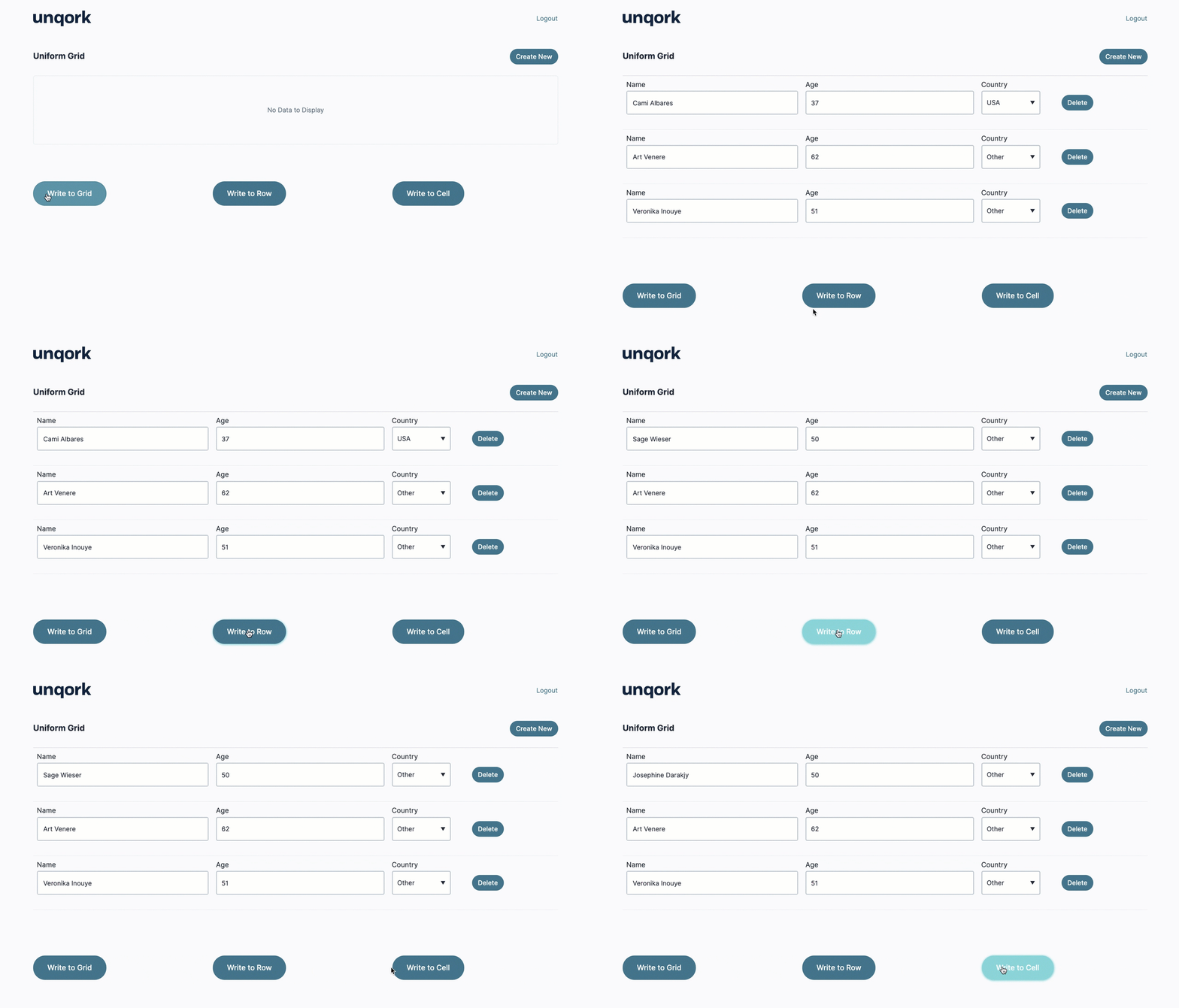
Setting up a Uniform Grid component for data entry is simple and straightforward. But, with some logic components, it's easy to read data from one location and write it to your Uniform Grid component. Referencing syntax also makes it possible to write data to specific parts of the component. For example, updating one grid row or a single cell.
Grid referencing syntax is currently supported in the following logic components: Calculator, Decisions, Initializer, Plug-In, and Data Workflow components.
To learn more about using grid referencing syntax with the Uniform Grid component, see the Uniform Grid and Freeform Grid: Logic and Referencing Syntax article.
Setting Up the Uniform Grid Component
You’ll begin by configuring the Uniform Grid component to include the following fields: Name, Age, and Country.
Configure the Uniform Grid Component
In the Module Builder, drag and drop a Uniform Grid component onto the canvas.
In the Property ID field, enter
uniformGrid.In the Label Text field, enter
Uniform Grid.From the Labels drop-down, select Show inline.
Click Save Component.
Configure the Text Field Component
Drag and drop a Text Field component onto the canvas, placing it inside the
uniformGridUniform Grid component.In the Property ID field, enter
name.In the Label Text field, enter
Name.Click Save Component.
Configure the Number Component
Drag and drop a Number component onto the canvas, placing it inside the
uniformGridUniform Grid component, below thenameText Field component.In the Property ID field, enter
age.In the Label Text field, enter
Age.Click Save Component.
Configure the Dropdown Component
Drag and drop a Dropdown component onto the canvas, placing it inside the
uniformGridUniform Grid component, below theageNumber component.In the Property ID field, enter
country.In the Label Text field, enter
Country.Complete the Values table as follows:
Option Label
Data Source Values
USA
USA
Other
Other
Click Save Component.
Writing Data to the Entire Grid
Begin by writing data to the entire Uniform Grid component. The data source is a Data Table component, and a Calculator component runs the logic to write the Data Table component's data to the Uniform Grid component. Because a Uniform Grid component stores data as an array of row objects, it's simple to map table-based data directly to the component.
Configure the Columns Component
For organizational purposes, add a Columns component to group the components involved in writing data to the Uniform Grid component at various levels. The first column contains the components involved in writing to the Uniform Grid component at the grid level.
Drag and drop a Columns component onto your canvas, placing it below the
uniformGridUniform Grid component.In the Property ID field, enter
col1.Under Column Layout, select the icon displaying three evenly spaced columns.
Click Save Component.
Configure the Data Table Component
The Data Table component is the source of the data that the Calculator component writes to the grid. Note that the Data Table component's column headers match the Property IDs of the fields in the Uniform Grid component. Similarly, every value in the country column matches one of the possible Data Source Values configured in the country Dropdown component you’ll add later.
Drag and drop a Data Table component in column one of the
col1Columns component.In the Property ID and Label Text fields, enter
dtPeopleGrid.Complete the data table as follows:
name
age
country
Cami Albares
37
USA
Art Venere
62
Other
Veronika Inouye
51
Other
Click Save Component.
Configure the Calculator Component
The formula used in this Calculator component maps the input (Data Table component) to the output (Uniform Grid component).
Drag and drop a Calculator component in column one of the
col1Columns component, below thedtPeopleGridData Table component.In the Property ID and Canvas Label Text fields, enter
calcGrid.In the Inputs table, enter the following:
#
Source
Alias
1
dtPeopleGrid
A
In the Outputs table, enter the following:
#
Property ID
Alias
1
uniformGrid
=A
.png)
Click Save Component.
Configure the Button Component
Lastly, add a Button component to trigger the Calculator component.
Drag and drop a Button component in column one of the
col1Columns component, below thecalcGridCalculator component.In the Property ID field, enter
btnGrid.In the Label Text field, enter
Write to Grid.From the Action Type drop-down, select Event.
From the On Click drop-down, enter or select
calcGrid.Click Save Component.
Writing Data to a Row
Next, look at writing data to a single row in the grid. Again, a data table is the data source, with one row of data. In this configuration, a Data Workflow retrieves the correct data structure to write to the grid. One row of the Uniform Grid component corresponds to one row in an array of row objects. To write data to a single row of the grid, you need to map the row object to another row object.
The Data Workflow uses a Get operator to retrieve a row object from the data table's array of row objects. Then, it outputs the row object to the row index of 0 in the Uniform Grid component. To target a single row of the Uniform Grid component, a Decisions component uses the following grid referencing syntax structure: {gridPropertyID}.row({rowIndex}).
Configure the Data Table Component
This Data Table component contains a single row of data. It’s important to note that the Data Table component's column headers match the Property IDs of the fields in the Uniform Grid component.
Drag and drop a Data Table component onto your canvas in the second column of the
col1Columns component.In the Property ID and Label Text fields, enter
dtPeopleRow.Complete the data table as follows:
name
age
country
Sage Wieser
50
Other
Click Save Component.
Configure the Data Workflow Component
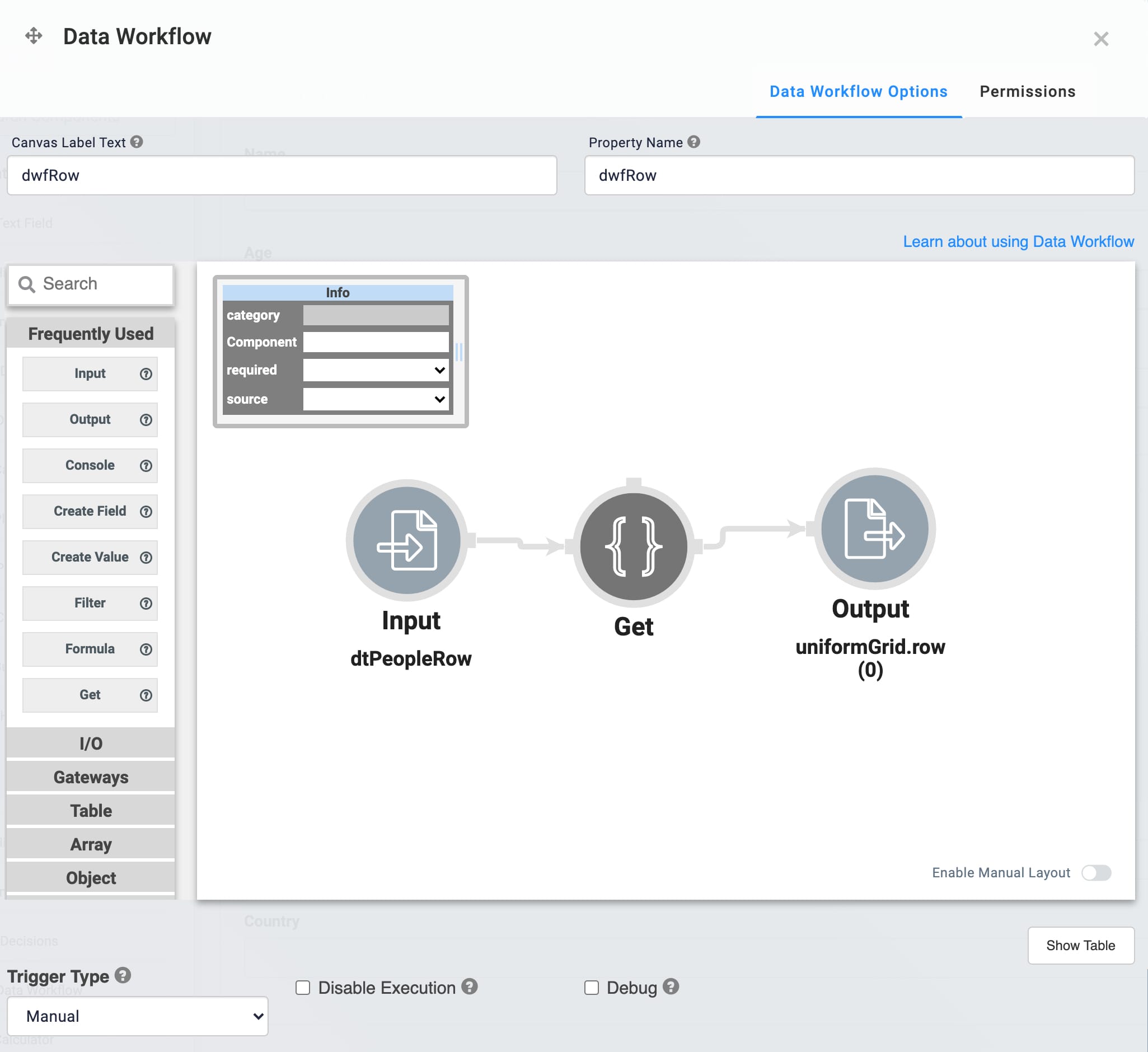
Next, set up the Data Workflow to retrieve the first row object from the Data Table component and output it to a Hidden component.
Drag and drop a Data Workflow component in the second column of the
col1Columns component, below thedtPeopleRowData Table component.In the Property ID and Canvas Label Text fields, enter
dwfRow..png)
Configure the Input Operator
Drag and drop an Input operator onto your Data Workflow canvas.
Configure the operator's Info window as follows:
Setting
Value
Category
Input
Component
dtPeopleRow
Required
Yes
Source
Default
Configure the Get Operator
Drag and drop a Get operator onto your Data Workflow canvas.
Configure the operator's Info window as follows:
Setting
Value
Category
Get
Label
Path
[0]
Connect the output port (left) of the
dtPeopleRowInput operator to the input port (right) of the Get operator.
Configure the Output Operator
Drag and drop an Output operator onto your Data Workflow canvas.
Configure the operator's Info window as follows:
Setting
Value
Category
Input
Component
uniformGrid.row(0)
Action
value
Connect the output port (left) of the Get operator to the input port (right) of the
uniformGrid.row(0)Output operator.Click Save Component.
Configure the Button Component
Lastly, add a Button component to trigger the Data Workflow component.
Drag and drop a Button component in the second column of the
col1Columns component, below thedwfRowData Workflow component.In the Property ID field, enter
btnRow.In the Label Text field, enter
Write to Row.From the Action Type drop-down, select Event.
From the On Click drop-down, select dwfRow.
Click Save Component.
Writing Data to a Cell
At the most granular level of grid referencing syntax, you’ll write data to a single cell of the Uniform Grid component. Writing data to a cell means updating a specific field in a single row of the grid. A single field in a single row is simply a key/value pair in the array of row objects. So, you can output a value directly from a logic component, like an Initializer component, and target a single cell of the Uniform Grid component. The Initializer component uses the following grid referencing syntax structure: {gridPropertyID}.col({columnPropertyID}).row({rowIndex}).
Configure the Initializer Component
This Initializer component defines what value to write to the output using the Outputs table.
Drag and drop an Initializer component in column three of the
col1Columns component.In the Property ID and Canvas Label Text fields, enter
initCell.From the Trigger Type drop-down, select New Submission.
In the Outputs table, enter the following:
#
Property ID
Type
Value
1
uniformGrid.col(name).row(0)
value
Josephine Darakjy
.png)
Click Save Component.
Configure the Button Component
Lastly, add a Button component to trigger the Initializer component.
Drag and drop a Button component in column three of the
col1Columns component, below theinitCellInitializer component.In the Property ID field, enter
btnCell.In the Label Text field, enter
Write to Cell.From the Action Type drop-down, select Event.
From the On Click drop-down, select initCell.
Click Save Component.
Save your module.
Here's how the completed configuration looks in the Module Builder:
.png)
Preview your module in Express View to view its functionality:

Setting up a Uniform Grid component for data entry is simple and straightforward. But, with some logic components, it's easy to read data from one location and write it to your Uniform Grid component. Referencing syntax also makes it possible to write data to specific parts of the component. For example, updating one grid row or a single cell.
Grid referencing syntax is currently supported in the following logic components: Calculator, Decisions, Initializer, Plug-In, and Data Workflow components.
To learn more about using grid referencing syntax with the Uniform Grid component, see the Uniform Grid and Freeform Grid: Logic and Referencing Syntax article.
Setting Up the Uniform Grid Component
You’ll begin by configuring the Uniform Grid component to include the following fields: Name, Age, and Country.
Configure the Uniform Grid Component
In the Module Builder, drag and drop a Uniform Grid component onto the canvas.
In the Property ID field, enter
uniformGrid.In the Label Text field, enter
Uniform Grid.Set Labels as Show inline.
Click Save.
Configure the Text Field Component
Drag and drop a Text Field component inside the
uniformGridUniform Grid component.In the Property ID field, enter
name.In the Label Text field, enter
Name.Click Save & Close.
Configure the Number Component
Drag and drop a Number component inside the
uniformGridUniform Grid component, below thenameText Field component.In the Property ID field, enter
age.In the Label Text field, enter
Age.Click Save & Close.
Configure the Dropdown Component
Drag and drop a Dropdown component inside the
uniformGridUniform Grid component, below theageNumber component.In the Property ID field, enter
country.In the Label Text field, enter
Country.Complete the Values table as follows:
Option Label
Data Source Values
USA
USA
Other
Other
Click Save & Close.
Writing Data to the Entire Grid
Begin by writing data to the entire Uniform Grid component. The data source is a Data Table component, and a Calculator component runs the logic to write the Data Table component's data to the Uniform Grid component. Because a Uniform Grid component stores data as an array of row objects, it's simple to map table-based data directly to the component.
Configure the Columns Component
For organizational purposes, add a Columns component to group the components involved in writing data to the Uniform Grid component at various levels. The first column contains the components involved in writing to the Uniform Grid component at the grid level.
Drag and drop a Columns component onto your canvas, placing it below the
uniformGridUniform Grid component.In the Property ID field, enter
col1.Under Column Layout, select the icon displaying three evenly spaced columns.
Click Save & Close.
Configure the Data Table Component
The Data Table component is the source of the data that the Calculator component writes to the grid. Note that the Data Table component's column headers match the Property IDs of the fields in the Uniform Grid component. Similarly, every value in the country column matches one of the possible Data Source Values configured in the country Dropdown component you’ll add later.
Drag and drop a Data Table component in column one of the
col1Columns component.In the Property ID and Canvas Label Text fields, enter
dtPeopleGrid.Complete the data table as follows:
name
age
country
Cami Albares
37
USA
Art Venere
62
Other
Veronika Inouye
51
Other
Click Save & Close.
Configure the Calculator Component
The formula used in this Calculator component maps the input (Data Table component) to the output (Uniform Grid component).
Drag and drop a Calculator component in column one of the
col1Columns component, below thedtPeopleGridData Table component.In the Property ID and Canvas Label Text fields, enter
calcGrid.In the Inputs table, enter the following:
#
Property ID
Alias
1
dtPeopleGrid
A
In the Outputs table, enter the following:
#
Property ID
Alias
1
uniformGrid
=A
.png)
Click Save & Close.
Configure the Button Component
Lastly, add a Button component to trigger the Calculator component.
Drag and drop a Button component in column one of the
col1Columns component, below thecalcGridCalculator component.In the Property ID field, enter
btnGrid.In the Label Text field, enter
Write to Grid.Set the Action Type as Event.
In the On Click field, enter
calcGrid.Click Save & Close.
Writing Data to a Row
Next, look at writing data to a single row in the grid. Again, a data table is the data source, with one row of data. In this configuration, a Data Workflow retrieves the correct data structure to write to the grid. One row of the Uniform Grid component corresponds to one row in an array of row objects. To write data to a single row of the grid, you need to map the row object to another row object.
The Data Workflow uses a Get operator to retrieve a row object from the data table's array of row objects. Then, it outputs the row object to the row index of 0 in the Uniform Grid component. To target a single row of the Uniform Grid component, a Decisions component uses the following grid referencing syntax structure: {gridPropertyID}.row({rowIndex}).
Configure the Data Table Component
This Data Table component contains a single row of data. It’s important to note that the Data Table component's column headers match the Property IDs of the fields in the Uniform Grid component.
Drag and drop a Data Table component in column two of the
col1Columns component.In the Property ID and Canvas Label Text fields, enter
dtPeopleRow.Complete the data table as follows:
name
age
country
Sage Wieser
50
Other
Click Save & Close.
Configure the Data Workflow Component
Next, set up the Data Workflow to retrieve the first row object from the Data Table component and output it to a Hidden component.
Drag and drop a Data Workflow component in column two of the
col1Columns component, below thedtPeopleRowData Table component.In the Canvas Label Text and Property Name fields, enter
dwfRow.
Configure the Input Operator
Drag and drop an Input operator onto your Data Workflow canvas.
Configure the operator's Info window as follows:
Setting
Value
Category
Input
Component
dtPeopleRow
Required
Yes
Source
Default
Configure the Get Operator
Drag and drop a Get operator onto your Data Workflow canvas.
Configure the operator's Info window as follows:
Setting
Value
Category
Get
Label
Path
[0]
Connect the output port (left) of the
dtPeopleRowInput operator to the input port (right) of the Get operator.
Configure the Output Operator
Drag and drop an Output operator onto your Data Workflow canvas.
Configure the operator's Info window as follows:
Setting
Value
Category
Input
Component
uniformGrid.row(0)
Action
value
Connect the output port (left) of the Get operator to the input port (right) of the
uniformGrid.row(0)Output operator.Click Save.
Configure the Button Component
Lastly, add a Button component to trigger the Data Workflow component.
Drag and drop a Button component in column two of the
col1Columns component, below thedwfRowData Workflow component.In the Property ID field, enter
btnRow.In the Label Text field, enter
Write to Row.Set the Action Type as Event.
From the On Click drop-down, select dwfRow.
Click Save & Close.
Writing Data to a Cell
At the most granular level of grid referencing syntax, you’ll write data to a single cell of the Uniform Grid component. Writing data to a cell means updating a specific field in a single row of the grid. A single field in a single row is simply a key/value pair in the array of row objects. So, you can output a value directly from a logic component, like an Initializer component, and target a single cell of the Uniform Grid component. The Initializer component uses the following grid referencing syntax structure: {gridPropertyID}.col({columnPropertyID}).row({rowIndex}).
Configure the Initializer Component
This Initializer component defines what value to write to the output using the Outputs table.
Drag and drop an Initializer component in column three of the
col1Columns component.In the Property ID and Canvas Label Text fields, enter
initCell.From the Trigger Type drop-down, select New Submission.
In the Outputs table, enter the following:
#
Property ID
Type
Value
1
uniformGrid.col(name).row(0)
value
Josephine Darakjy
.png)
Click Save & Close.
Configure the Button Component
Lastly, add a Button component to trigger the Initializer component.
Drag and drop a Button component in column three of the
col1Columns component, below theinitCellInitializer component.In the Property ID field, enter
btnCell.In the Label Text field, enter
Write to Cell.Set the Action Type as Event.
From the On Click drop-down, select initCell.
Click Save & Close.
Save your module.
Here's how the completed configuration looks in the Module Builder:
.png)
Preview your module in Express View to view its functionality:
