Overview
Visual cues like color coding or cell border highlights can make exploring and analyzing large data sets easier. That's why the Dynamic Grid component includes a variety of built-in cell classes and nested cell classes. By using these custom cell classes, you can target and style cells in your Dynamic Grid. You can apply custom styling in a few ways:
Customizing the CSS stylesheet applied to your application. You can work with Unqork's Styles team or use Style Administration to upload and manage your own stylesheet.
Want to learn more about uploading custom stylesheets using Style Administration? Visit our CSS Upload article.
Using the Custom CSS Class setting to apply custom CSS classes to your Dynamic Grid. You can apply Custom CSS Classes at the component level or column level. For configuration-based styling, you'll typically define the CSS class in a Content component. Styles applied using the Custom CSS Class setting apply at run time.
Conditionally applying styling, using the customClass Output Type in a logic component. You can use the customClass output to target styling at the component, column, row, or cell level. You'll still need to define the CSS class, again typically with a Content component.
To learn more about using targeted logic with a Dynamic Grid component, search Dynamic Grid: Targeted Logic and Referencing Syntax in our In-Product Help.
Custom Cell Selectors
The Dynamic Grid's custom cell selectors let you target and style cells based on a cell's column type, as well as if it's editable or read-only. There are also pre-existing classes nested within grid cells that you can access and style. The following table gives an overview of what cell classes and nested cell classes are available.
Target | Grid Cell | Cell Renderer | Cell Editor |
|---|---|---|---|
All editable cells
| unq-dynamic-grid__editable-cell | Not applicable. | Not applicable. |
All read-only cells
| unq-dynamic-grid__read-only-cell | Not applicable. | Not applicable. |
All cells with the Value Is Clicked Trigger Type applied | unq-dynamic-grid__cell-value | Not applicable. | unq-dynamic-grid__cell-value--clickable |
All Text Field cells | unq-dynamic-grid__textfield-cell | unq-dynamic-grid__cell-value |
|
All Number cells | unq-dynamic-grid__number-cell | unq-dynamic-grid__cell-value | unq-dynamic-grid__numeric-input |
All Checkbox cells | unq-dynamic-grid__checkbox-cell | unq-dynamic-grid__checkbox | unq-dynamic-grid__checkbox-editor |
All Single-select cells | unq-dynamic-grid__singleselect-cell | unq-dynamic-grid__cell-value |
|
All Multi-select cells | unq-dynamic-grid__multiselect-cell |
|
|
All Button cells | unq-dynamic-grid__button-cell |
| N/A |
All Date cells | unq-dynamic-grid__date-cell | unq-dynamic-grid__cell-value |
|
You can group selectors to apply the same style to multiple cell types. For example:
/** Text Field and Number cells will have a blue background. **/
.unq-dynamic-grid__textfield-cell, .unq-dynamic-grid__number-cell {
  background-color: blue;
}
Cell Selector Usage Examples
Next, look at three examples of CSS applied to a Dynamic Grid using cell selectors.
Example 1: Cell Styles Applied to Editable and Read-Only Cells
In the following code snippet, there are two styling directions:
Apply green borders around editable cells.
Apply a grey background to read-only cells.
.unq-dynamic-grid .ag-cell.unq-dynamic-grid__editable-cell {
  border: green solid 2px;
  border-right: green solid 2px; // overrides base ag-cell border-right
}

.unq-dynamic-grid .ag-cell.unq-dynamic-grid__read-only-cell {
  background-color: rgba(0, 0, 0, 0.15);
}
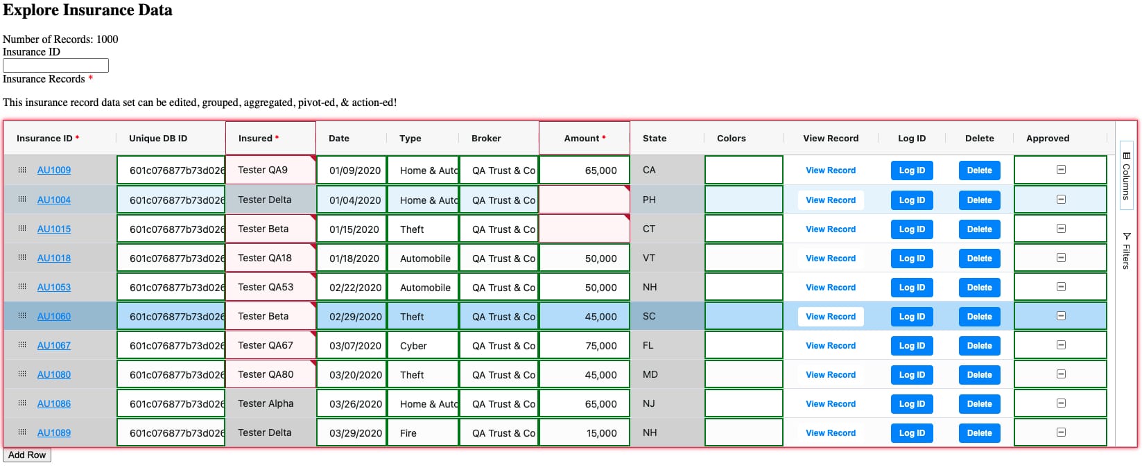
Here's how the CSS looks when applied to a Dynamic Grid populated with data.
This image also shows default validation, row selection, and row highlight styles. You can also see that the Button column type doesn't support editable or read-only styles.

Example 2: Cell Styles Applied to Each Column Type
In the following code snippet, there are seven styling directions:
Apply a red background to Text Field cells.
Apply a purple background to Number cells.
Apply a grey background to Single-select Dropdown cells.
Apply a green background to Multi-select Dropdown cells.
Apply a yellow background to Date cells.
Apply an orange background to Button cells.
Apply a pink background to Checkbox cells.
.unq-dynamic-grid .ag-cell.unq-dynamic-grid__textfield-cell {
  background-color: rgba(255, 0, 0, 0.25);
}

.unq-dynamic-grid .ag-cell.unq-dynamic-grid__number-cell {
  background-color: rgba(0, 4, 255, 0.25);
}

.unq-dynamic-grid .ag-cell.unq-dynamic-grid__singleselect-cell {
  background-color: rgba(8, 0, 8, 0.25);
}

.unq-dynamic-grid .ag-cell.unq-dynamic-grid__checkbox-cell {
  background-color: rgba(255, 0, 208, 0.25);
}

.unq-dynamic-grid .ag-cell.unq-dynamic-grid__multiselect-cell {
  background-color: rgba(0, 255, 13, 0.25);
}

.unq-dynamic-grid .ag-cell.unq-dynamic-grid__date-cell {
  background-color: rgba(255, 221, 0, 0.25);
}

.unq-dynamic-grid .ag-cell.unq-dynamic-grid__button-cell {
  background-color: rgba(255, 115, 0, 0.25);
}
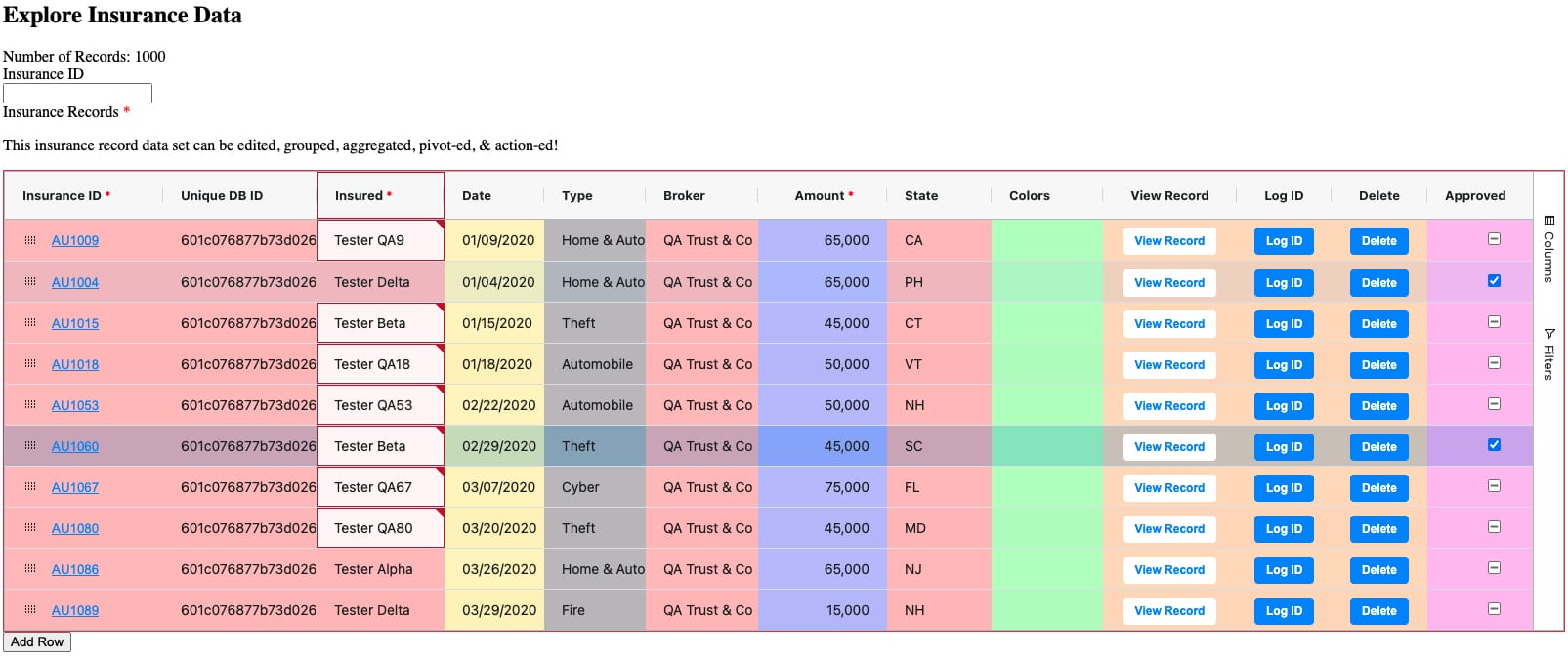
Here's how the CSS looks when applied to a Dynamic Grid populated with data.
This image also shows default validation, row selection, and row highlight styles.

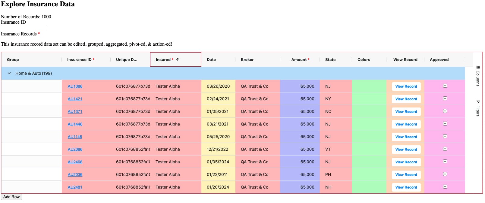
As mentioned, row grouping affects how CSS styling applies. Here's how the same CSS styles look when applied after row grouping. Notice that the top-level row-grouped cell (Home & Auto (199)) doesn't show any styling.

Example 3: Grouping Cell Styles
In this final example, the code snippet shows how to group cell styles to target multiple cell types. Altogether, there are five styling directions:
Apply a red background to Text Field, Number, and Date cells.
Apply a purple background to Single-select Dropdown and Multi-select Dropdown cells.
Apply a green background to Checkbox and Button cells.
Apply green borders around editable cells.
Apply a grey background to read-only cells.
.unq-dynamic-grid {
  .ag-cell {
     &.unq-dynamic-grid__textfield-cell, &.unq-dynamic-grid__number-cell, &.unq-dynamic-grid__date-cell {
        background-color: rgba(255, 0, 0, 0.25);
      }

      &.unq-dynamic-grid__singleselect-cell, &.unq-dynamic-grid__multiselect-cell  {
        background-color: rgba(0, 4, 255, 0.25);
      }

      &.unq-dynamic-grid__checkbox-cell,
      &.unq-dynamic-grid__button-cell {
        background-color: rgba(0, 255, 128, 0.25);
      }

      &.unq-dynamic-grid__editable-cell {
        border: green solid 2px;
        border-right: green solid 2px; // overrides base ag-cell border-right
      }

      &.unq-dynamic-grid__read-only-cell {
        background-color: rgba(0, 0, 0, 0.15);
      }
    }
}
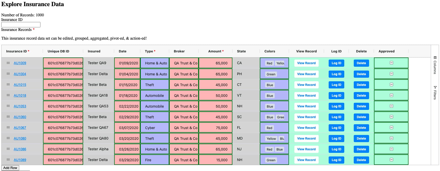
Here's how the CSS looks when applied to a Dynamic Grid populated with data.
Styling Stacking Behavior
Because there are several ways to apply styling to your Dynamic Grid, it's important to understand how different styling directions work together. For example, how styles applied using the Custom CSS Class setting interact with styles applied using the customClass output in a Decisions component.
customClass Stacking at a Single Level
Styling applied using the customClass output doesn't stack at a single level. Suppose you have two Decisions components, both with rules to apply styling to a specific column of your Dynamic Grid. This is single-level stacking because both styles target a single level of the grid: the column level.
The first Decisions component, ruleGreenBorder, applies a customClass that adds a green border around the cells in the column. The customClass variable's definition is .cell-border-green.
The second Decisions component, ruleRedBorder, applies a customClass that adds a red border around cells in the column. The customClass variable's definition is .cell-border-red.
When ruleGreenBorder is triggered, the green border applies. If ruleRedBorder is then triggered, the green border is removed and the red border applies. The red and green borders don't stack.
customClass Stacking at Different Levels
Styling applied using the customClass output stacks across different levels (component, column, row, or cell). Suppose you have three Decisions components that all target your Dynamic Grid, but at different levels:
ruleRedColumn applies a customClass that adds a red cell border around cells in the firstName column of a grid. The customClass variable's definition is .cell-border-red.
ruleGreenRow applies a green cell border around cells in row 1 of the grid (dynamicGrid.row(0)). The customClass variable's definition is .cell-border-green.
ruleBlueCell applies a blue cell border specifically to cells in row 1 of the firstName column of the grid (dynamicGrid.row(0).col(firstName)). The customClass variable's definition is .cell-border-blue.
Upon triggering all three components, all three customClass styles apply. So, the cell at row 1 of the firstName column shows a class list of class="… cell-border-red cell-border-green cell-border-blue".
customClass and Cell Selector Stacking
Styles applied using the customClass output and styles applied through the application's stylesheet can also interact. Variables defined in the customClass style stack with cell selectors defined in your stylesheet. Look at a scenario where styling directions from a stylesheet and a Decisions component interact:
At the stylesheet level, the cell selector .unq-dynamic-grid__textfield-cell defines that all Text Field cells in a grid have a blue cell border.
At the configuration level, a Decisions component applies a customClass that adds a red cell border around cells in the firstName column of the grid. The customClass variable's definition is .cell-border-red.
Assume the firstName column is a Text Field column type. In that case, the firstName column is affected by two styling directions:
A red cell border (.cell-border-red), applied by the Decisions component.
A blue cell border, defined by the .unq-dynamic-grid__textfield-cell cell selector in the stylesheet.
So, the firstName column shows a class list of class="… cell-border-red .unq-dynamic-grid__textfield-cell".
Styling Limitations
There are three limitations to keep in mind when introducing custom CSS styling to your Dynamic Grid component:
You can't create new named CSS classes.
Your CSS can only affect styling, not structure or behavior.
Styling can impact performance.
Inability to Create New Named CSS Classes
Your custom CSS can only create new style selectors that target existing classes, or apply a general styling change to a top-level rule. Your CSS can't create a new named CSS class because the Dynamic Grid components always generates the same CSS class bindings. An active custom stylesheet can't override the Dynamic Grid's core code base.
CSS Affects Styling, Not Structure or Behavior
You can't fundamentally change the structure or behavior of the Dynamic Grid when making styling changes. For example, when an end-user makes selections from a Multi-select Dropdown column, a drop-down interface displays. Then, any selected options render in the cell as horizontally-wrapped pills.
You can use CSS to change the styling of those pills. For example, changing their color or some aspects of the layout (such as wrapping top-to-bottom instead of left-to-right). You can't, however, override the fundamental form or behavior of showing selected options as pills.
Similarly, CSS styling can't override the intrinsic behavior of the Dynamic Grid or its columns. For example, you can't disable keyboard shortcuts or change the fact that selecting a cell in some column types makes a drop-down menu display. You also can't change the grid's layout and responsiveness, beyond using any settings in the component itself.
Also, you can't use CSS styling to change the size of the grid, its columns, rows, or cells. You must use applicable configuration settings to make the necessary changes.
Styling Can Impact Performance
The Dynamic Grid component is designed for high performance. Part of this high performance comes from the Dynamic Grid's streamlined appearance. Consider that complex styling, particularly cell or row-based styling, can decrease performance. For example, applying styling to every cell of a 10,000 cell grid has more impact than only styling column headers.