Overview
Sometimes your application has more than one output action or value. Instead of configuring each output separately, you can use an Output operator. Here's where the_group Output operator configuration comes in. Using the _group Component setting, you can dynamically output multiple values or actions.
Learning Objectives
In this article, you'll learn how to set up and use the _group Component setting.
Configuration
The first step to setting up the _group output configuration is setting up a data table. Your data table stores your component IDs, outputs, and output actions. Then, configure the Output operator in a Data Workflow. Normally, the Output operator outputs your data to a single component. But, for the _group output, you'll make use of the operator's _group Component setting. This configuration uses the output information from your data table instead of a component.
Let's say you have a list of US states without assigned capitals. You want to output the capital to each US state. But, you also want to avoid assigning each capital as a separate output. You can use the _group Component setting to assign capitals to your states with a single output.
You'll begin by adding a Data Table component to store your component IDs, outputs, and actions. In this example, the component IDs are where you'll store your outputs. Your Data Table component outputs are the US capitals. Then, you'll add US state fields to receive the outputs. Next, your Data Workflow runs the _group output through an Output operator. You'll finish with a Button component to trigger the whole operation
Configure the Data Table Component
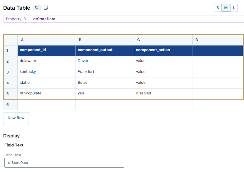
First, configure a Data Table component to store some sample data. This component holds the component ID, output, and action for your _group output configuration.
In the Module Builder, drag and drop a Data Table component onto your canvas.
In the Property ID and Label Text fields, enter
dtStateData.In the data table, enter the following:
A
B
C
1
component_id
component_output
component_action
2
delaware
Dover
value
3
kentucky
Frankfort
value
4
idaho
Boise
value
5
btnPopulate
yes
disabled
For the _group output configuration, the capitalization in your Data Table component matters. You must use the same casing as shown in the example.
Configure the Text Field Components
Next, configure a few Text Field components as the output actions of your _group output configuration.
Drag and drop three Text Field components onto your canvas, placing them below your Data Table component.
Enter the following Property ID and Label Text fields for each Text Field component:
Property ID
Label Text
1
delaware
Delaware
2
kentucky
Kentucky
3
idaho
Idaho
Set Read Only View to
 (ON).
(ON).Click Save & Close as you add them.
Configure the Data Workflow Component
Next, configure a Data Workflow component with an Input operator to bring your data into the Data Workflow. Then, you'll add an Output operator with the _group output Component settings. You'll use the _group output configuration to complete the output actions in your Data Table component.
Drag and drop a Data Workflow component onto your canvas, placing it below the idaho Text Field component.
In the Property ID and Canvas Label Text fields, enter
dwfPopulateCapitals.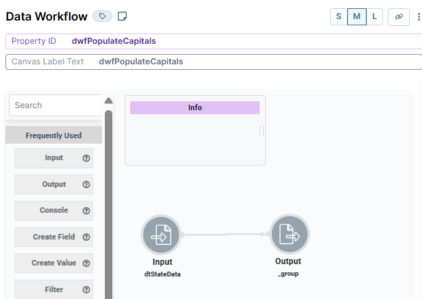
Configure the Input Operator
Drag and drop an Input operator onto your Data Workflow canvas.
Configure the Input operator's Info window as follows:
Info
Category
Input
Component
dtStateData
Required
Yes
Source
Default
Configure the Output Operator
Drag and drop an Output operator onto your Data Workflow canvas.
Configure the Output operator's Info window as follows:
Info
Category
Output
Component
_group
Action
value
Connect the output port (right) of the dtStateDataInput operator to the input port (left) of the Output operator.
Click Save Component.
Configure the Button Component
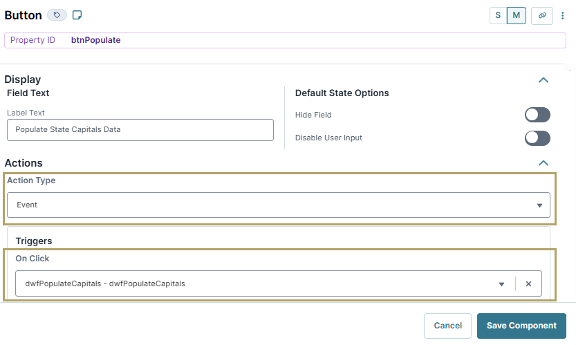
Lastly, you'll add a Button component to trigger your Data Workflow component.
Drag and drop a Button component onto your canvas, placing it above your dtStateDataData Workflow component.
In the Property ID field, enter btnPopulate.
In the Label Text, enter
Populate State Capitals Data.From the Action Type drop-down, select Event.
From the On Click drop-down, select dwfPopulateCapitals.
Click Save & Close.
Save your module.
Here's how the completed example looks in theModule Builder:
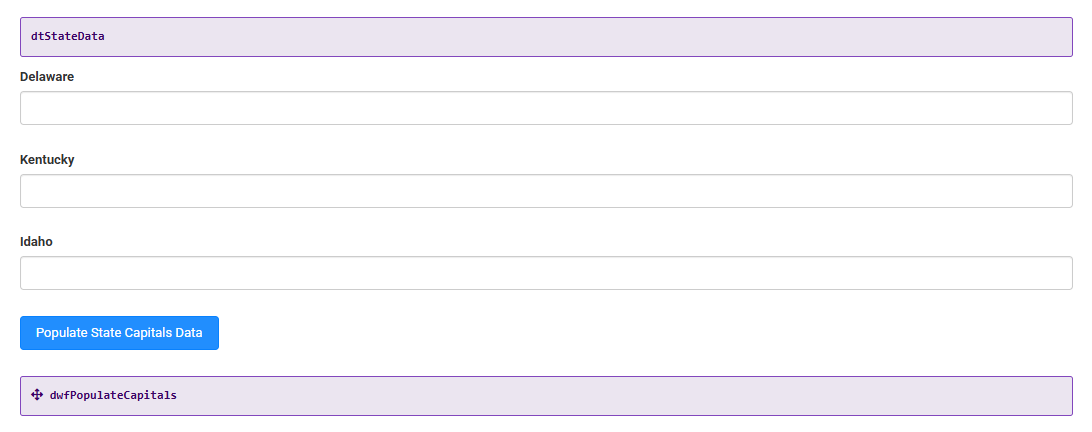
Preview your module in Express View. Then, click the Populate State Capitals Data button to view the results. The state capital values from your Data Table component populate next to each state. The button also follows the Data Table component's output action and disables.

Overview
Sometimes your application has more than one output action or value. Instead of configuring each output separately, you can use a single Output operator. Here's where the _group Output operator configuration comes in. Using the _group Component setting, you can dynamically output multiple values or actions.
Learning Objectives
In this article, you'll learn how to set up and use the _group Component setting.
Configuration
The first step to setting up the _group output configuration is setting up a data table. Your data table stores your component IDs, outputs, and output actions. Then, configure the Output operator in a Data Workflow. Normally, the Output operator outputs your data to a single component. But, for the _group output, you'll make use of the operator's _group Component setting. This configuration uses the output information from your data table instead of a component.
Let's say you have a list of US states without assigned capitals. You want to output the capital to each US state. But, you also want to avoid assigning each capital as a separate output. You can use the _group Component setting to assign capitals to your states with a single output.
You'll begin by adding a Data Table component to store your component IDs, outputs, and actions. In this example, the component IDs are where you'll store your outputs. Your Data Table component outputs are the US capitals. Then, you'll add US state fields to receive the outputs. Next, your Data Workflow runs the _group output through an Output operator. You'll finish with a Button component to trigger the whole operation
Configure the Data Table Component
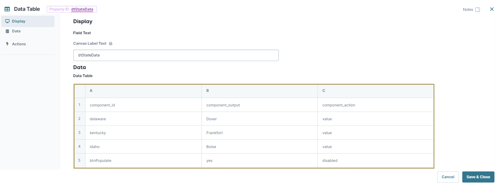
First, configure a Data Table component to store some sample data. This component holds the component ID, output, and action for your _group output configuration.
In the Module Builder, drag and drop a Data Table component onto your canvas.
In the Property ID and Canvas Label Text fields, enter
dtStateData.In the data table, enter the following:
component_id
component_output
component_action
delaware
Dover
value
kentucky
Frankfort
value
idaho
Boise
value
btnPopulate
yes
disabled
For the _group output configuration, the capitalization in your Data Table component matters. You must use the same casing as shown in the example.
Configure the Text Field Components
Next, configure a few Text Field components as the output actions of your _group output configuration.
Drag and drop three Text Field components onto your canvas, placing them below your dtStateDataData Table component.
Enter the following Property ID and Label Text fields:
Property ID
Label Text
delaware
Delaware
kentucky
Kentucky
idaho
Idaho
Set the Read Only View to
 (ON)
(ON)Click Save & Close as you add them.
Configure the Data Workflow Component
Next, configure a Data Workflow component with an Input operator to bring your data into the Data Workflow. Then, you'll add an Output operator with the _group output Component settings. You'll use the _group output configuration to complete the output actions in your Data Table component.
Drag and drop a Data Workflow component onto your canvas, placing it below the idaho Text Field component.
In the Canvas Label Text and Property Name fields, enter
dwfPopulateCapitals.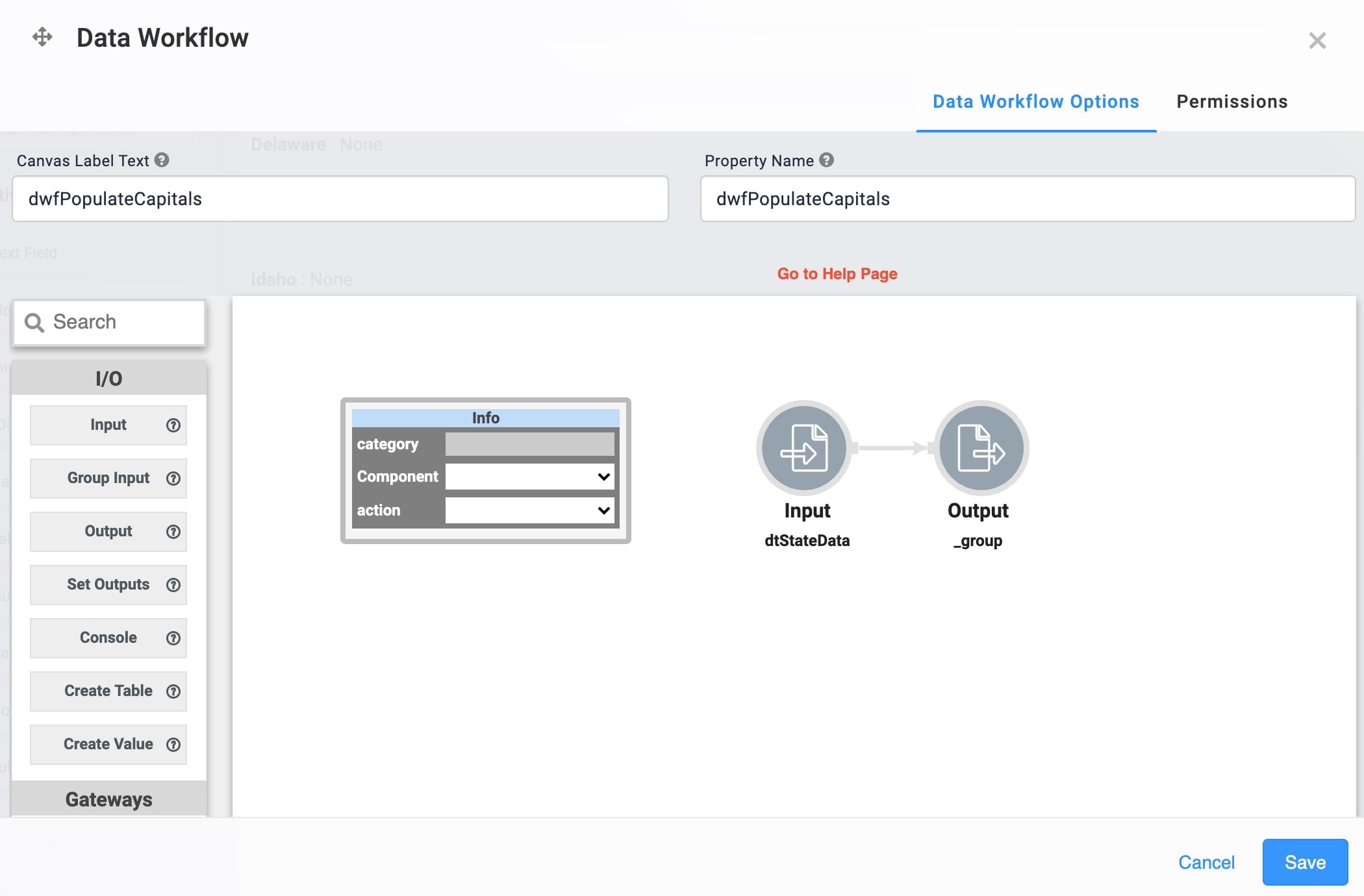
Configure the Input Operator
Drag and drop an Input operator onto your Data Workflow canvas.
Configure the Input operator's Info window as follows:
Setting
Value
Category
Input
Component
dtStateData
Required
Yes
Source
Default
Configure the Output Operator
Drag and drop an Output operator onto your Data Workflow canvas.
Configure the Output operator's Info window as follows:
Setting
Value
Category
Output
Component
_group
Action
value
Connect the output port (right) of the dtStateDataInput operator to the input port (left) of the Output operator.
Click Save.
Configure the Button Component
Next, you'll add a Button component to trigger your Data Workflow component.
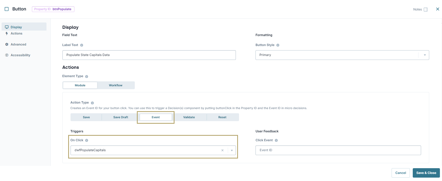
Drag and drop a Button component onto your canvas, placing above your dtStateDataData Workflow component.
In the Property ID field, enter btnPopulate.
In the Label Text, enter
Populate State Capitals Data.Set the Action Type as Event.
From the On Click drop-down, select dwfPopulateCapitals.
Click Save & Close.
Save your module.
Here's how the completed example looks in theModule Builder:
.png)
Preview your module in Express View. Then, click the Populate State Capitals Data button to view the results. The state capital values from your Data Table component populate next to each state. The button also follows the Data Table component's output action and disables.
.jpg)