Use Case: Building a Scatter Plot
Overview
It's often easier to digest data when it's displayed visually. So, adding a chart or graph to your application is a great way to speed up data analysis. Unqork offers a few options when it comes to this type of data representation. And one option you'll see and use quite often is the scatter plot.
Using a scatter plot can help you find correlations between 2 variables in your data. As long as you have 2 numerical keys in your data set, you can turn those into points on a scatter plot. Scatter plots are a quick way to spot trends in your data and to make predictions for the future.
What You'll Learn
In this article, you'll learn:
What is a Scatter Plot?
A scatter plot shows individual data points as dots on a traditional x- and y-axis. Data points can use any 2 keys from a data set as long as those keys are numerical values. Scatter plots let you see data both on an individual level, with each data point on its own. But they also let you see relationships between 2 variables at a glance. This helps you recognize patterns in your data, which can then help you make estimates for the future. Based on where your data falls on the chart, you can often tell if either variable has significance to the other.
Let's say you're tracking the number of sales for each sales agent in your department. In your data set, you have the following keys:
-
Agent ID
-
Revenue
-
Number of leads
-
Number of sales
You want to see if an agent makes more sales when they have more leads. To check any correlation between these 2 variables, you'd use a scatter plot.
While a scatter plot can show a lot, there are some cases when you wouldn't want to use one. If you have too much data, a scatter plot won't be useful because the result will be too crowded. You won't be able to see one dot from the others.
And sometimes your data is simply not related, and a scatter plot won't change that. (Putting someone's height and the number of Taylor Swift songs they know by heart on a scatter plot doesn't make sense, as much as you want it to.) So, when you know from the start your data doesn't have a relationship, you don't need to bother with a scatter plot.
To help show a useful scatter plot in Unqork, let's look at our earlier example of tracking sales for a list of agents.
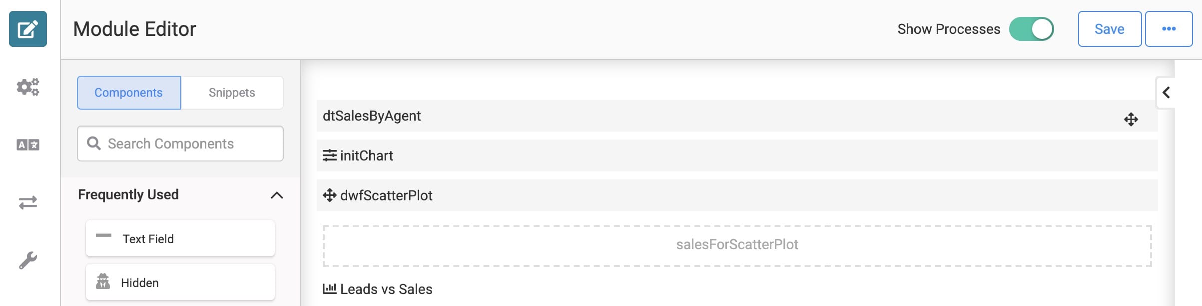
Here's how your module will look in the Module Builder:
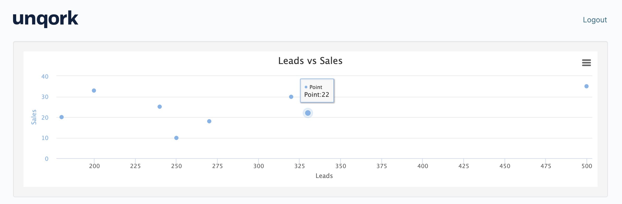
And here's how your completed module will look in Express View:
What You'll Need
For this use case, you'll need:
-
1 Data Table component
-
1 Hidden component
-
1 Chart component
-
1 Initializer component
-
1 Data Workflow component
To set up your Data Workflow, you'll need:
-
1 Input operator
-
1 Pick operator
-
2 Console operators
-
2 Rename Field operators
-
1 Output operator
These instructions assume you have a new module open, saved, and with a title.
Configuration
Configure the Data Table Component
First, you'll set up data to display in your scatter plot. You'll use a Data Table for that.
| 1. | Drag and drop a Data Table component onto your canvas. |
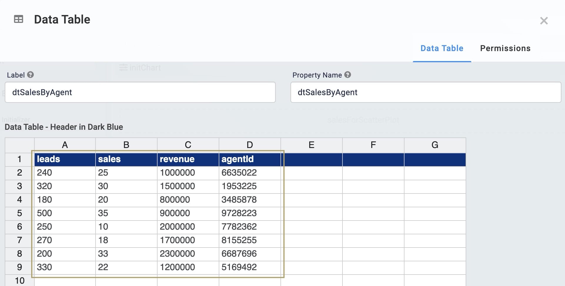
| 2. | Enter dtSalesByAgent in the Label and Property Name fields. |
| 3. | In the data table, enter the following: |
| leads | sales | revenue | agentId |
|---|---|---|---|
|
240 |
25 |
1000000 |
6635022 |
|
320 |
30 |
1500000 |
1953225 |
|
180 |
20 |
800000 |
3485878 |
|
500 |
35 |
900000 |
9728223 |
|
250 |
10 |
2000000 |
7782362 |
|
270 |
18 |
1700000 |
8155255 |
|
200 |
33 |
2300000 |
6687696 |
|
330 |
22 |
1200000 |
5169492 |
| 4. | Click Save. |
Configure the Hidden Component
You'll use a Data Workflow component to pull the data you want to show in your scatter plot. Before you configure your Data Workflow, you'll need a place to store its output. You'll use a Hidden component for that.
| 1. | Drag and drop a Hidden component onto your canvas. Place your Hidden component below your Data Table. |
| 2. | Enter salesForScatterPlot in the Property ID and Canvas Label Text fields. |
| 3. | Click Save. |
Configure the Data Workflow Component
Next, you'll configure your Data Workflow component. Here, you'll use a Pick operator to choose 2 keys from your data. Then, you'll convert each of those fields to either x or y respectively. These will then serve as the x- and y-axis in your scatter plot. Your data must be formatted this way in order to properly pass through your Chart component.
| 1. | Drag and drop a Data Workflow component onto your canvas. Place your Data Workflow below your Data Table. |
| 2. | Enter dwfScatterPlot in the Canvas Label Text and Property Name fields. |
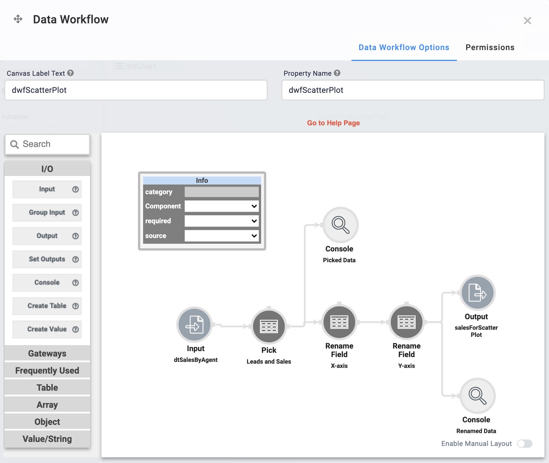
Configure the Input Operator
| 1. | Drag and drop an Input operator onto your Data Workflow canvas. |
| 2. | Configure the Input operator's Info window as follows: |
|
Setting |
Value |
|---|---|
|
Category |
Input |
|
Component |
dtSalesByAgent |
|
Required |
Yes |
|
Source |
Default |
Configure the Pick Operator
This Pick operator pulls the leads and sales columns from your data table.
| 1. | Drag and drop a Pick operator onto your Data Workflow canvas. |
| 2. | Configure the Pick operator's Info window as follows: |
|
Setting |
Value |
|---|---|
|
Category |
Pick |
|
Label |
Leads and Sales |
|
Pick Keys |
leads, sales |
| 3. | Connect the output port (right) of the Input operator to the input port (left) of the Pick operator. |
Configure the First Console Operator
This is the first Console operator in this configuration. This operator shows the data retrieved by the Pick operator. You'll use this operator for troubleshooting purposes.
| 1. | Drag and drop a Console operator onto your Data Workflow canvas. |
| 2. | Configure the Console operator's Info window as follows: |
|
Setting |
Value |
|---|---|
|
Category |
Console |
|
Label |
Picked Data |
| 3. | Connect the output port (right) of the Pick operator to the input port (left) of the Console operator. |
Configure the First Rename Field Operator
This Rename Field operator renames your leads column to x. This allows your leads data to serve as the x values in your data points.
| 1. | Drag and drop a Rename Field operator onto your Data Workflow canvas. |
| 2. | Configure the Rename Field operator's Info window as follows: |
|
Setting |
Value |
|---|---|
|
Category |
Rename Field |
|
Label |
X-axis |
|
Current Name |
leads |
|
Target Name |
x |
| 3. | Connect the output port (right) of the Pick operator to the input port (left) of the Rename Field operator. |
Configure the Second Rename Field Operator
This Rename Field operator renames your sales column to y. This allows your sales data to serve as the y values in your data points.
| 1. | Drag and drop another Rename Field operator onto your Data Workflow canvas. |
| 2. | Configure the Rename Field operator's Info window as follows: |
|
Setting |
Value |
|---|---|
|
Category |
Rename Field |
|
Label |
Y-axis |
|
Current Name |
sales |
|
Target Name |
y |
| 3. | Connect the output port (right) of the X-axis Rename Field operator to the input port (left) of the Y-axis Rename Field operator. |
Configure the Second Console Operator
This is the second Console operator in this configuration. This operator shows the data once it's been renamed by the Rename Field operators. You can use this operator for troubleshooting purposes.
| 1. | Drag and drop another Console operator onto your Data Workflow canvas. |
| 2. | Configure the Console operator's Info window as follows: |
|
Setting |
Value |
|---|---|
|
Category |
Console |
|
Label |
Renamed Data |
| 1. | Connect the output port (right) of the Y-axis Rename Field operator to the input port (left) of the Renamed Data Console operator. |
Configure the Output Operator
The Output operator places your final result in the Hidden component you set up earlier.
| 1. | Drag and drop an Output operator onto your Data Workflow canvas. |
| 2. | Configure the Output operator's Info window as follows: |
|
Setting |
Value |
|---|---|
|
Category |
Output |
|
Component |
salesForScatterPlot |
|
Action |
value |
| 3. | Connect the output port (right) of the Y-axis Rename Field operator to the input port (left) of the Output operator. |
| 4. | Click Save. |
Configure the Chart Component
Now it's time to configure your Chart component. Here, you'll set which data to reference when populating your chart. So, you'll set your Hidden component as the chart's input.
| 1. | Drag and drop a Chart component onto your canvas. Place your Chart below your Hidden component. |
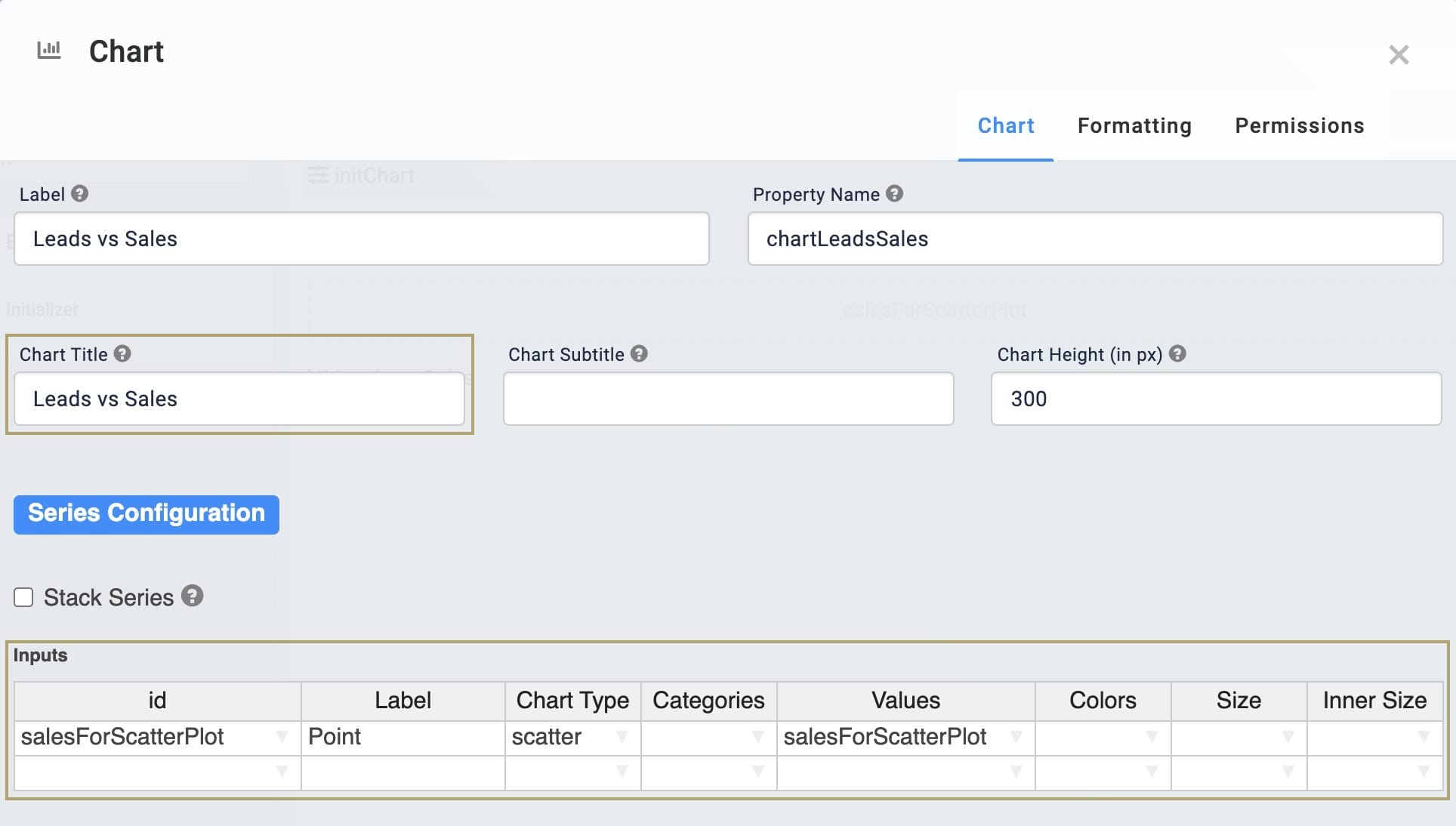
| 2. | Enter Leads vs Sales in the Label field. |
| 3. | Enter chartLeadsSales in the Property Name field. |
| 4. | Enter Leads vs Sales in the Chart Title field. |
| 5. | In the Inputs table, enter the following: |
| ID | Label | Chart Type | Categories | Values |
|---|---|---|---|---|
|
salesForScatterPlot |
Point |
scatter |
|
salesForScatterPlot |
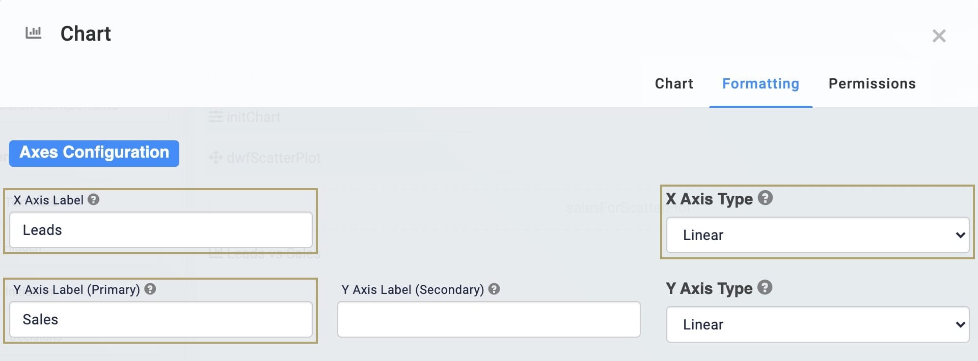
| 6. | Click the Formatting tab at the top of the configuration window. |
| 7. | Enter Leads in the X Axis Label field. |
| 8. | Enter Sales in the Y Axis Label (Primary) field. |
| 9. | Select Linear from the X Axis Type drop-down. |
| 10. | Click Save. |
Configure the Initializer Component
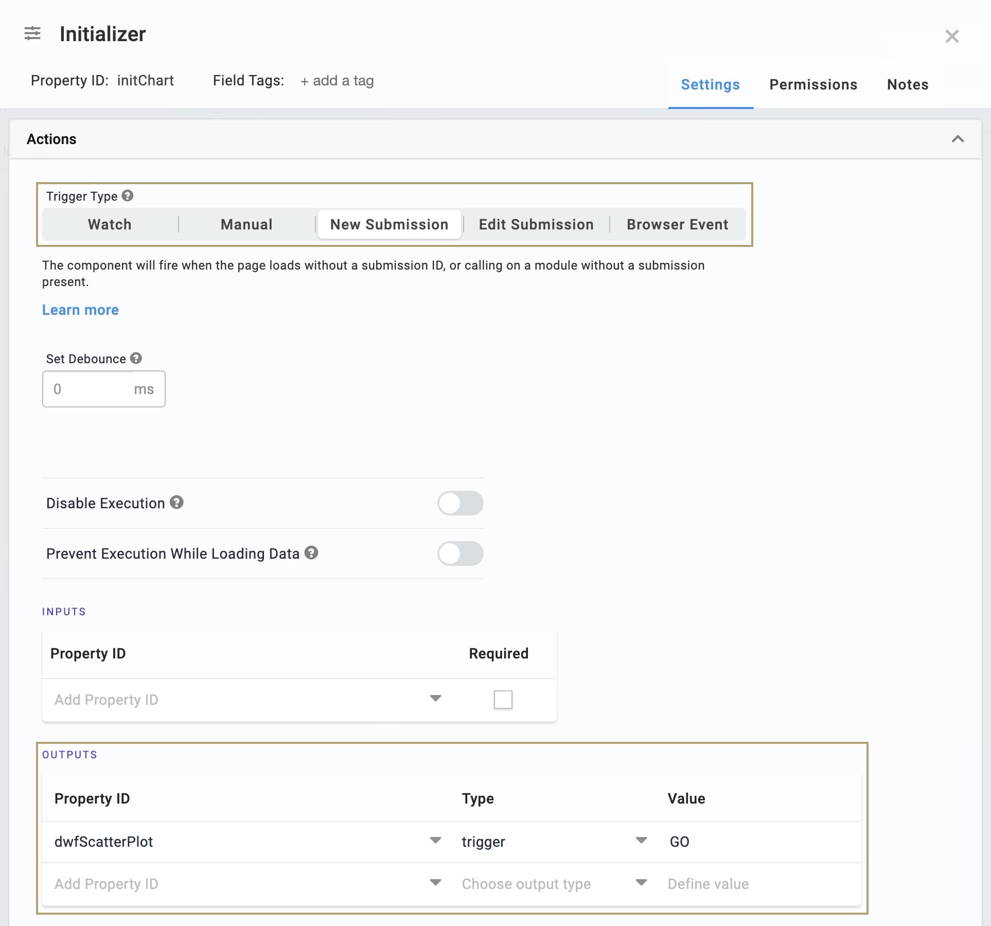
Finally, you'll need a way to start your Data Workflow. You'll use an Initializer component for that.
| 1. | Drag and drop an Initializer component onto your canvas. Place your Initializer below your Data Table. |
| 2. | Enter initChart in the Property ID and Canvas Label Text fields. |
| 3. | Select New Submission as the Trigger Type. |
| 4. | In the Outputs table, enter the following: |
| Property ID | Type | Value |
|---|---|---|
|
dwfScatterPlot |
trigger |
GO |
| 5. | Click Save. |
| 6. | Save your module. |
Now it's time to test your work. Preview your module in Express View. You'll see the data from your Data Table displayed as a scatter plot. Number of leads shows as your x-axis for each point and number of sales shows as your y-axis. You can hover over each point to see its exact y-value.
Lab
You can view this complete use case here: https://training.unqork.io/#/form/6095541b04f013359ff044ab/edit.
