Overview
Version: 6.56.0
UAT Release Date: May 03, 2022
Proposed Production Release Date: May 17, 2022
Module Editor
Release Highlights
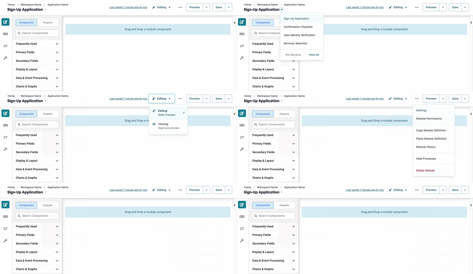
A new Module Editor Header design!

The new Module Builder Header has all the same logic and capabilities as the old header. Now, Creators discover a new UX design, including a new settings menu, breadcrumb navigation, and updated interactions with the Save and Preview buttons. These new features help direct Creators to perform the most relevant actions while configuring modules.
Share your Component configurations with Deep Linking!
We added the ability to deep link directly to a component in the Module Builder with additional URL parameters. Users can highlight a specific component in the Module Builder canvas (and Module Outline), or open a particular component’s settings modal on page-load. The two new query string parameters are “componentId” and “action”.
Highlighting a component in the Module Builder canvas on page-load: https://client-env.unqork.io/#/form/{moduleId}/edit?componentId={componentPropertyId}
Opening a component’s settings modal on page-load: https://client-env.unqork.io/#/form/{moduleId}/edit?componentId={componentPropertyId}&action=settings
Enhancements
Component Definitions: Created the definitions for implementing the upcoming component settings modals generator.
flattenComponents: Simplified the flattenComponents function to return only a list of flattened components.
Platform Data: Moved the Save Handler's useSaveModule hook (used for tracking) to its own function.
Fixes
Module History: Resolved a security issue where Module History sanitized two instances of HTML.
Components
Enhancements
Address Component v2: Non-service specific settings are now visually grouped for clarity.
Address Component v2: Updated "Places Service" setting tooltip text to describe how it's populated and how creators should use it.
Address Component v2: Updated UX design and introduced user-friendly tooltips that provide guidance about the supported Google Places and Canada Post services. These services are defined in Services Administration.
Dynamic Grid Component: Added a new trigger action when the end-user rearranges a row in Express View.
Dynamic Grid Component: Improved arrow key navigation inside Number and Text Field columns.
Plug-In Component: Increased performance of PDF generation using the Generate PDF from Template (PDF Bar) Internal Service.
Uniform Grid: The Multi-Select Dropdown component now displays labels instead of values in Express View.
Fixes
Charts Component: Fixed an issue with pie charts not being visible.
Components: Fixed an issue where icons were missing from certain components in the Module Outline.
Decisions Component: Fixed an issue with Micro Decisions when deleting rows using the context menu.
Dynamic Grid Component: Fixed an issue when deleting a value from Multi-select Column didn’t fire attached triggers.
Dynamic Grid Component: Fixed an issue where drop-downs wouldn’t show correctly in a Panel.
Dynamic Grid Component: Fixed an issue where the “Target not found” DevTools Console warning logs when a logic component targets specific Dynamic Grid cells without values.
Dynamic Grid Component: Disable, Enable, Hidden properties now work as expected after row grouping.
Freeform/Uniform Grid Components: Fixed an issue when using a Plug-In component to inject data into a Grid component via {{data.x}} or Dynamic Index syntax.
File Component: Fixed an issue where the File Component was executing a post trigger twice.
Grids Components: Fixed an issue where hitting Enter/Return added rows to a Uniform or Freeform Grid component in Express View.
Number Component: Fixed an issue where the Number Component wasn’t displaying the appropriate prefix/suffix when formatted as currency.
Panel Component: Fixed an issue where the Import Module setting wouldn’t import modules correctly using the Reference Import setting.
Plug-In Component: Fixed an issue where the Plug-In component gives an error when it returns an empty data set.
Workflow
Release Highlights
The Workflow Builder receives an updated interface!
The Workflow Builder has been redesigned to be more consistent with the Module Builder and provides a stronger connection between the two editor interfaces. Enhancements include the new breadcrumb navigation to show the application associated with that workflow and the other modules and workflows in that application. Workflow Settings page redesigned for consistency and ease of use.
Enhancements
Timer and Timer Start Nodes: Updated nodes to use CRON expressions and added placeholder text to the CRON Expression field.
Workflow Builder: Updated module title UI in the Workflow Builder.
Workflow Nodes: Updated to allow workflow gateways to function with non-persisted data.
Fixes
General Workflow: Fixed an issue where anonymous users were redirected to a login screen and couldn’t access the anonymous workflow.
Workflow Builder: Fixed an issue where Workflow wasn’t logging an error caused when validating access for dynamic modules.
Platform UI
Release Highlights
Customize your Login and Logout pages!
You can now create custom login and logout modules for your applications. Customize the look your end-users see, and create your own login/logout logic to fit your application’s needs.
Check out the documentation for login and logout modules in our Login Module and Logout Module articles.
Platform Architecture
Enhancements
Platform Data: Modified various version, health, and heartbeat endpoints behind VPN and authentication.
UDLC Toolkit: Permitted UDLC applications to frame in Designer.
Fixes
Azure Private Link: Fixed an issue with private domain name setup and validation across all environment levels.
Nunjucks Transforms: Resolved a performance regression issue.
Apps, Admin, Access Provisioning, and API
Enhancements
API Documentation: Updated the Get Module Submissions to detail the Offset parameter.
API Documentation: Updated to require Designer admin or promote permissions for promote/hosts endpoint.
Express User Administration: Updated the user-invite experience with a secure, time-limited link to set a password of their own.
Promotion History: Created a queue promotion failure log to display failed promotions.
Single Sign-On (SSO): Enabled SSO to expose the OIDC id_token on service requests using OIDC authentication.
Fixes
Access Provisioning: Fixed an issue where multi-factor authentication (MFA) wasn’t working correctly when changing the default URL.
Administration: Fixed an issue where unsanitized input could be appended to a URL.
Administration: Fixed an issue where changes in Environment Administration were saved but didn't take effect until after server restart.