Use Case: Building a Bubble Chart
Overview
Unqork offers several ways to display data visually in your applications. One option is the bubble chart, a variation of the scatter plot. The bubble chart lets you graph 3 values together as one data point.
What You'll Learn
In this article, you'll learn:
What is a Bubble Chart?
Just like a scatter plot, a bubble chart uses x and y values to show points on a graph. But unlike a scatter plot, each point on a bubble chart can be a different size. The size of each point comes from a third value in your data.
For example, a bubble chart could show:
-
A country's unemployment rate on the x-axis.
-
GDP growth percentage on the y-axis.
-
Net GDP per capita as the size of each bubble.
This third variable offers a fuller picture in cases where these variables interact.
Another good use for a bubble chart would be tracking sales for each agent in your department. You'll set this up using the following keys from a data set:
-
Number of leads
-
Number of sales
-
Revenue
You want to see if an agent makes more sales when they have more leads. But you also want to see how much revenue comes from each of these circumstances. For that, you'll build a bubble chart.
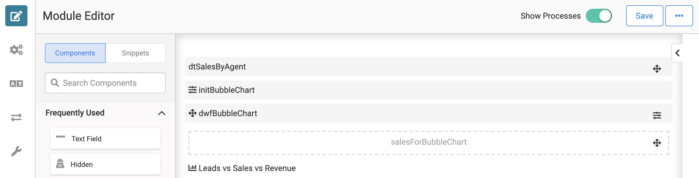
Here's how your module will look in the Module Builder:
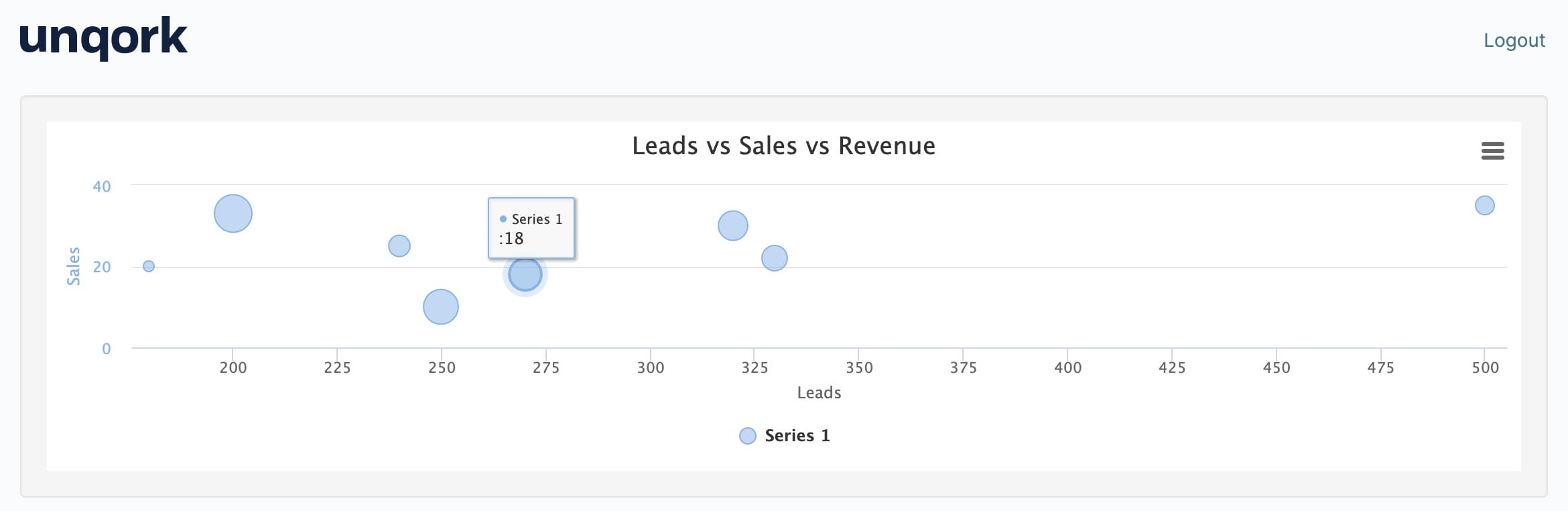
And here's how your completed module will look in Express View:
What You'll Need
For this use case, you'll need:
-
1 Data Table component
-
1 Hidden component
-
1 Chart component
-
1 Initializer component
-
1 Data Workflow component
To set up your Data Workflow, you'll need:
-
1 Input operator
-
1 Pick operator
-
2 Console operators
-
3 Rename Field operators
-
1 Output operator
NOTE These instructions assume you have a new module open, saved, and with a title.
Configuration
Configure the Data Table Component
First, you'll set up data to display in your bubble chart. You'll use a Data Table for that.
| 1. | Drag and drop a Data Table component onto your canvas. |
| 2. | Enter dtSalesByAgent in the Label and Property Name fields. |
| 3. | In the data table, enter the following: |
| leads | sales | revenue | agentId |
|---|---|---|---|
|
240 |
25 |
1000000 |
6635022 |
|
320 |
30 |
1500000 |
1953225 |
|
180 |
20 |
800000 |
3485878 |
|
500 |
35 |
900000 |
9728223 |
|
250 |
10 |
2000000 |
7782362 |
|
270 |
18 |
1700000 |
8155255 |
|
200 |
33 |
2300000 |
6687696 |
|
330 |
22 |
1200000 |
5169492 |
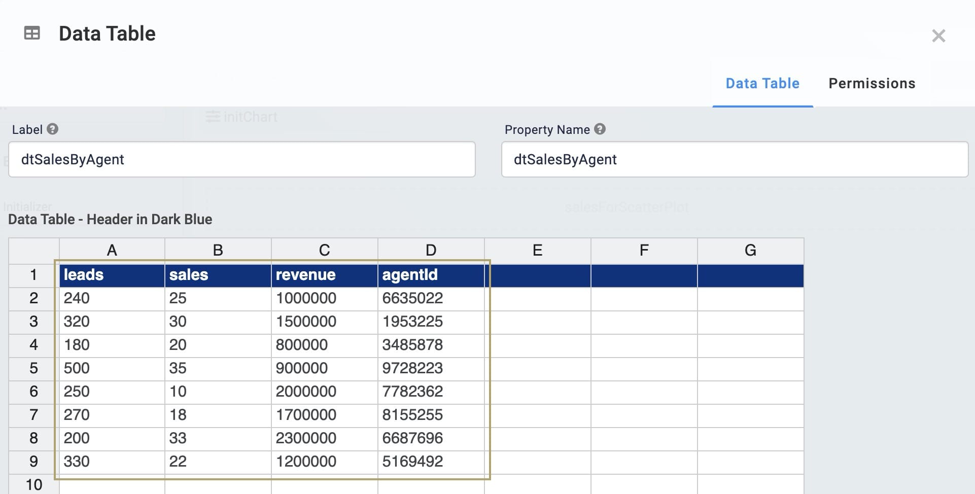
| 4. | Click Save. |
Configure the Hidden Component
You'll use a Data Workflow component to pull the data you want to show in your scatter plot. But before you configure your Data Workflow, you'll need a place to store its output. You'll use a Hidden component for that.
| 1. | Drag and drop a Hidden component onto your canvas. Place your Hidden component below your Data Table. |
| 2. | Enter salesForBubbleChart in the Property ID and Canvas Label Text fields. |
| 3. | Click Save. |
Configure the Data Workflow Component
Next, you'll configure your Data Workflow component. Here, you'll use a Pick operator to choose 3 keys from your data. Then, you'll convert each of those fields to either x, y, and z respectively. Your x and y values will inform where your data points fall on each axis. And your z values will determine the size of each point. Your data must be formatted this way in order to properly pass through a Chart component.
| 1. | Drag and drop a Data Workflow component onto your canvas. Place your Data Workflow below your Data Table. |
| 2. | Enter dwfScatterPlot in the Canvas Label Text and Property Name fields. |
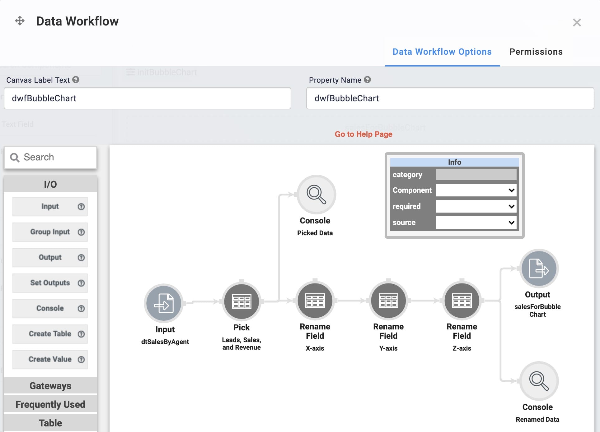
Configure the Input Operator
| 1. | Drag and drop an Input operator onto your Data Workflow canvas. |
| 2. | Configure the Input operator's Info window as follows: |
|
Setting |
Value |
|---|---|
|
Category |
Input |
|
Component |
dtSalesByAgent |
|
Required |
Yes |
|
Source |
Default |
Configure the Pick Operator
This Pick operator pulls the leads and sales columns from your data table.
| 1. | Drag and drop a Pick operator onto your Data Workflow canvas. |
| 2. | Configure the Pick operator's Info window as follows: |
|
Setting |
Value |
|---|---|
|
Category |
Pick |
|
Label |
Leads, Sales, and Revenue |
|
Pick Keys |
leads, sales, revenue |
| 3. | Connect the output port (right) of the Input operator to the input port (left) of the Pick operator. |
Configure the First Console Operator
This is the first Console operator in this configuration. This operator shows the data retrieved by the Pick operator. You can use this operator for troubleshooting purposes.
| 1. | Drag and drop a Console operator onto your Data Workflow canvas. |
| 2. | Configure the Console operator's Info window as follows: |
|
Setting |
Value |
|---|---|
|
Category |
Console |
|
Label |
Picked Data |
| 3. | Connect the output port (right) of the Pick operator to the input port (left) of the Console operator. |
Configure the First Rename Field Operator
This Rename Field operator renames your leads column to x. This lets your leads data serve as the x values in your data points.
| 1. | Drag and drop a Rename Field operator onto your Data Workflow canvas. |
| 2. | Configure the Rename Field operator's Info window as follows: |
|
Setting |
Value |
|---|---|
|
Category |
Rename Field |
|
Label |
X-axis |
|
Current Name |
leads |
|
Target Name |
x |
| 3. | Connect the output port (right) of the Pick operator to the input port (left) of the Rename Field operator. |
Configure the Second Rename Field Operator
This Rename Field operator renames your sales column to y. This lets your sales data serve as the y values in your data points.
| 1. | Drag and drop another Rename Field operator onto your Data Workflow canvas. |
| 2. | Configure the Rename Field operator's Info window as follows: |
|
Setting |
Value |
|---|---|
|
Category |
Rename Field |
|
Label |
Y-axis |
|
Current Name |
sales |
|
Target Name |
y |
| 3. | Connect the output port (right) of the X-axis Rename Field operator to the input port (left) of the Y-axis Rename Field operator. |
Configure the Third Rename Field Operator
This Rename Field operator renames your revenue column to z. This lets your revenue data serve as the z values in your data points.
| 1. | Drag and drop another Rename Field operator onto your Data Workflow canvas. |
| 2. | Configure the Rename Field operator's Info window as follows: |
|
Setting |
Value |
|---|---|
|
Category |
Rename Field |
|
Label |
Z-axis |
|
Current Name |
revenue |
|
Target Name |
z |
| 3. | Connect the output port (right) of the Y-axis Rename Field operator to the input port (left) of the Z-axis Rename Field operator. |
Configure the Second Console Operator
This is the second Console operator in this configuration. This operator shows the data once it's been renamed by the Rename Field operators. You can use this operator for troubleshooting purposes.
| 1. | Drag and drop another Console operator onto your Data Workflow canvas. |
| 2. | Configure the Console operator's Info window as follows: |
|
Setting |
Value |
|---|---|
|
Category |
Console |
|
Label |
Renamed Data |
| 3. | Connect the output port (right) of the Z-axis Rename Field operator to the input port (left) of the Renamed Data Console operator. |
Configure the Output Operator
The Output operator places your final result in the Hidden component you set up earlier.
| 1. | Drag and drop an Output operator onto your Data Workflow canvas. |
| 2. | Configure the Output operator's Info window as follows: |
|
Setting |
Value |
|---|---|
|
Category |
Output |
|
Component |
salesForBubbleChart |
|
Action |
value |
| 3. | Connect the output port (right) of the Z-axis Rename Field operator to the input port (left) of the Output operator. |
| 4. | Click Save. |
Configure the Chart Component
Now it's time to configure your Chart component. Here, you'll set which data to reference when populating your chart. So, you'll set your Hidden component as the chart's input.
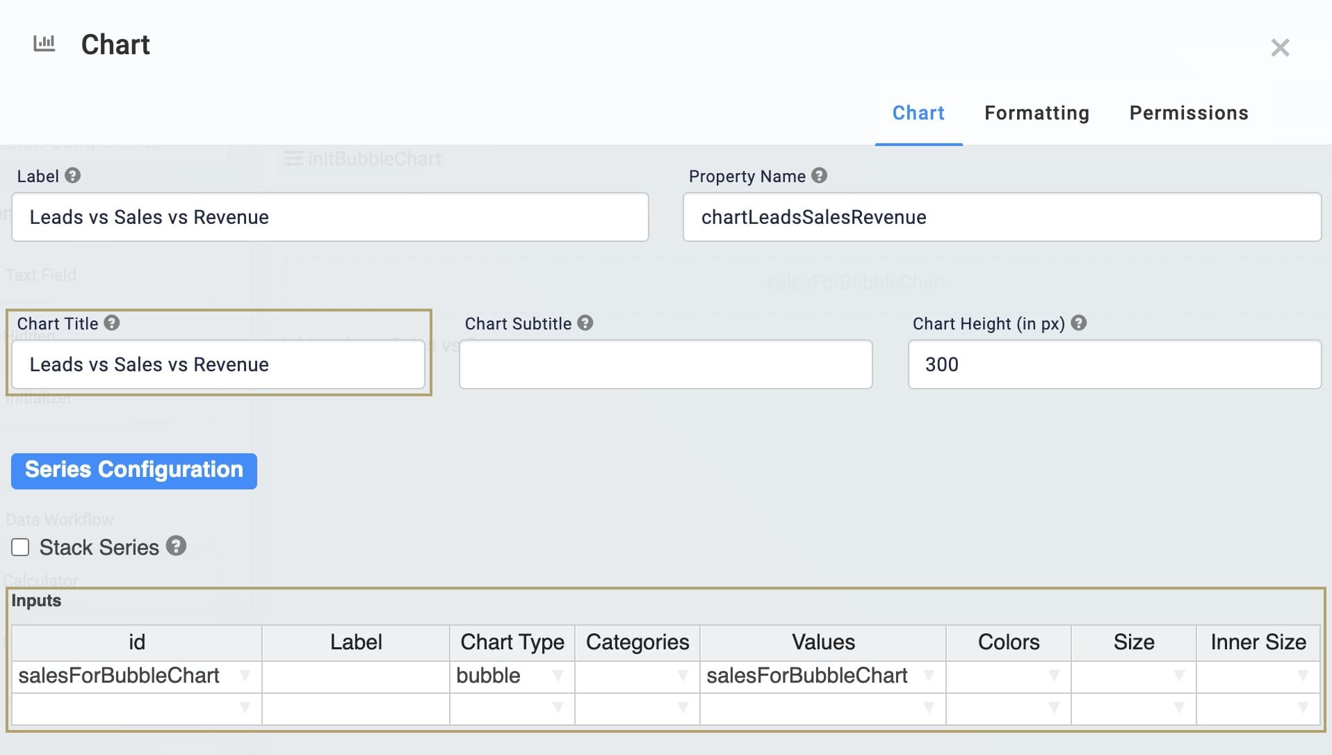
| 1. | Drag and drop a Chart component onto your canvas. Place your Chart below your Hidden component. |
| 2. | Enter Leads vs Sales vs Revenue in the Label field. |
| 3. | Enter chartLeadsSalesRevenue in the Property Name field. |
| 4. | Enter Leads vs Sales vs Revenue in the Chart Title field. |
| 5. | In the Inputs table, enter the following: |
| ID | Label | Chart Type | Categories | Values |
|---|---|---|---|---|
|
salesForBubbleChart |
|
bubble |
|
salesForBubbleChart |
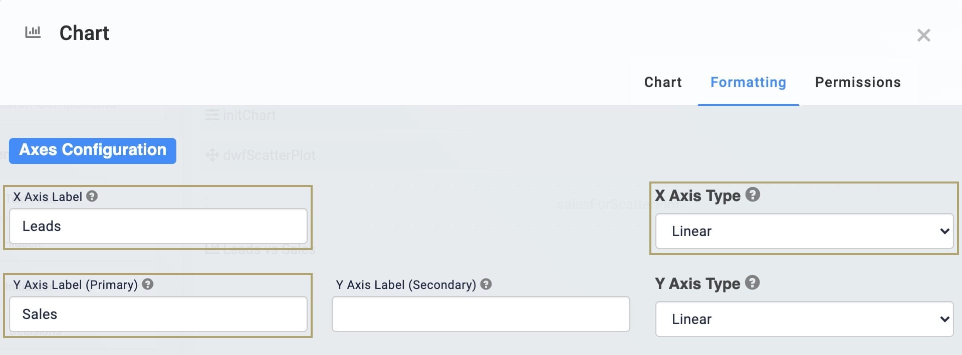
| 6. | Click the Formatting tab at the top of the configuration window. |
| 7. | Enter Leads in the X Axis Label field. |
| 8. | Enter Sales in the Y Axis Label (Primary) field. |
| 9. | Select Linear from the X Axis Type drop-down. |
| 10. | Click Save. |
Configure the Initializer Component
Finally, you'll need a way to start your Data Workflow. You'll use an Initializer component for that.
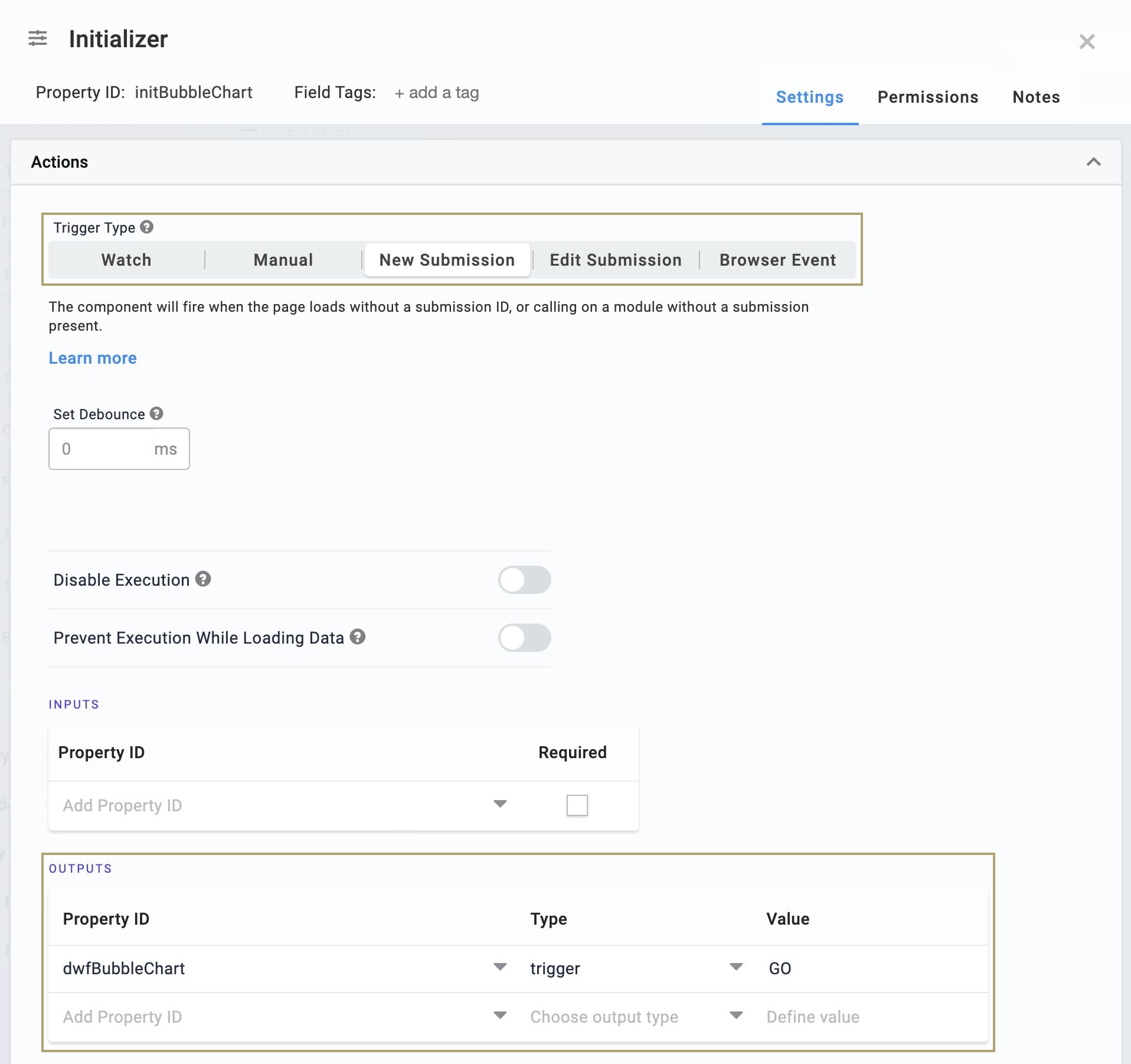
| 1. | Drag and drop an Initializer component onto your canvas. Place your Initializer below your Data Table. |
| 2. | Enter initBubbleChart in the Property ID and Canvas Label Text fields. |
| 3. | Select New Submission as the Trigger Type. |
| 4. | In the Outputs table, enter the following: |
| Property ID | Type | Value |
|---|---|---|
|
dwfBubbleChart |
trigger |
GO |
| 5. | Click Save. |
| 6. | Save your module. |
Now, let's preview your work. Open your module in Express View. You'll see the data from your Data Table displayed similar to a traditional scatter plot. Leads serve as the x-axis and sales serve as the y-axis. But you'll notice that each point on the chart is a different size. This draws from your revenue values. If a point has a larger revenue value, its bubble is larger. And if a point's revenue is smaller, the bubble is smaller. This gives you an added layer of data to analyze.
Lab
You can view this complete use case here: https://training.unqork.io/#/form/609a8b82a33de9038708620f/edit.
